sydney tong.
Vote Oakland is a Bay Area based organization focused on local election ballot transparency. The organization needs a tool that assists voters in learning about politicians and measures on the ballot.
My Role
Research, Design, PrototypeTimeline
Dec `21 - Feb `22Platform
App & WebsiteTools
Figma, UseberryOverview
Vote Oakland is a Bay Area based organization focused on local election ballot transparency. The organization needed a tool that assisted voters in learning about politicians and measures on the ballot. Vote Oakland’s primary target users include first-time voters who are concerned about policies affecting their community and would like to learn more.
* graphics for this project, case study and presentations are from Blackillustrations.com.
The Problem
55% of Oakland’s population (440,646*) is registered to vote. Only 73% of registered voters voted in the 2016 General Election**. Vote Oakland has identified a lack of general knowledge about local politics and limited understanding about personal impact as crucial drivers for involvement in city and county politics. *Census Bureau **Oaklandca.gov
The Goal
Design an app and corresponding responsive website that will improve local political education and promote registering to vote for eligible voters in Oakland.
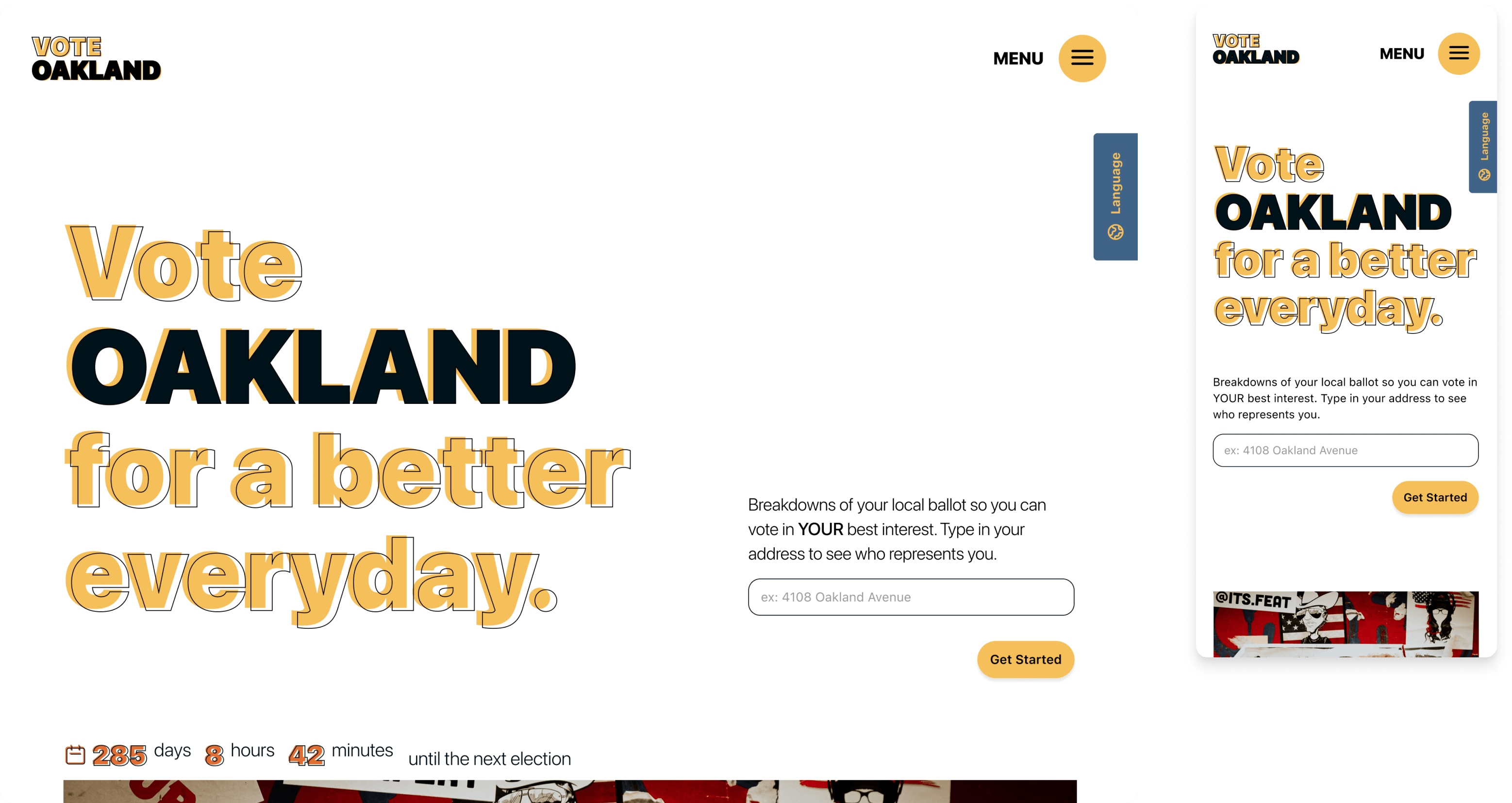
Informed voting for local ballots.
Design an app and corresponding website that will improve voter registration and increase ballot transparency for local Oakland election ballots .
Search
Emphasis on an easy search user-flow to help people find topics and politicians they’re interested in.
Website
Prioritized website functionality helps users research and build their ballots.
App
Primary feature allows users to stay up-to-date on current events, politicians and measures.
Inclusivity
Features were designed with inclusivity in mind from conception to execution.
Research
We wanted to be thorough during the research and discovery phase because we didn’t quite know what product and features we needed to create. It was important that we understood the users and the problems they were facing when deciding how to vote in local politics.
Competitive Analysis + The GapUser InterviewsPersonasUser JourneyCrazy Eights - Ideation
Competitive Analysis + Finding the Gap
Competitive audits allowed us to see how local non-profits and local governments handled sensitive ballot information. We saw that we could find success in organized data,an easy-to-use UI, creating the best search user flow, and focus on inclusivity.
ca.gov
Ballotpedia
The Oaklandside

Oakland Rising
Interviews
Most interview participants wanted to get involved in local politics but didn’t actively seek out information on candidates or measures. There was a general lack of trust in the media and feeling that their involvement would make little difference. Participants that did vote felt that it was difficult to find information on candidates and bills.
Users would be open and willing to work towards learning more about local politics if they had access to an easy-to-use tool to help guide them.
Time
Researching candidates is time consumingResources
There are not many unbiased resources that focus on local politicsTrack
Confusing to keep track of politicians while making ballot choices Worth
Citizens don’t feel their voices are heard or there is a lack of feedback from politiciansPersonas based on interviews
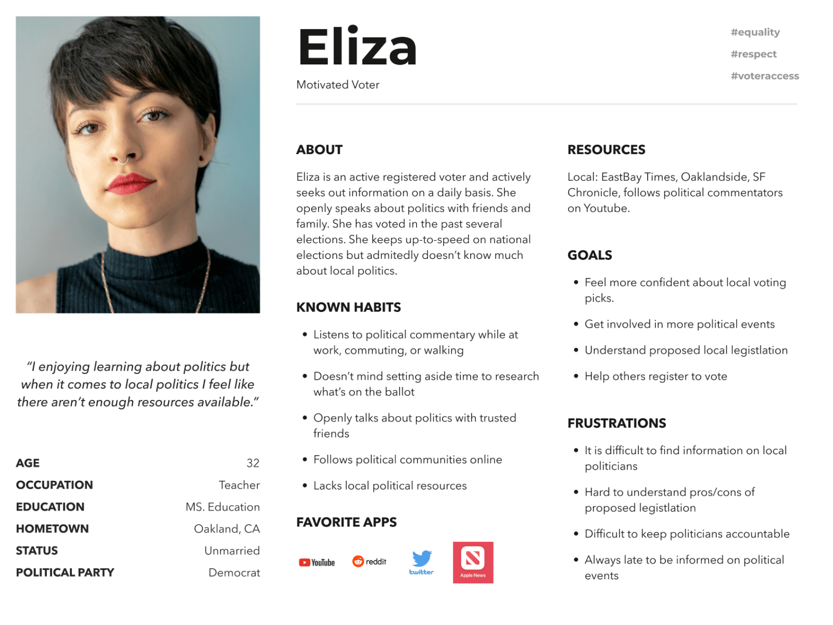
Eliza is a registered voter who needs a tool to help her learn about local politics because she wants to be able to vote informed and confidently.
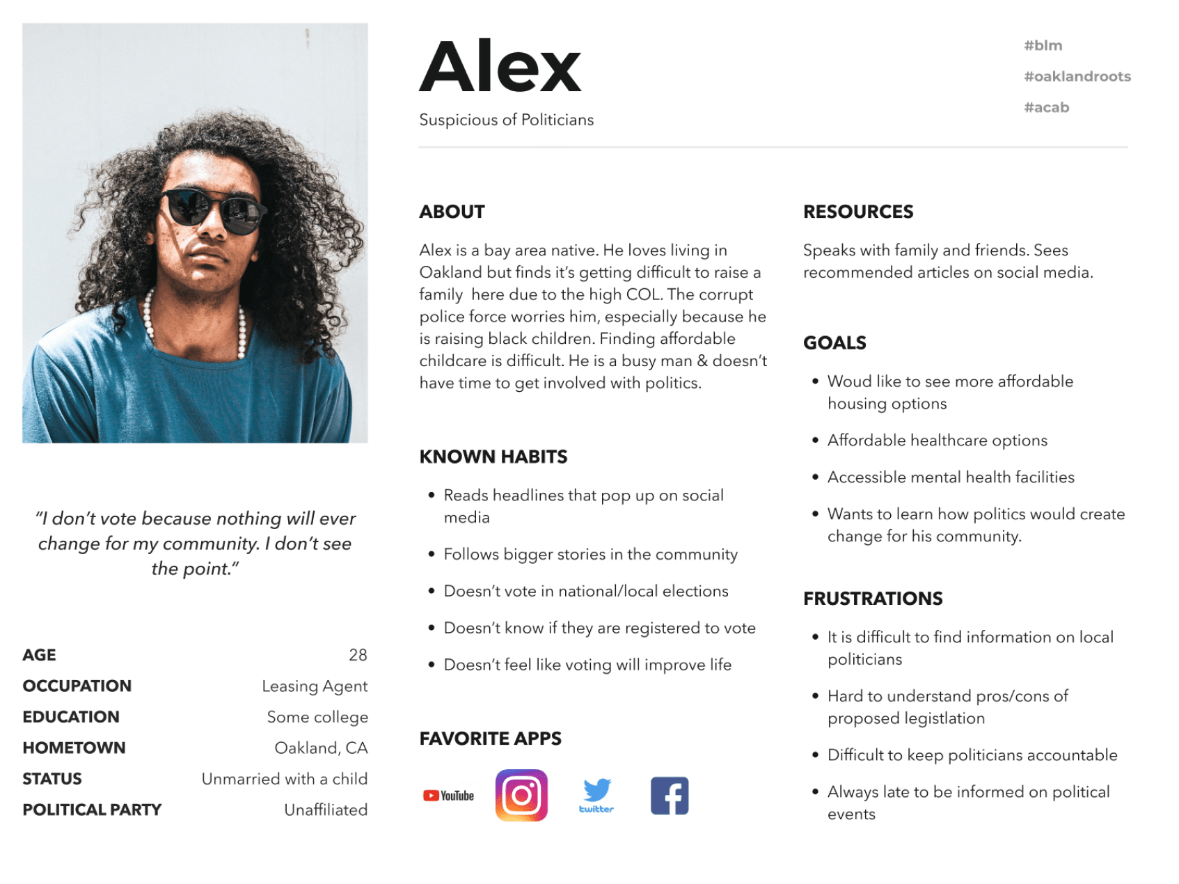
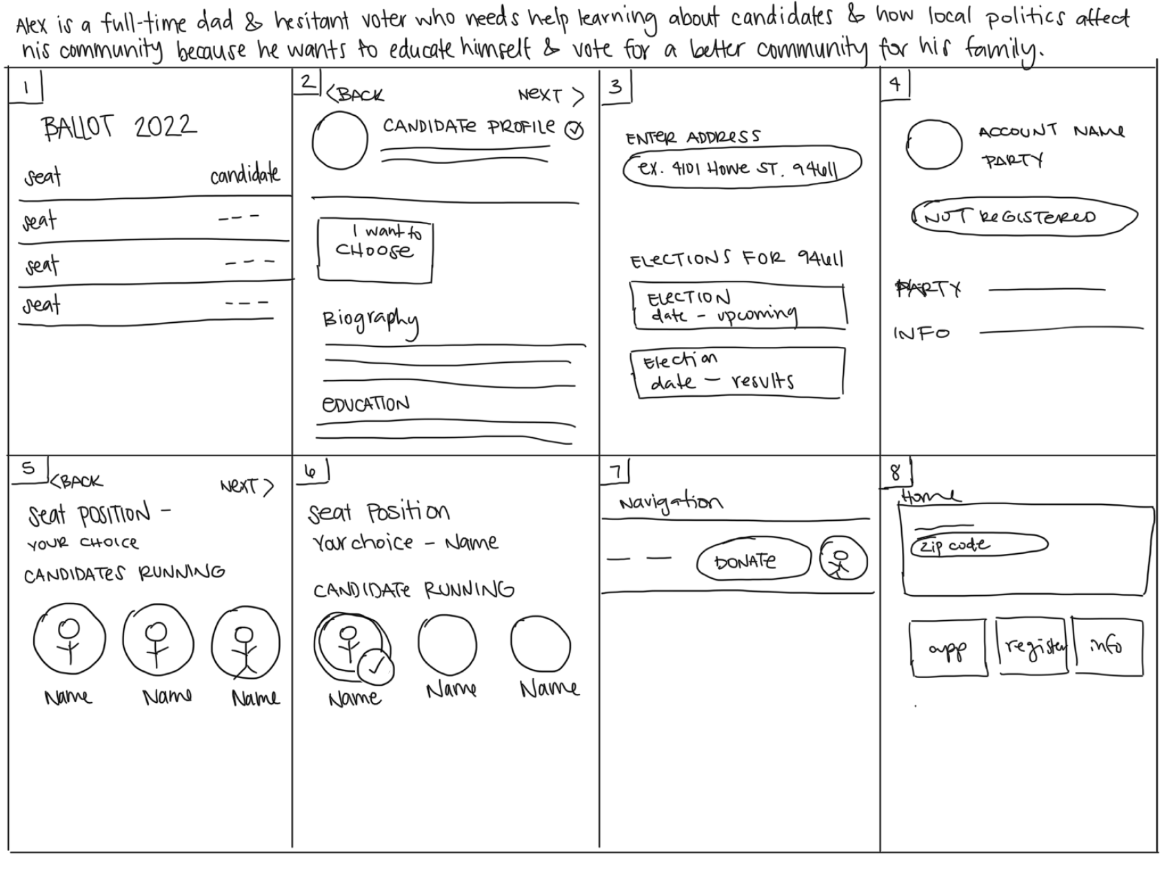
Alex is a busy, employed, full-time dad and hesitant voter who needs help learning about candidates and how local politics affect his community because he wants to educate himself and vote for a better world for his family.
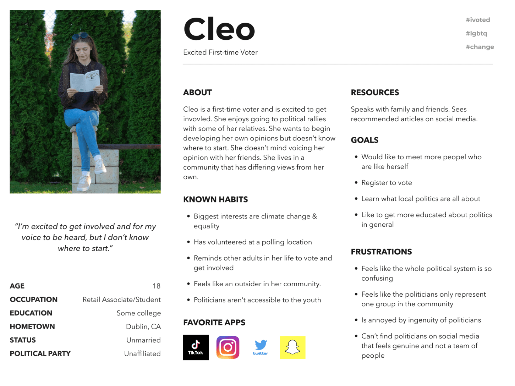
Cleo is a first-time voter and student who needs a tool to help her learn about local politics and events because she wants to vote confidently and get involved in the community.
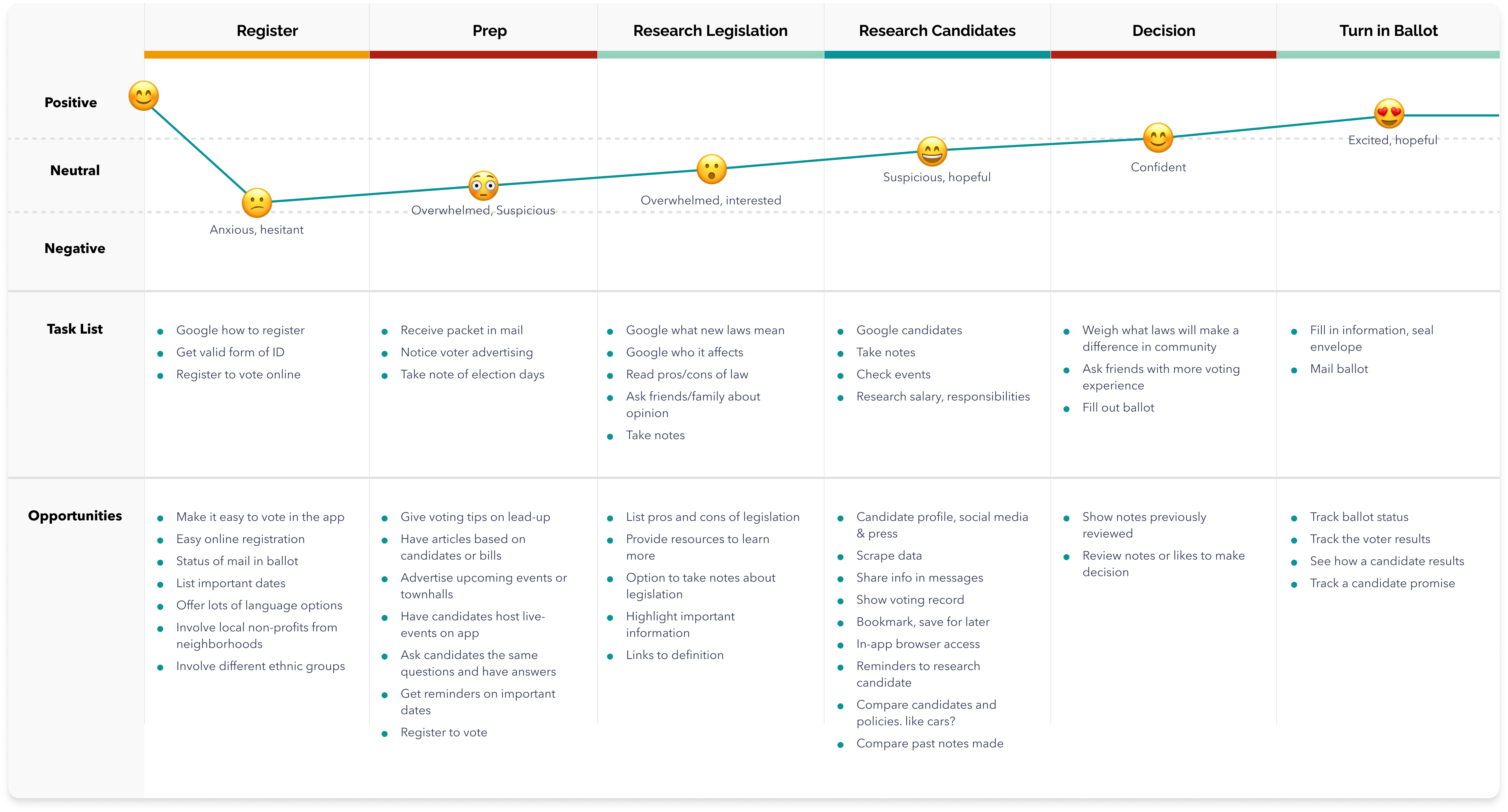
Journey Map
User Journey map revealed a lot of oppourtunties to engage users and improve their experience. Through interviews and white paper research we were able to see how we wanted users to navigate through our site. Major features included the ability to register to vote and fill out their local ballot while researching candidates.
Ideation
Ideation exercises helped to quickly identify methods we could use to address gaps identified in the competitive audit. My focus was specifically on helping elegible voters fill out their ballots and register to vote.
Design
The design went through several iterations to meet user’s needs discovered through usability tests. User testing and interviews identified the onboarding and the ballot fill-out process as the most valuable to the users.
The onboarding process to the app needed to be improved to encourage users to register to vote. The process for users to create their own ballot choices for the current election needed to be made the main focal point of the app.
WireframesUsability studiesIterationsApp hi-fidelity prototypesWeb hi-fidelity prototypes
Sketching for efficient flows and visualizations
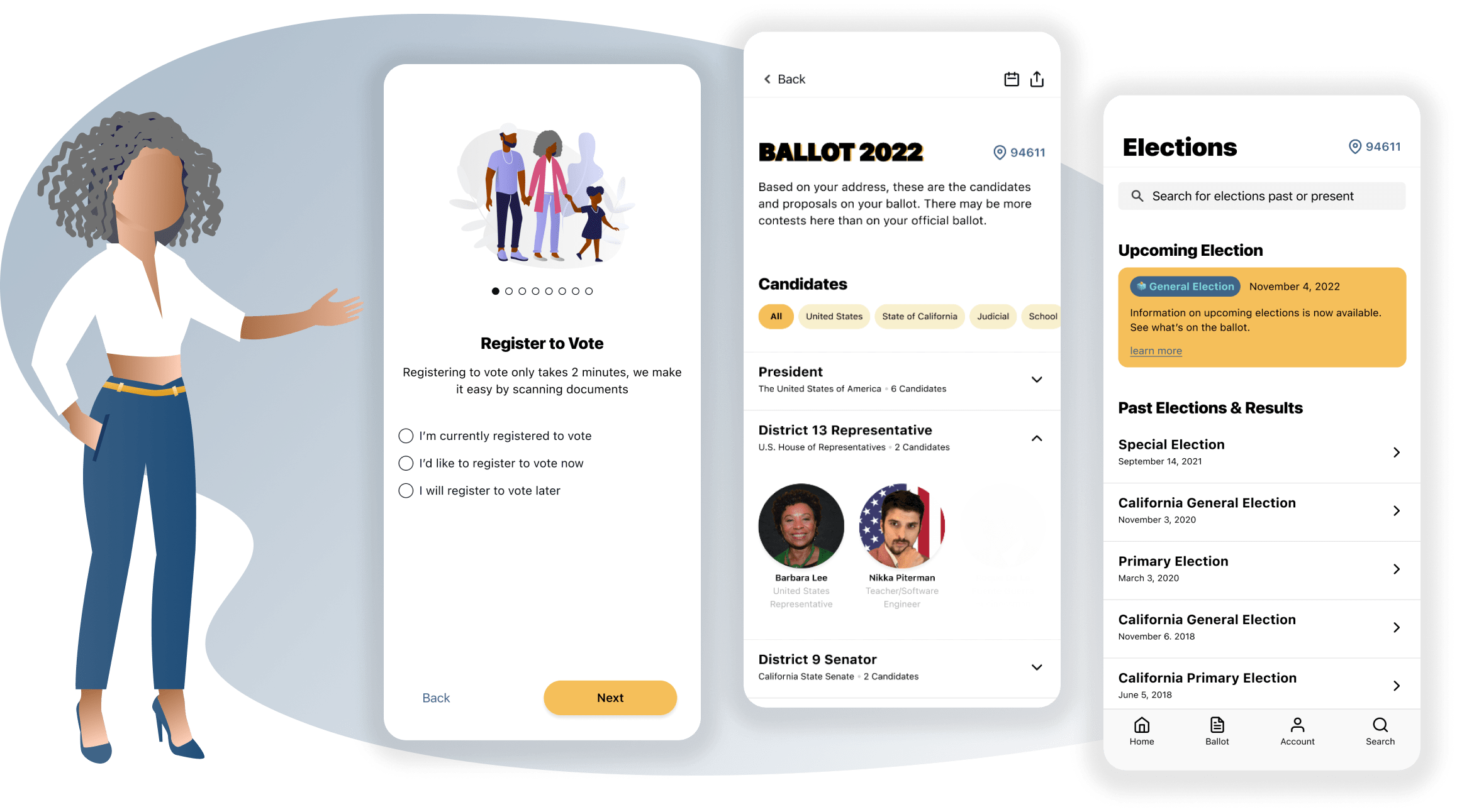
After ideating and drafting paper wireframes, I created the initial digital designs for the Vote Oakland app. These designs focused on delivering personalized guidance to users filling out a ballot for their local election.
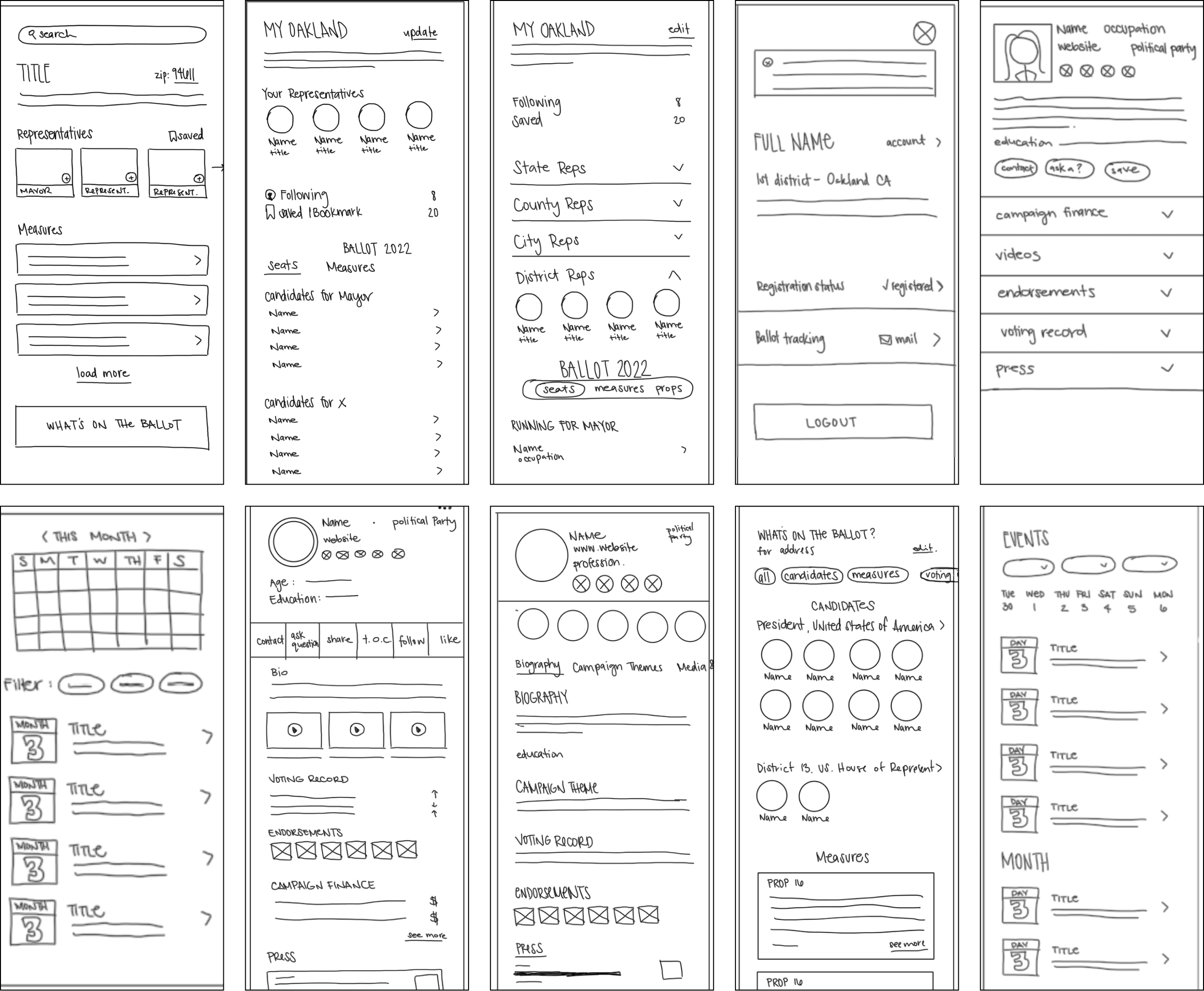
Digital Wireframes & Flows
Paper wireframes helped to guide flows, layouts and features needed to create a site that helped voters compare policies and candidates. Based on various feedback from peers, I continually iterated my design over the span of 8 weeks- with 3 major improvements: flow clarity and organization, interaction feedback and voter registration.
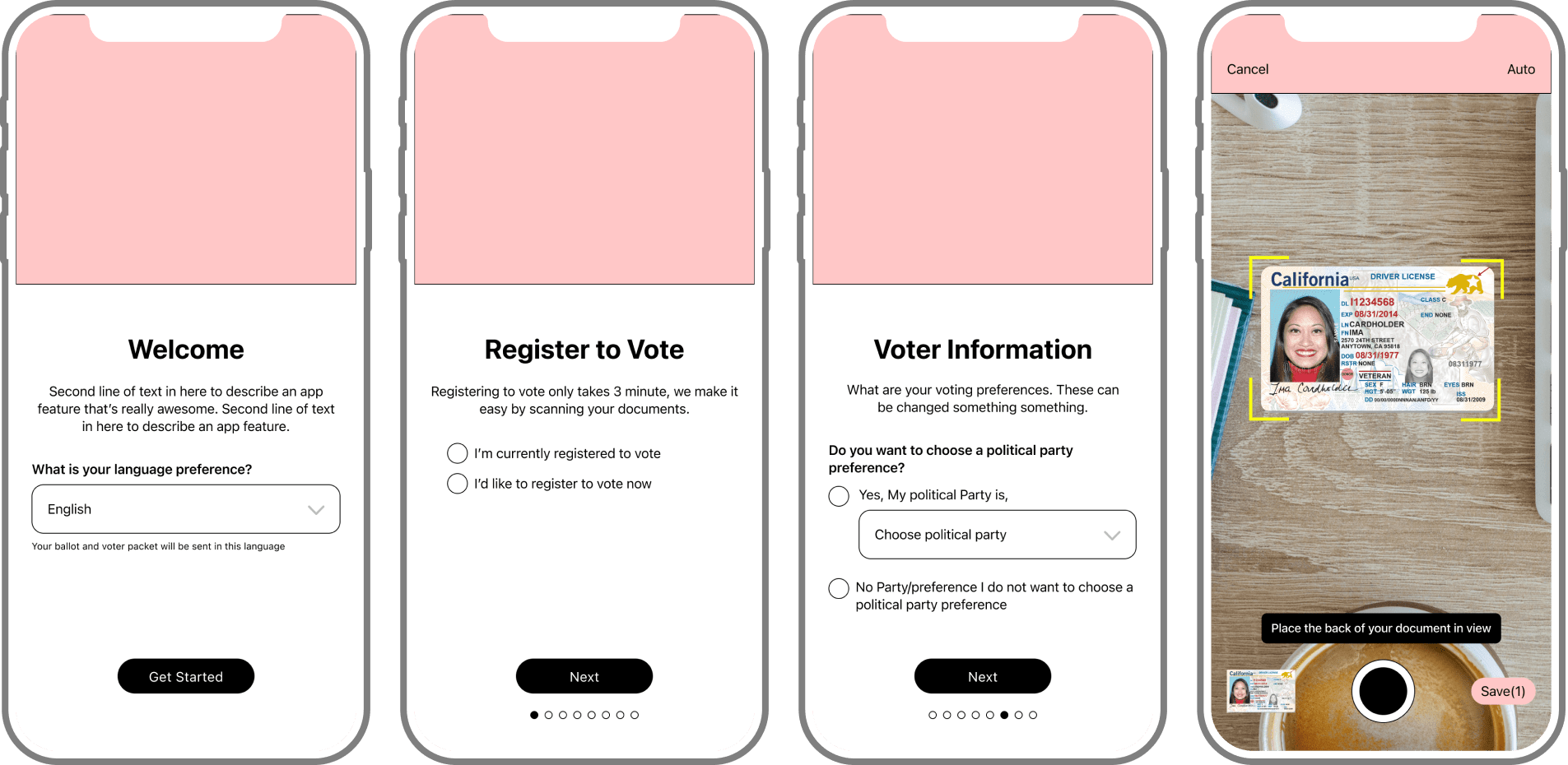
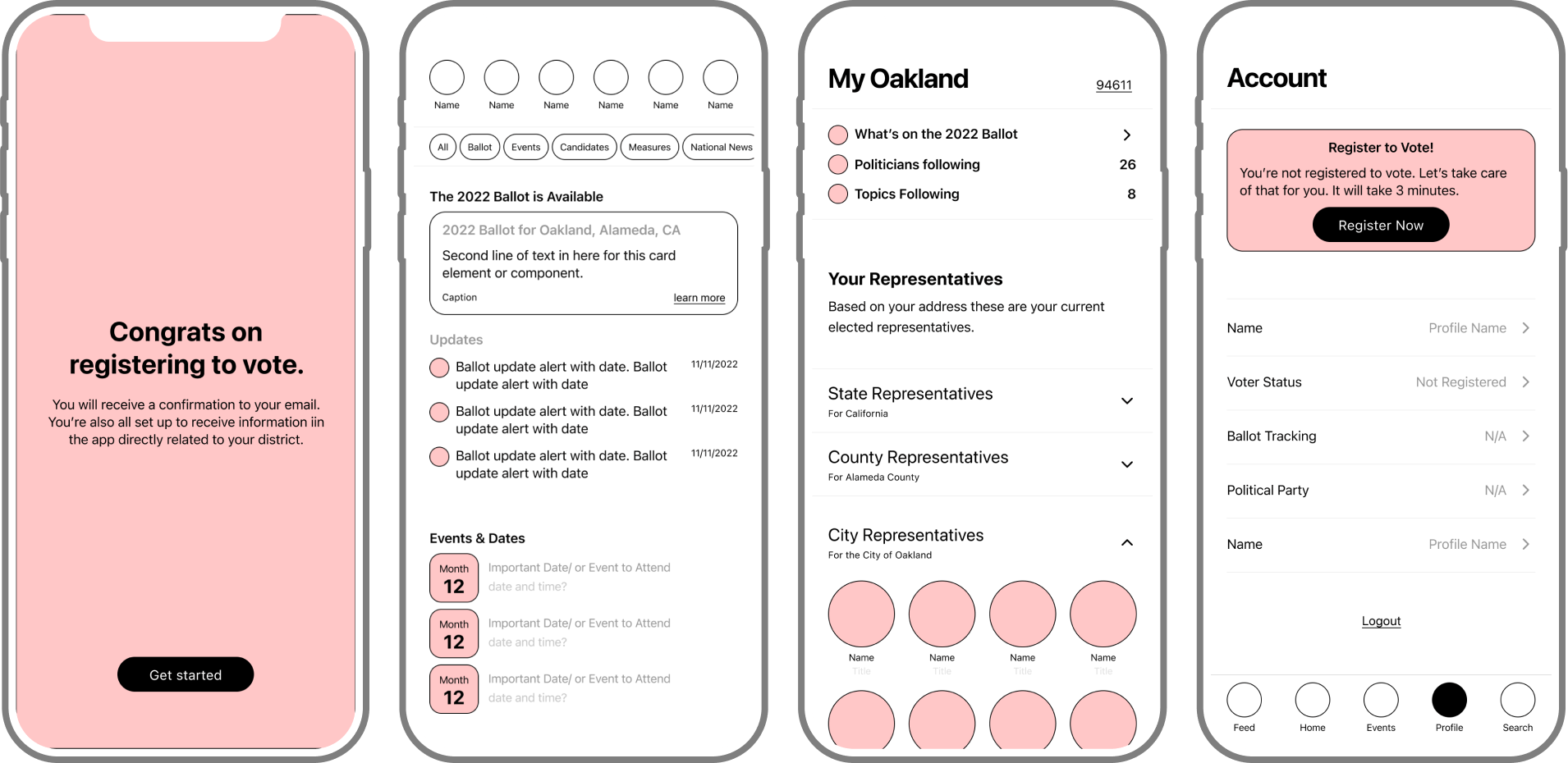
Including a registration to vote flow in the onboarding process increased voter registration without costing the user time or trust.
1
Didn't register
Simplify the number of filters and improvements to geometry specific filters2
Confusing navigation
Navigation titles and flows benefitted from simplication3
Ballot choices
Confusing to keep track of politicians while making ballot choices4
Unclear objectives
Citizens don’t feel their voices are heard or there is a lack of feedback from politicians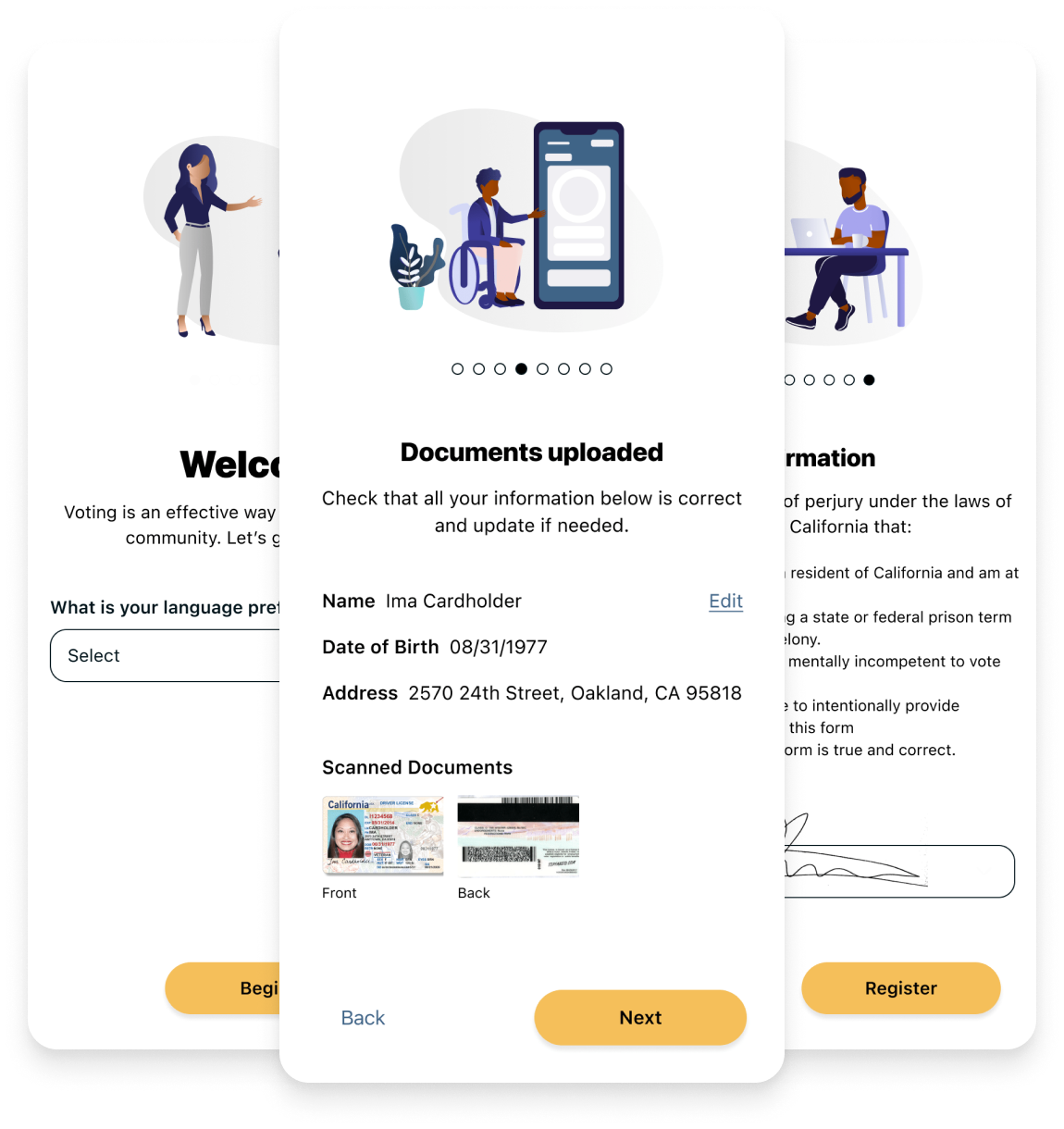
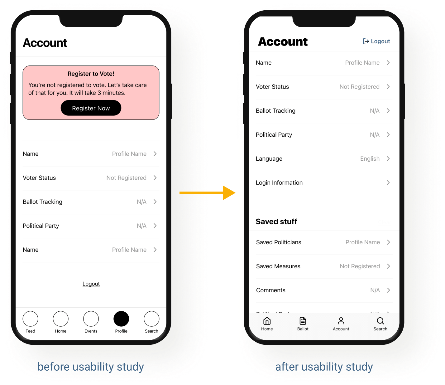
Simplifying the navigation
Simplifying the navigation - Users needed to navigate throughout the app more easily. We improved this by simplifying the navigation tabs and adding more descriptive headers in the account page.
Prototype v1Language
Oakland is very diverse with 40% of homes speaking a language other than English (*Census Bureau). Offering the app in multiple languages was a must.
Downloadable Content
18% of homes are without internet access. We need to allow content to be downloaded when connected.
Annotations
When handing off designs to the engineering team I have included annotations about component role, accessibility label, and how screen readers interact with the component and page
Inclusivity
It is important that illustrations and images used are inclusive and representative of Oakland demographics.
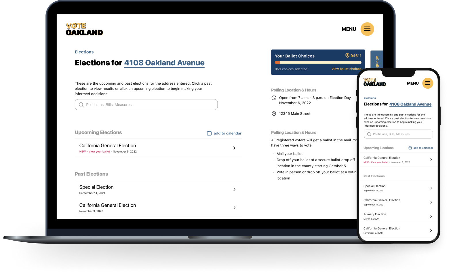
A website to support the app
The purpose of the app was to aid users in staying abreast of currently politics and staying connected to politicians. The website helped users fill out their ballot and helped them sign up to the app.
Home screen offers a clear call to action
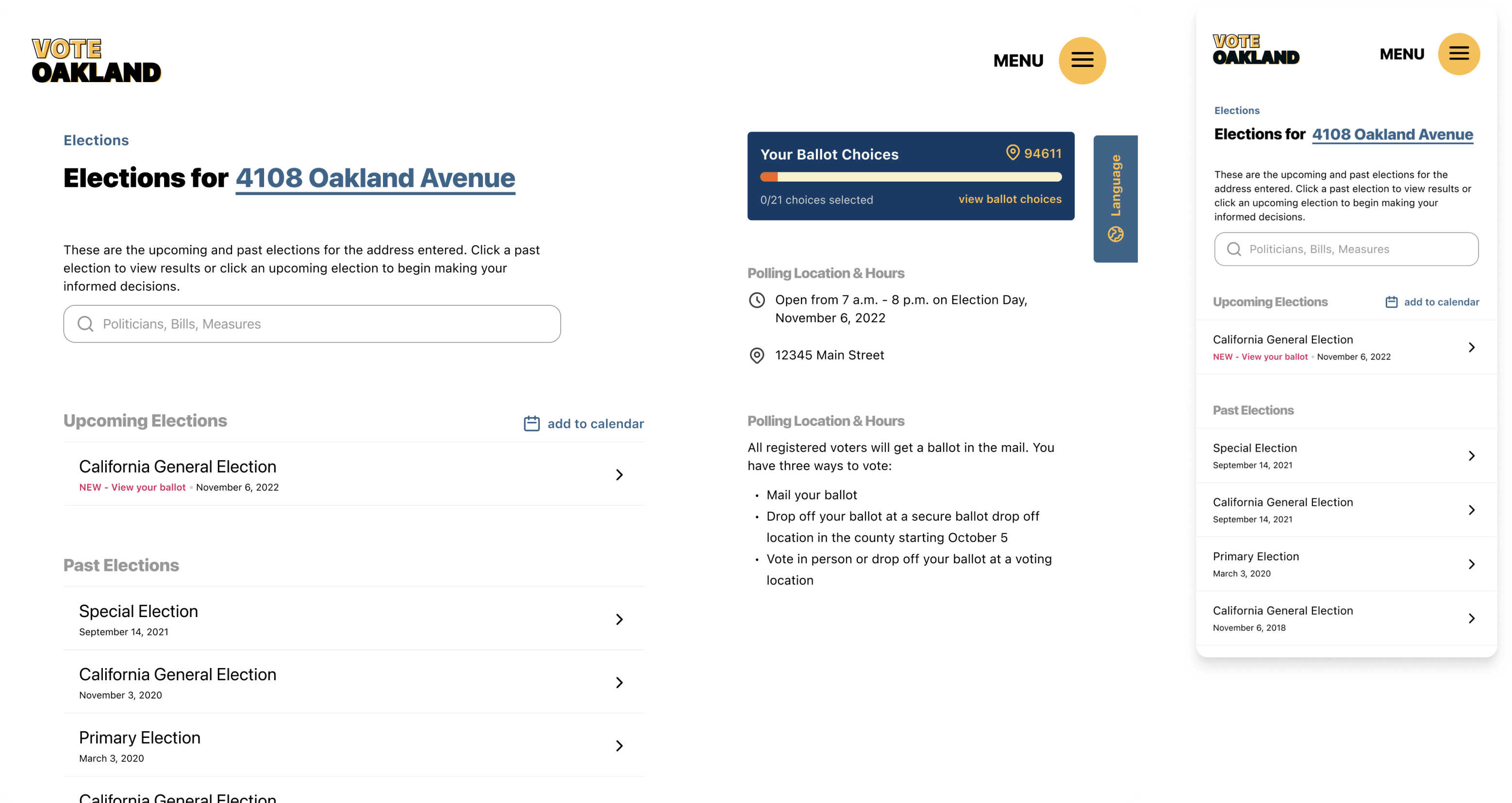
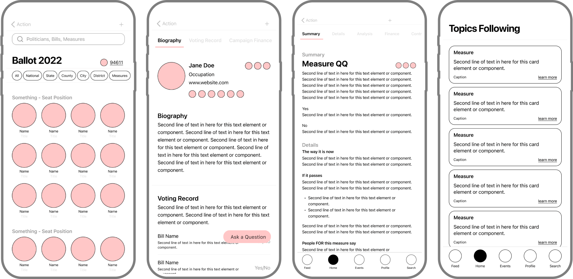
Election search page gives users the ability to look up politicians or measures by election
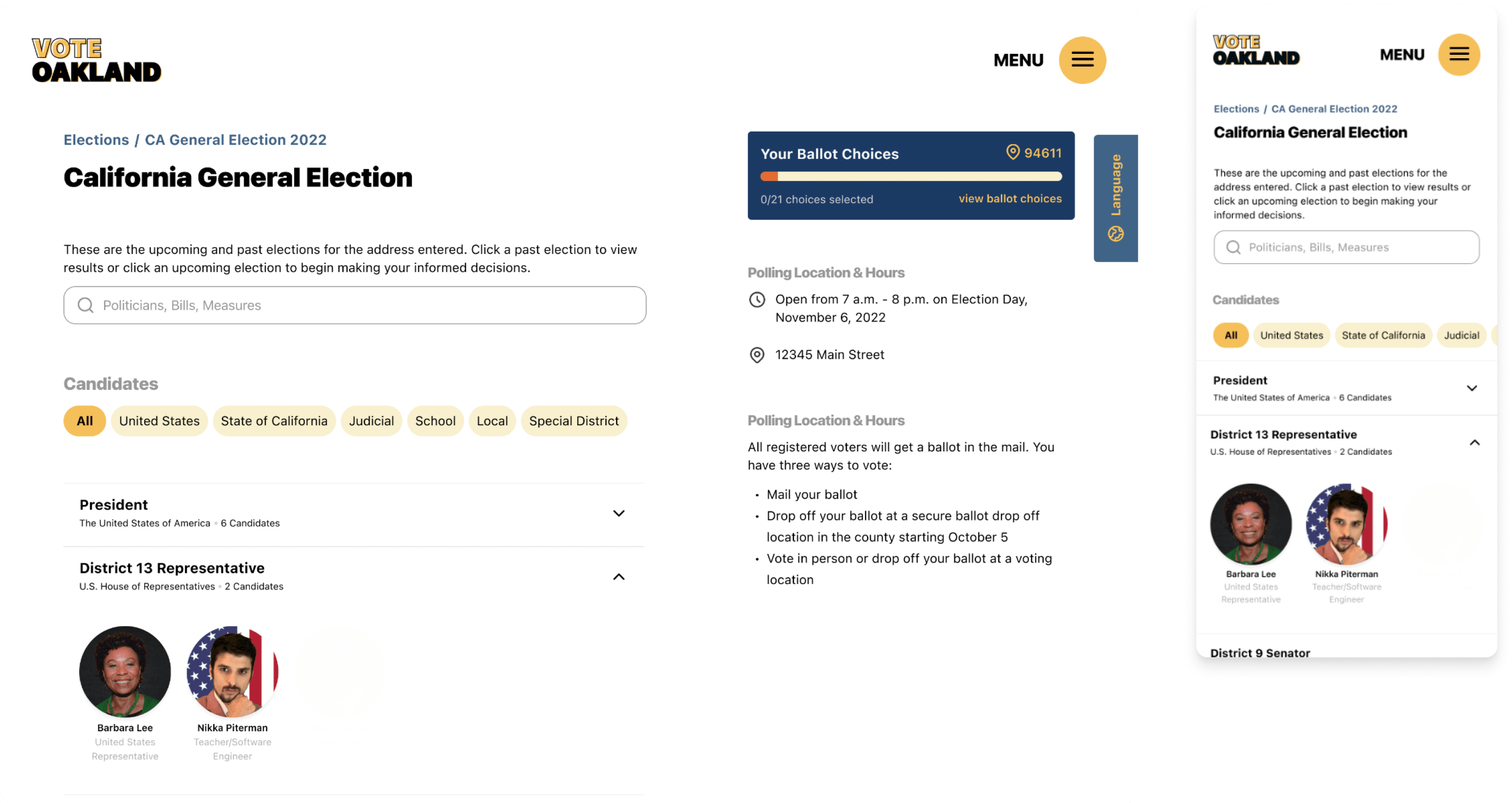
Election detail page allows user to see everything that is on their next ballot
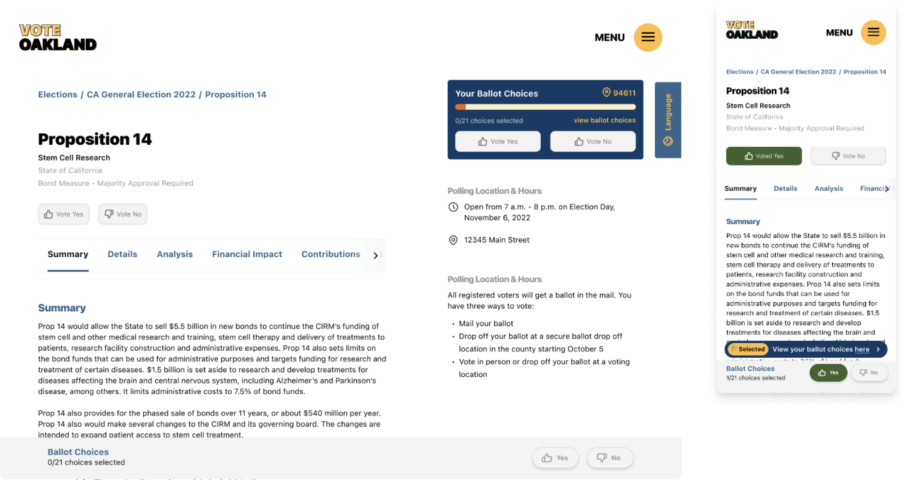
Measure and prop page has all details for that specific measure
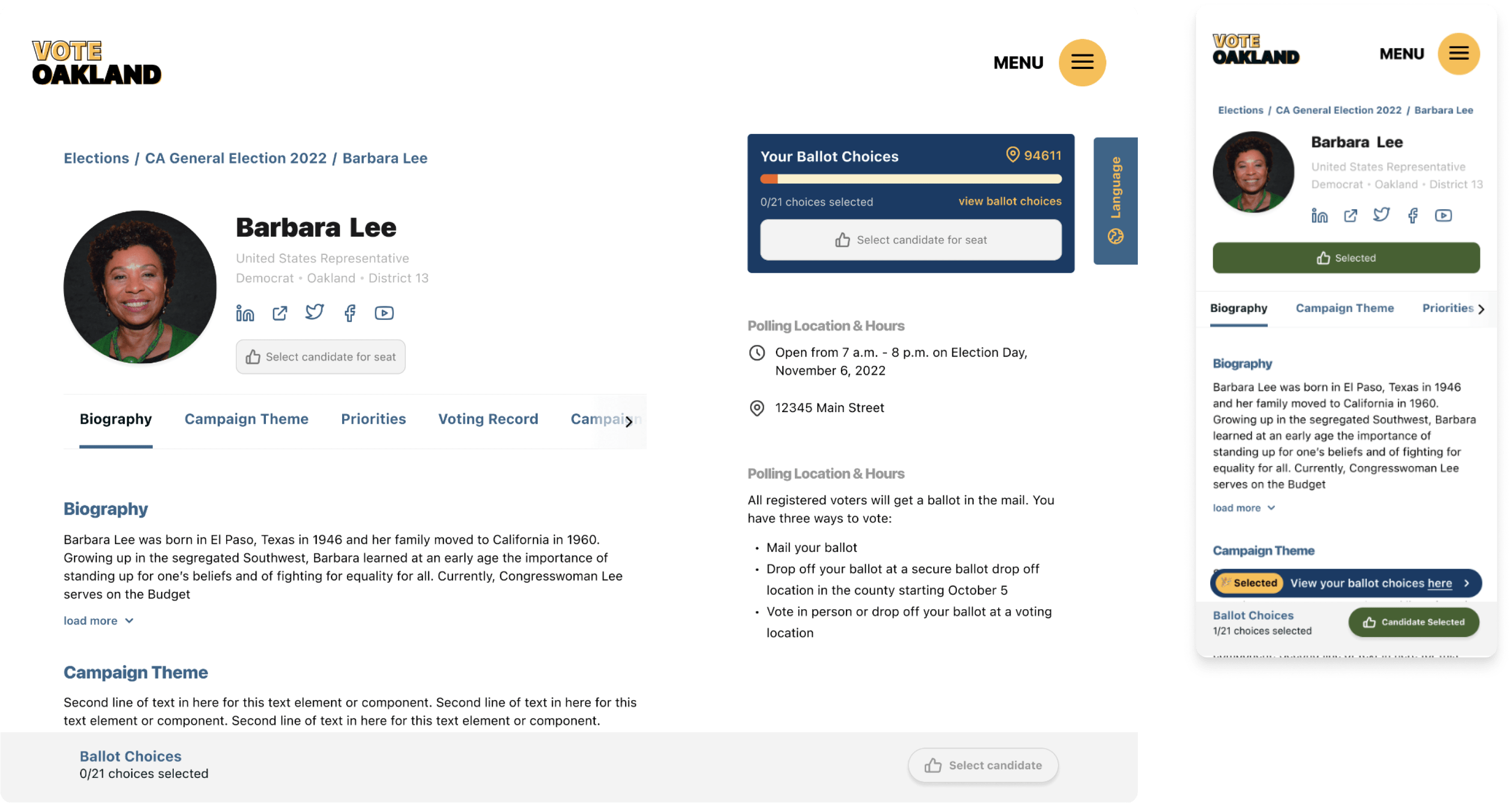
Candidate page with resources detailing the candidates position, past and campaign
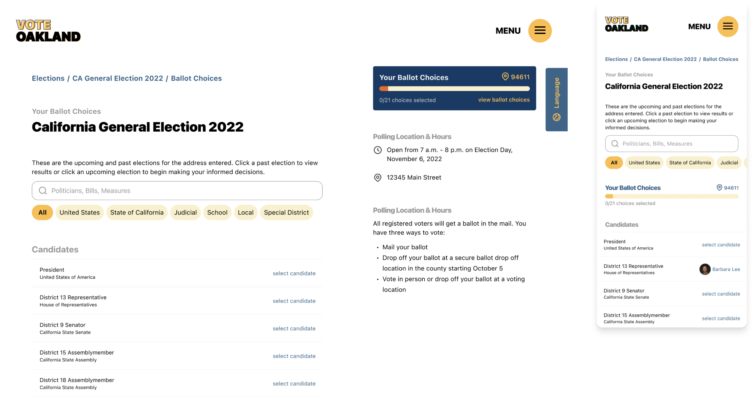
Ballot choice page lets users see who they've chosen for seat/ measure for quick fill out for their ballot
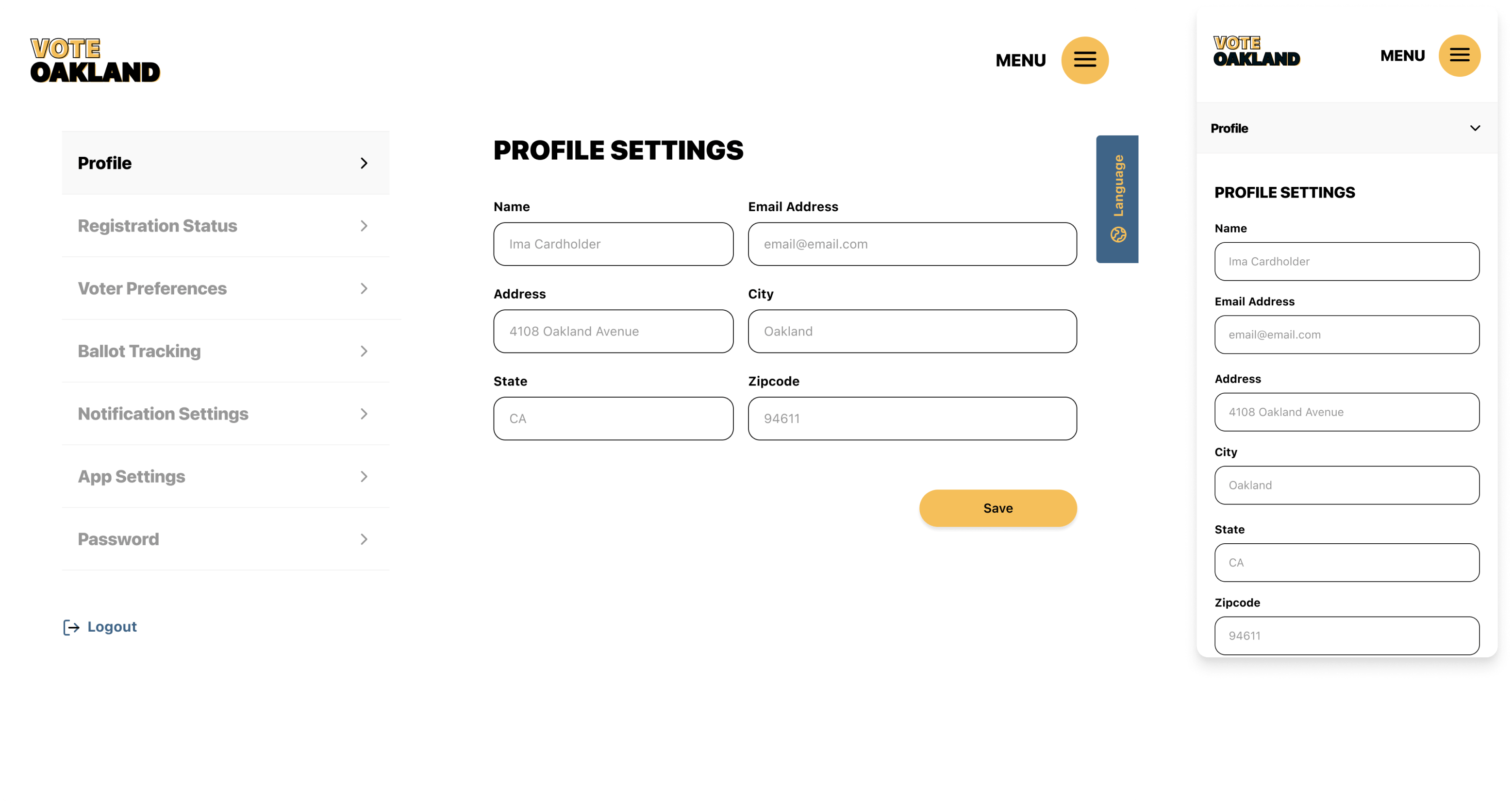
Profile settings page for desktop and mobile
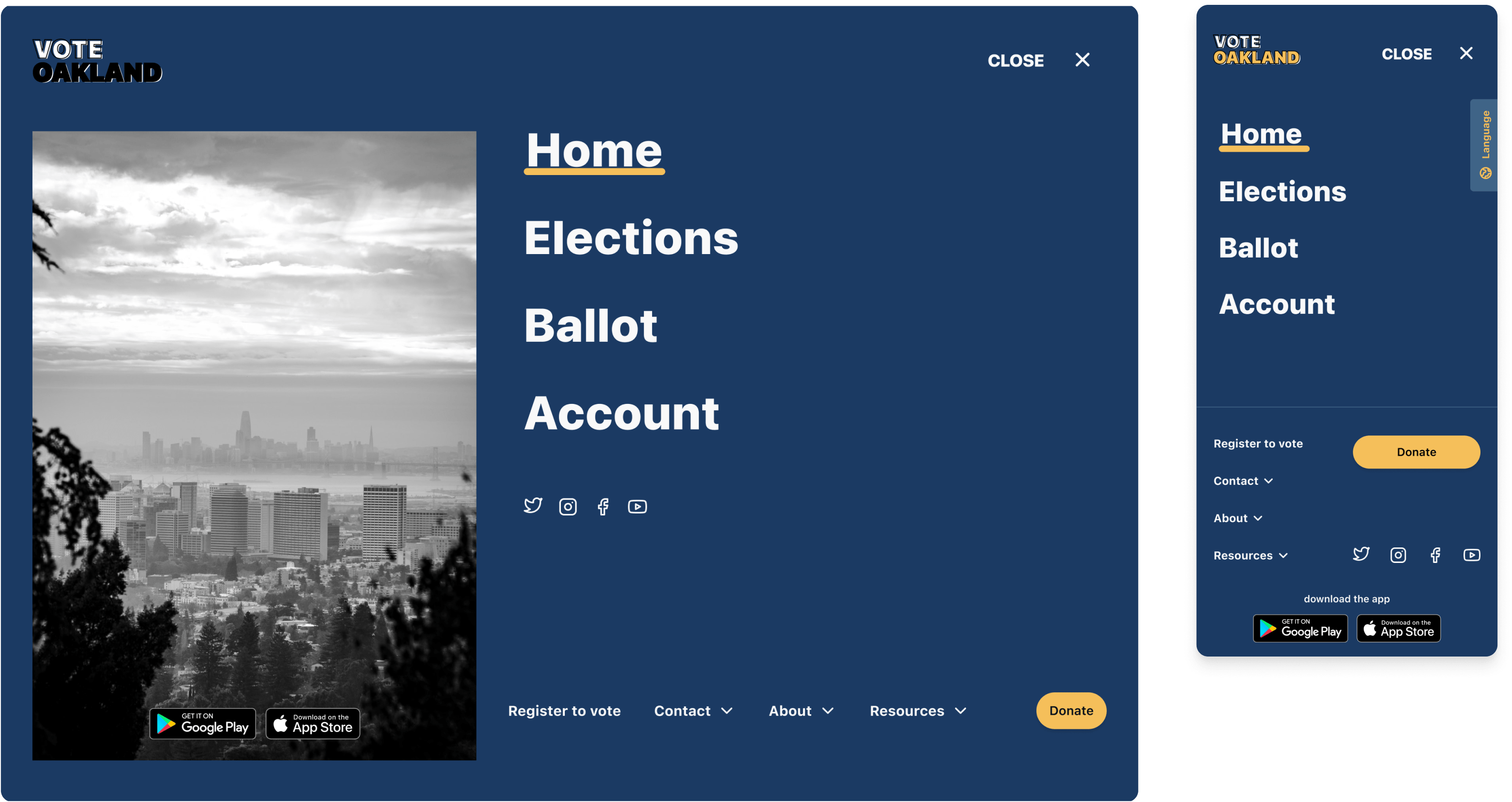
Menu for desktop and mobile
Optimized
The designs for screen size variation included mobile, tablet and desktop. I optimized the designs to fit specific user needs.
Ballot Building
Website was centered around helping users build their personal ballot and less on connecting with politicians.
SEO
Copy is optimized to take advantage of SEO practices to put the site on the top of search rankings.
iA
Our goal here was to make strategic information architecture decisions that would improve overall website navigation.
Takeaways
Impact
Users shared that the app made it more simple to find out more information about candidates running for local office. Through the app they felt they could find information on candidates more easily. They felt it was more transparent and liked the idea of filling out their ballot.
What I learned
My biggest takeaway was that users value transparency and ease-of-use. Micro-interactions were hugely important in the success of the design and helped users navigate throughout the selection process with ease.
Next Steps:
1
Usability Testing
Conduct follow-up usability testing on the new website. 2
Collaborate
Collaborate with engineer on accessibility features and hand-off3
Iterate
Ideate any additional areas of need and ideate on new features. 4
Audit
Refinements on inconsistencies in existing prototypes.5
Features
Release of new features that will cater to newer users.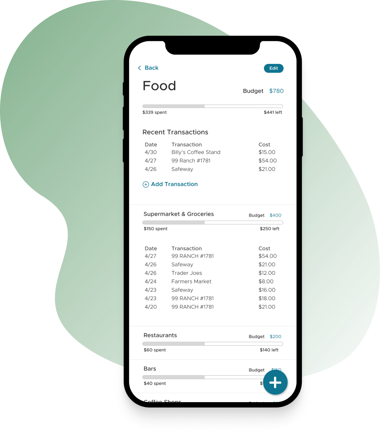
Previous Case StudyThe Budget App.A webapp that allows couples to harmoniously track expenses and create budgets together. It categorizes expenses and helps track where money goes every month.
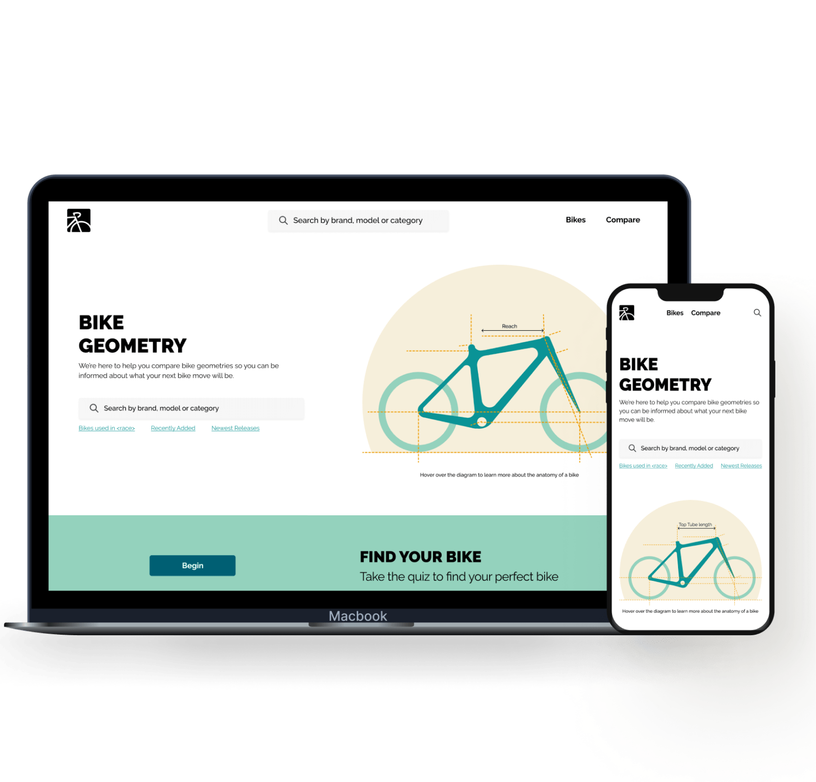
Next Case StudyBYKE NERD.A comparison tool for bike enthusiasts who need help analyzing the details and intricacies of bike specs.
Designing out of
San Diego, California.
San Diego, California.
I'm always open to hearing about new project ideas and possibilities for collaboration. If you have an idea that you'd like to bring to life or if you're in need of a passionate product designer to be part of your team, I'd love to have a conversation.
hello@sydneytong.com
510.338.7860©2024 sydney tong. All rights reserved.