sydney tong.
A comparison tool for bike enthusiasts who need help analyzing the details and intricacies of bike specs. With Bike Nerd users can more easily find a bike with a geometry that fits their needs.
My Role
Research, Design, PrototypeTimeline
Aug `21 - Oct `22Platform
WebsiteTools
Figma, UseberryOverview
Byke Nerd is a bicycle geometry comparison website that assists cyclists comparing bike geometries across different brands. It is a database of bicycles that help users search for a bicycle that fits their needs and riding style.
*I created these graphics
The Problem
Users searching for a bicycle needed a way to compare bicycles against one-another in one space to determine how a bicycle would ride.
The Goal
A bicycle database that contains bicycle geometries and allows users to compare sizes and geometries across brands against one-another.
An easier way to compare bicycles.
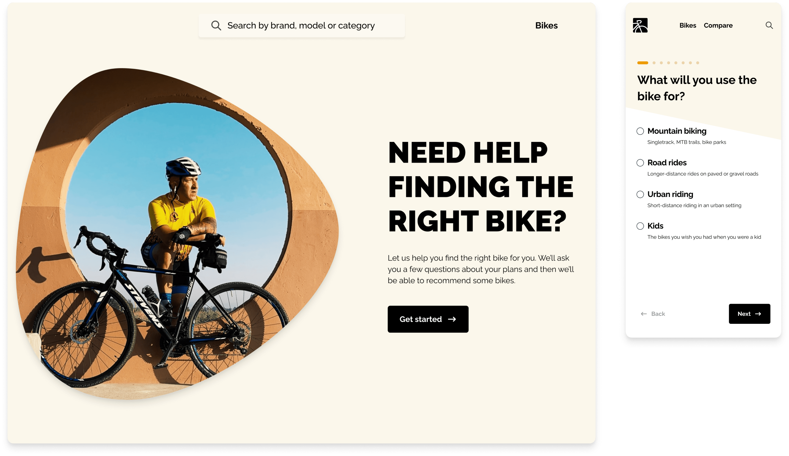
Design a responsive website that will improve the bike search and comparison process for bicycle enthusiasts looking for their next bike.
Search
Users need a website that helps them search quickly for a bicycle that fits their needs.
Website
A website that users can access no matter where they are searching for a bicycle.
Terminology
Bicycle terminology is confusing and can be intimidating to new users.
Compare
Users need a website that helps them compare bicyles and narrow their search options.
Research
We wanted to be very thorough during the research and discovery phase because we didn’t quite know what product and features we needed to create. It was important that we understood the users and the problems they were facing when purchasing a new bicycle.
Competitive Analysis + The GapUser InterviewsPersonasUser JourneyCrazy Eights - Ideation
Competitive Analysis + Finding the Gap
Competitive audits allowed us to see the importance bicycle brands place on geometry. Analysis of bike comparison sites we saw that we could find success in organized data, an easy-to-use UI, expansive bike data, terminolgy clarity, creating the best search user flow, and focus on accessibility.
99 Spokes

Geometry Geeks

Bike Geo
Bike Insights

Mad Scientist MTB

Interviews
User interviews were vital to see the thought process of cyclists when purchasing a new bicycle. It was interesting to see how experienced cyclists relied on their own knowledge and online resources, while intermediate and beginner cyclists tended to leverage the experience of their communities, salespeople or a trusted friend.
Their main hesitations and frustrations when purchasing a new bike revolved around time, resources, tracking and cost. Interviews helped us identify 3 different types of users.
Time
Finding bicycles with the right dimensions and comparing them is time consuming. Information
Information online is overwhelming and it’s hard to find one source of truth. Some aspects of cycling are fairly new/trendy. Components
It is difficult to find components with the right dimensions that are affordable. Difficult
Comparing different bike brands on different websites against one-another is a pain for users. Example: clicking back and forth between pages. Personas based on interviews
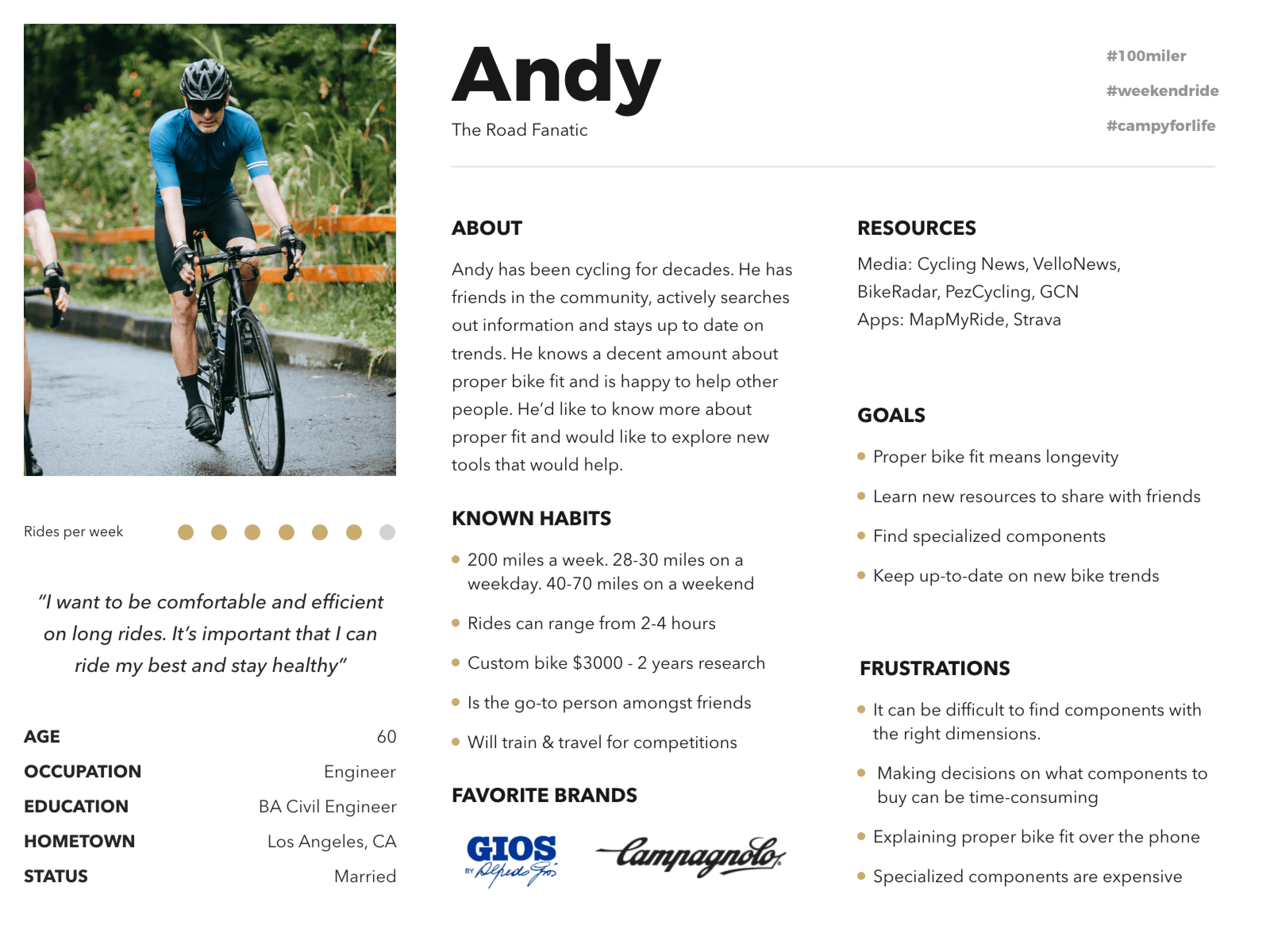
Andy is an avid cyclist who needs a tool to help him find a bicycle with the proper geometry and dimensions because he wants to compare new bicycle models to find his next bicycle.
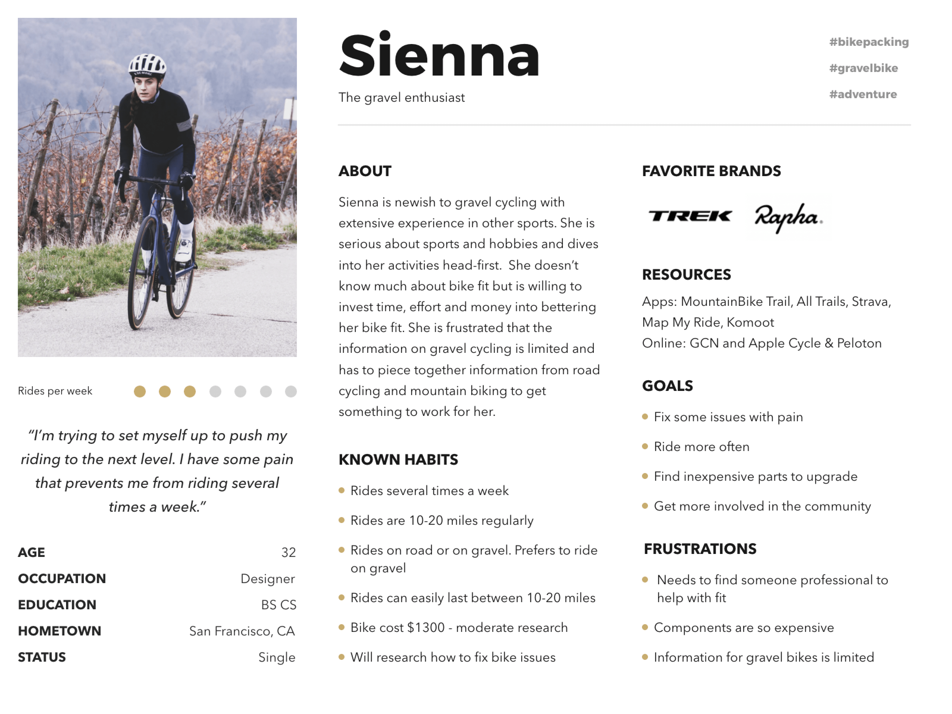
Sienna is an experienced gravel cyclist who needs help assistance modifying her bike fit and geometry where she can because she wants to improve her riding & comfort.
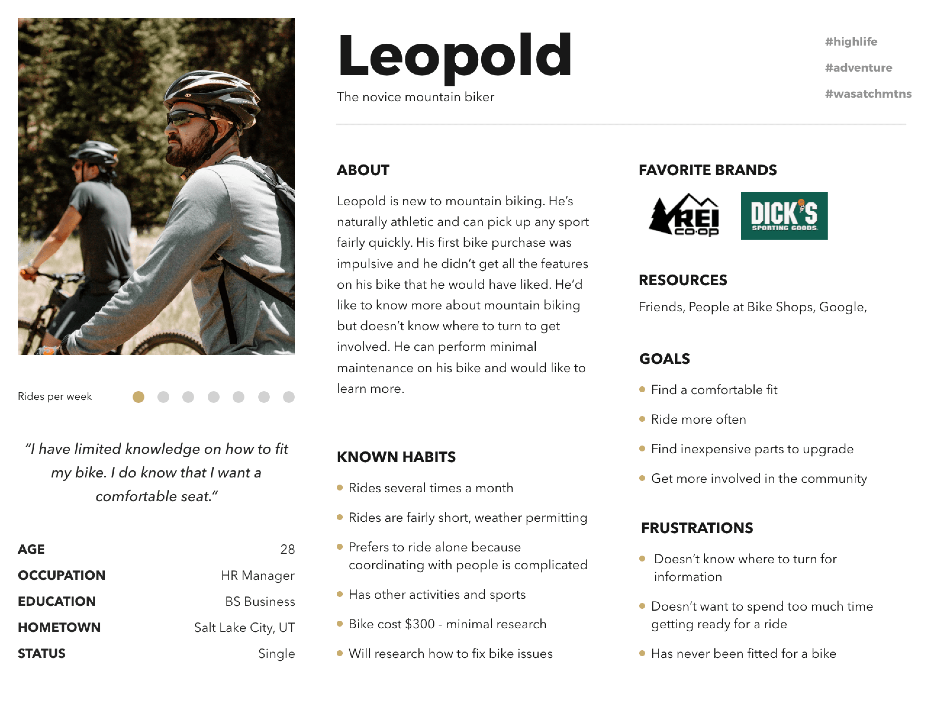
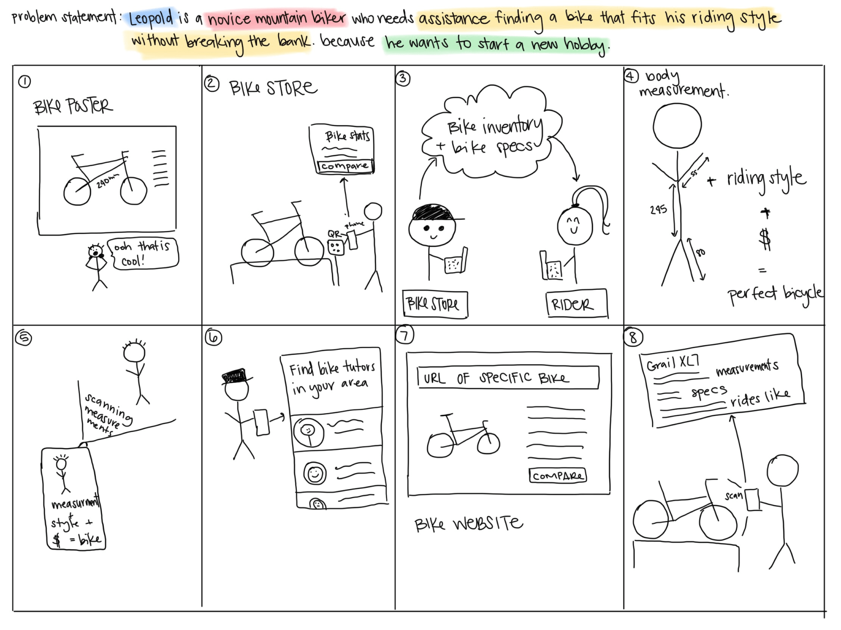
Leopold is a novice mountain biker who needs assistance finding a mountain bike with a good fit that won’t break the bank because he wants to start a new hobby and ride in the mountains near his home.
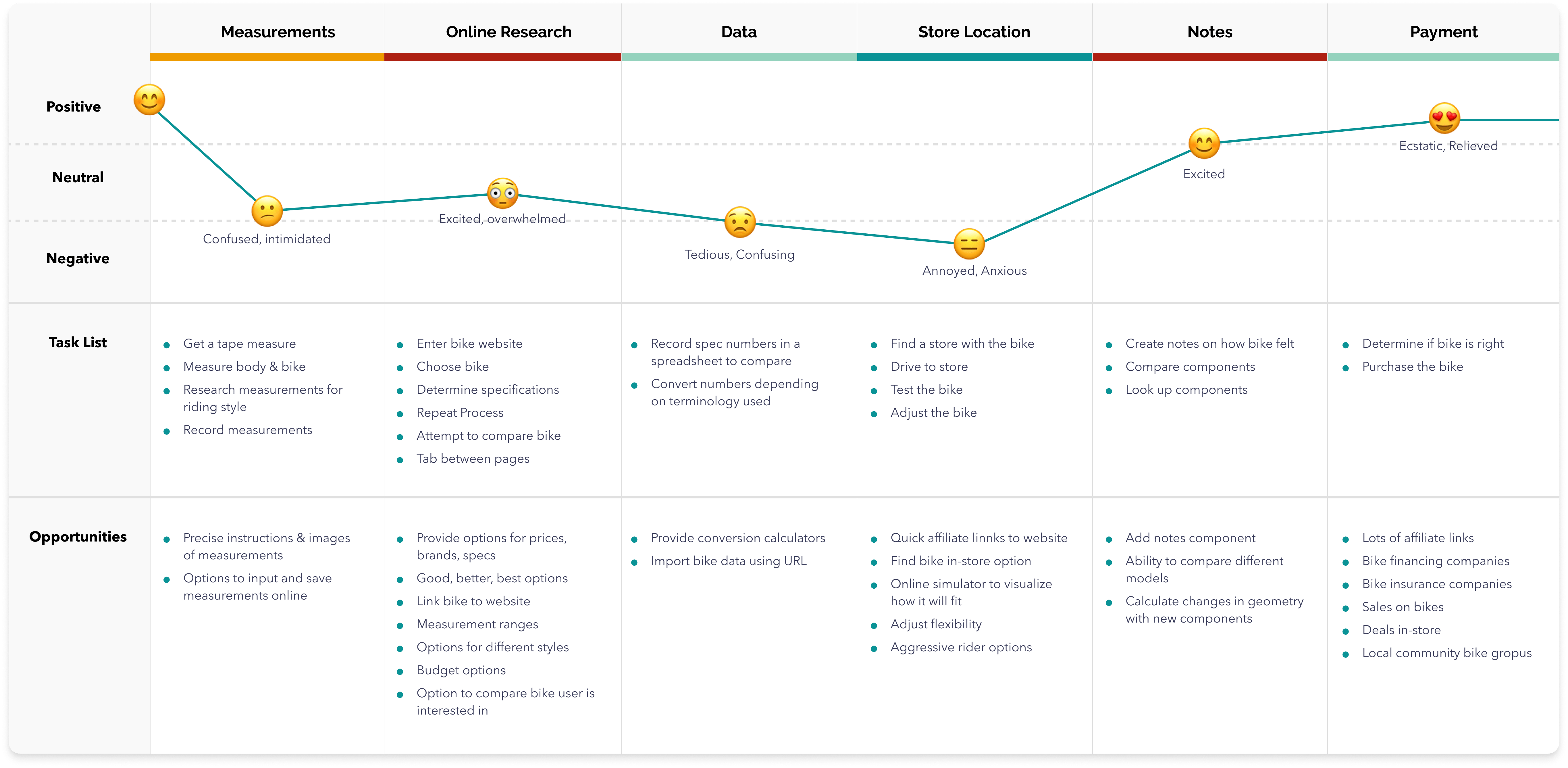
User Journey Map
User Journey map revealed a lot of oppourtunties to engage users and improve their experience. Through interviews and white paper research we were able to see how we wanted users to navigate through our site. Major features included the ability to refresh terminology throughout the site and also add bikes to the comparison page.
Ideation
Ideation exercises helped to quickly identify methods we could use to address gaps identified in the competitive audit. My focus was specifically on helping cyclists compare bike geometries while shopping.
Design
Paper wireframes were crucial in quickly drafting the user flow for the website. I created the initial designs for the Byke Nerd website. Designs focused on optimizing the bike search and flow experience for users.
Users needed a way to search the site on a variety of devices. I started to work on designs for additional screen sizes to make sure the site would be fully responsive. My goal was to make sure the search could switch effortlessly between desktop and mobile.
WireframesUsability StudiesIterationsHi-fidelity Prototypes
Sketching for efficient flows and visualizations
Digital Wireframes & Flows
Paper wireframes helped to guide flows, layouts and features needed to create a site that helped cyclists compare bicycle geometries. Based on various feedback from peers, I continually iterated my design with 3 major improvements: table clarity and organization, bike names and photos.
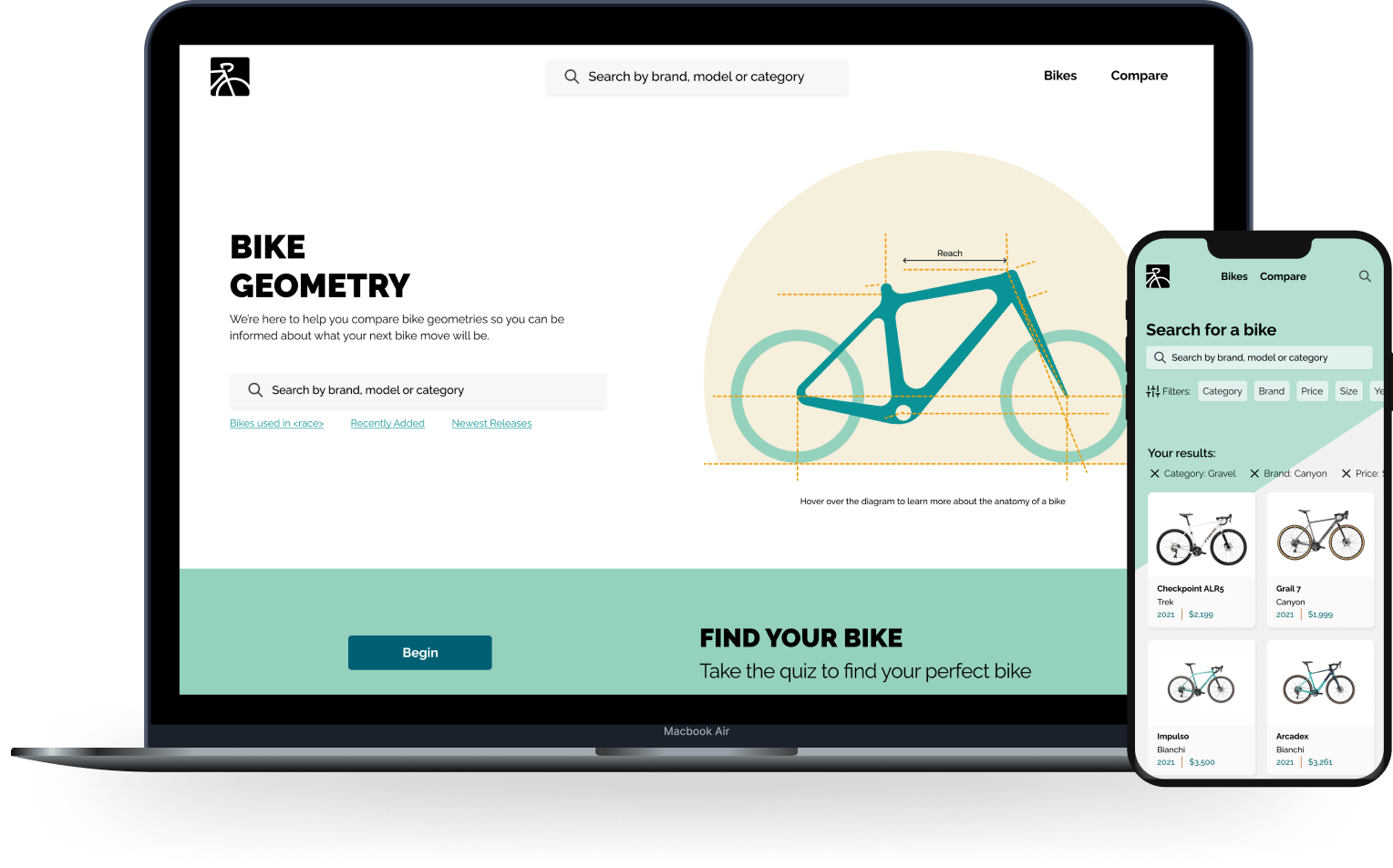
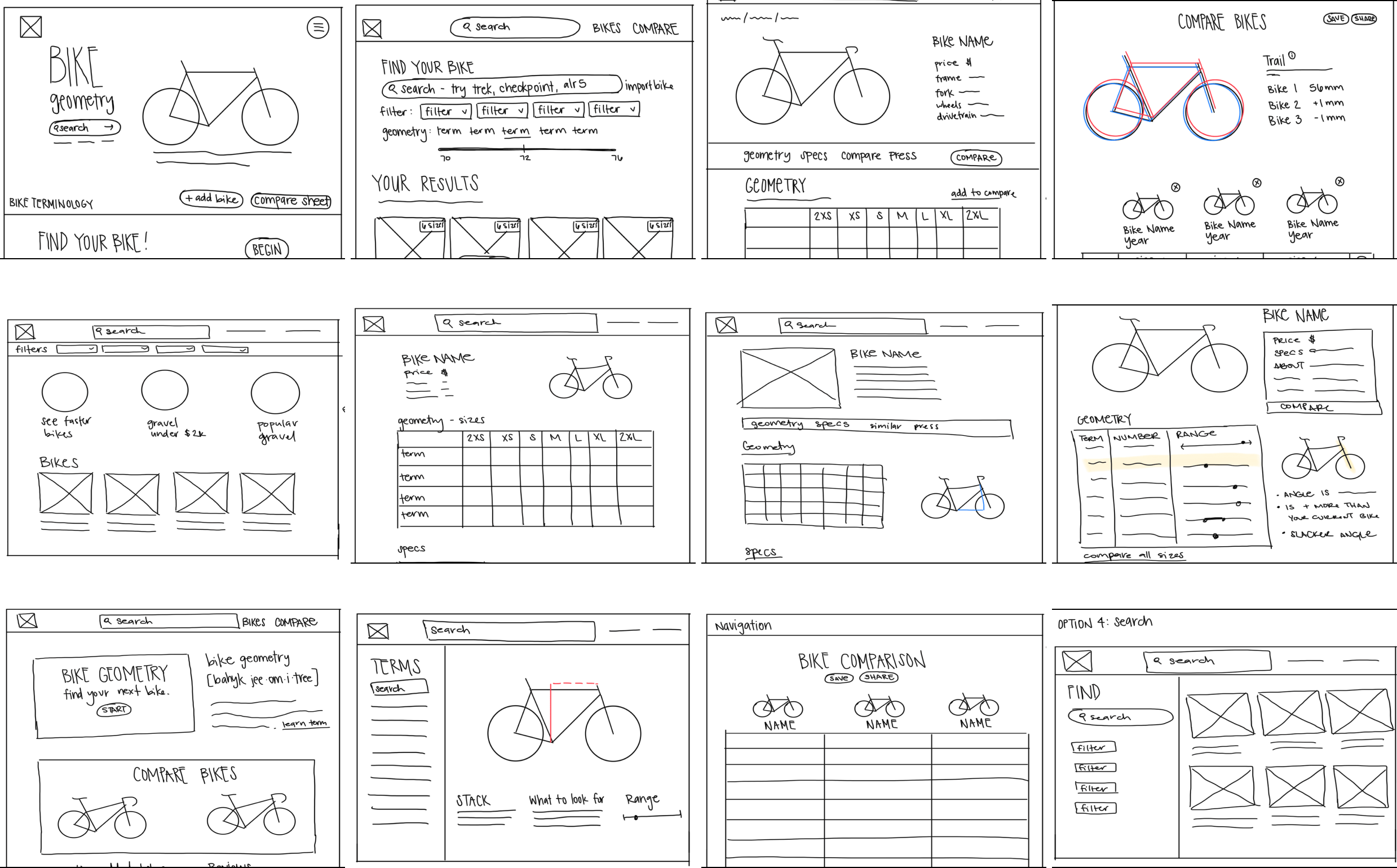
The home page has 4 entrance points to the search flow. The two in the navigation stay in place so the user always knows they can start a new search.
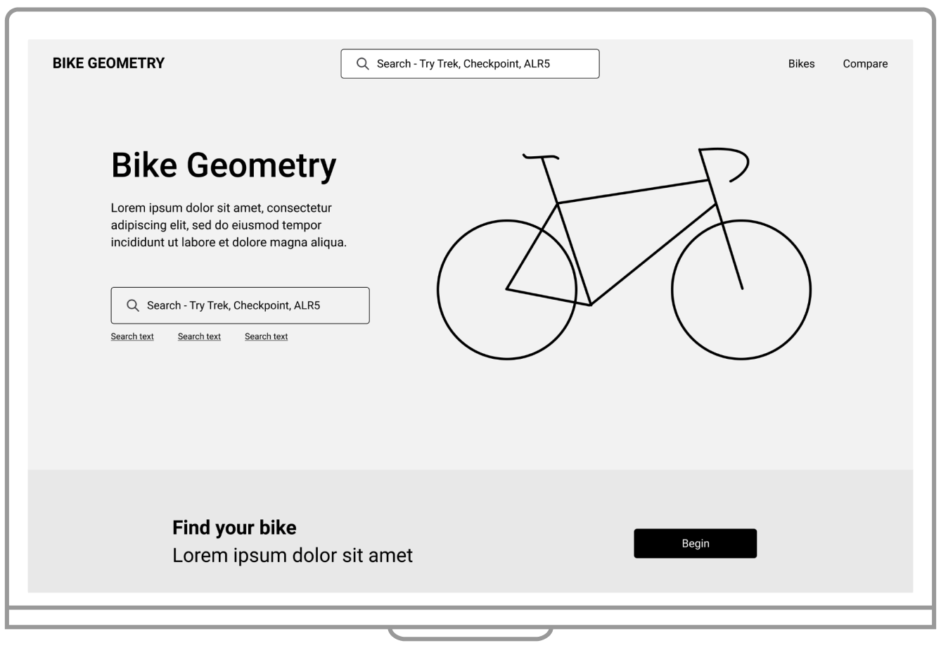
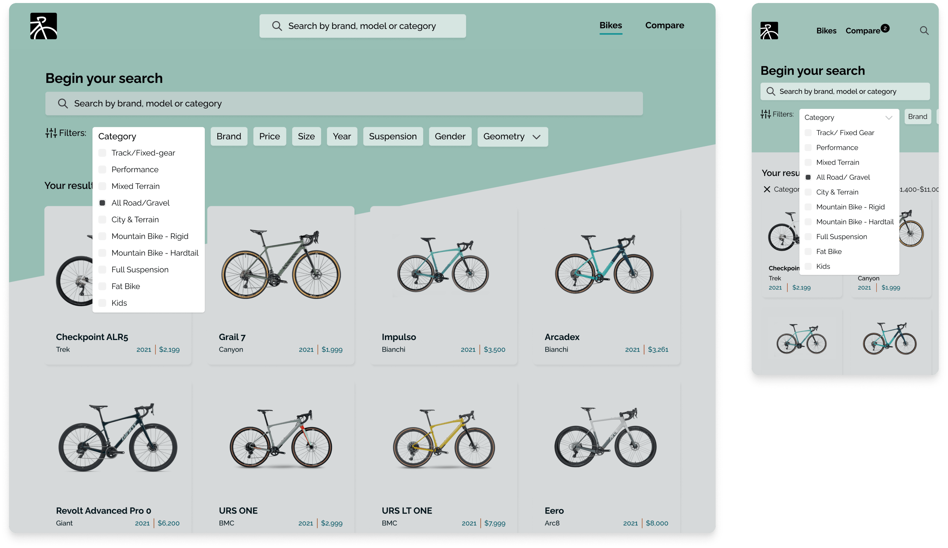
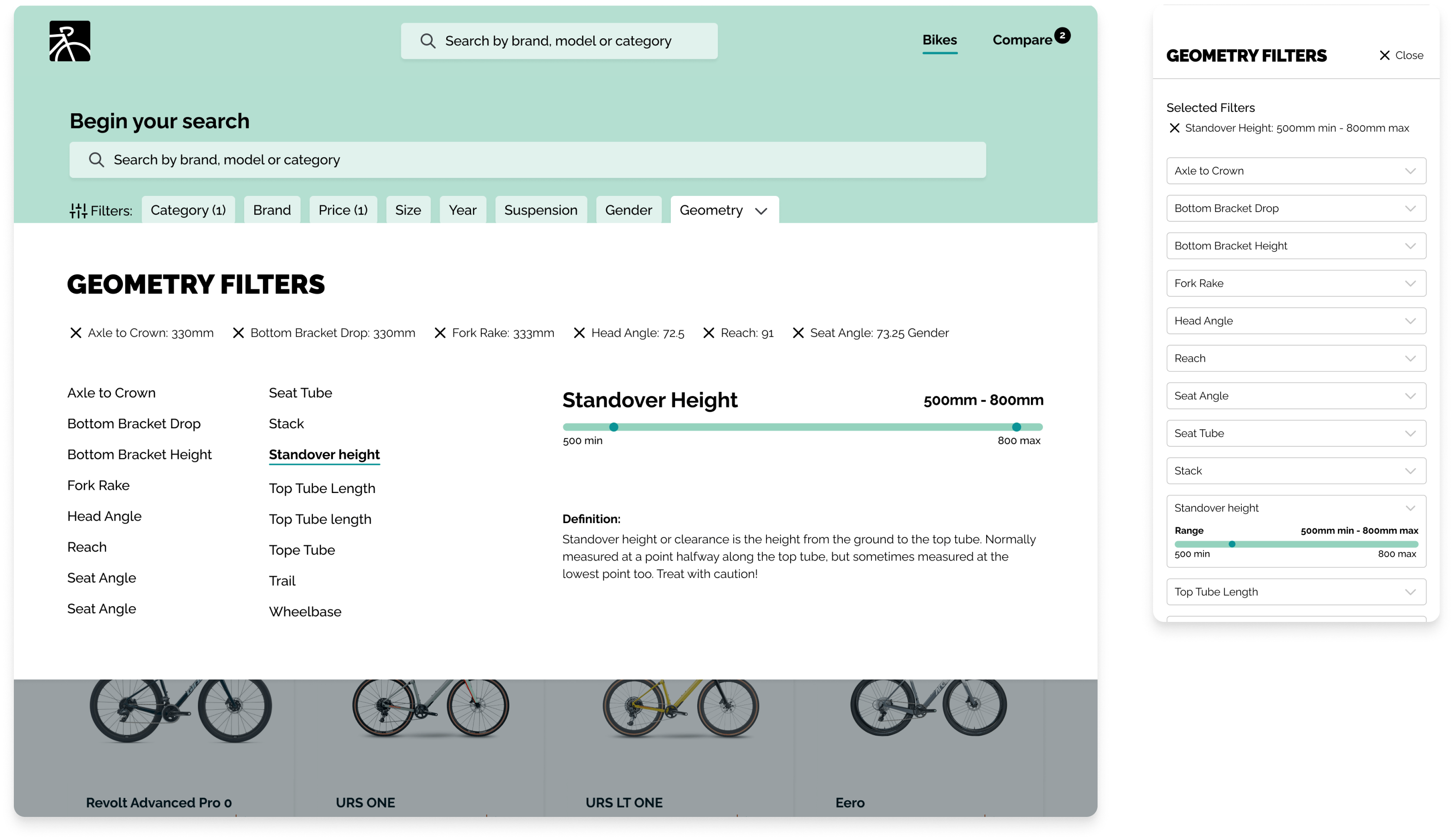
The search page included many filters to help users narrow their search. We also put all geometry filters together as to not overwhelm the users.
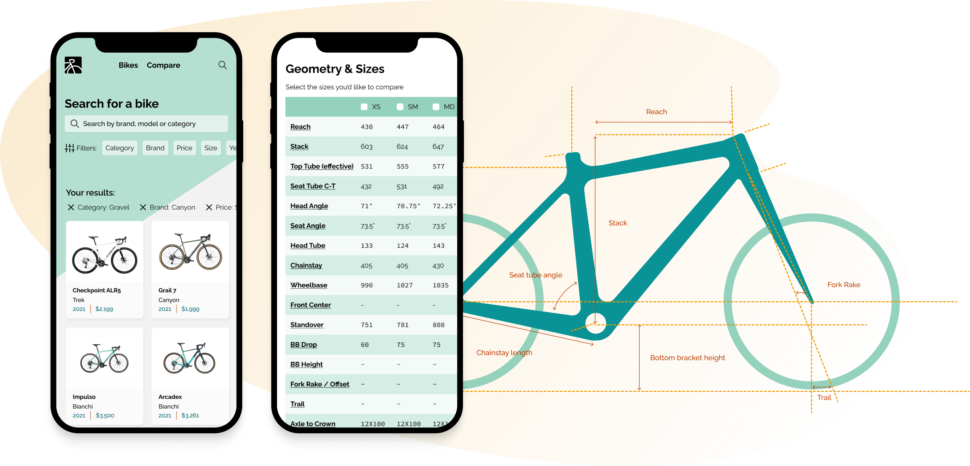
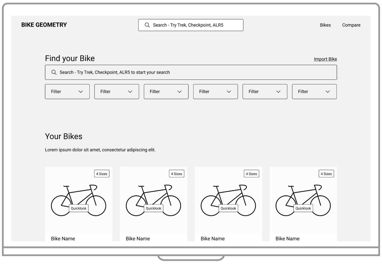
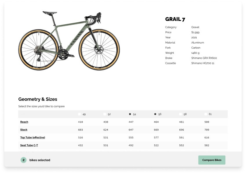
Initial designs of the bike detail page included quick specifications in the header and an industry standard table.
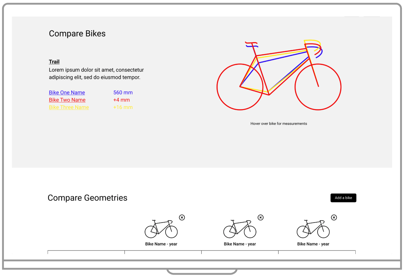
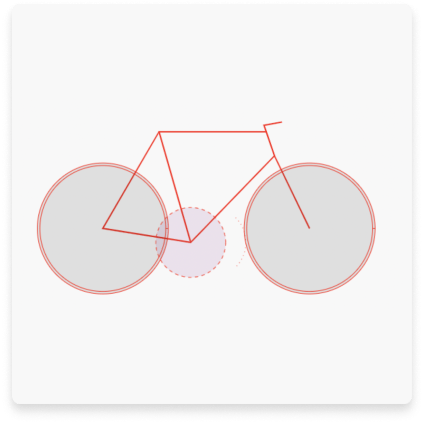
Initial designs for the comparison page allowed users the ability to compare skeletal bike geometries in a variety of ways.
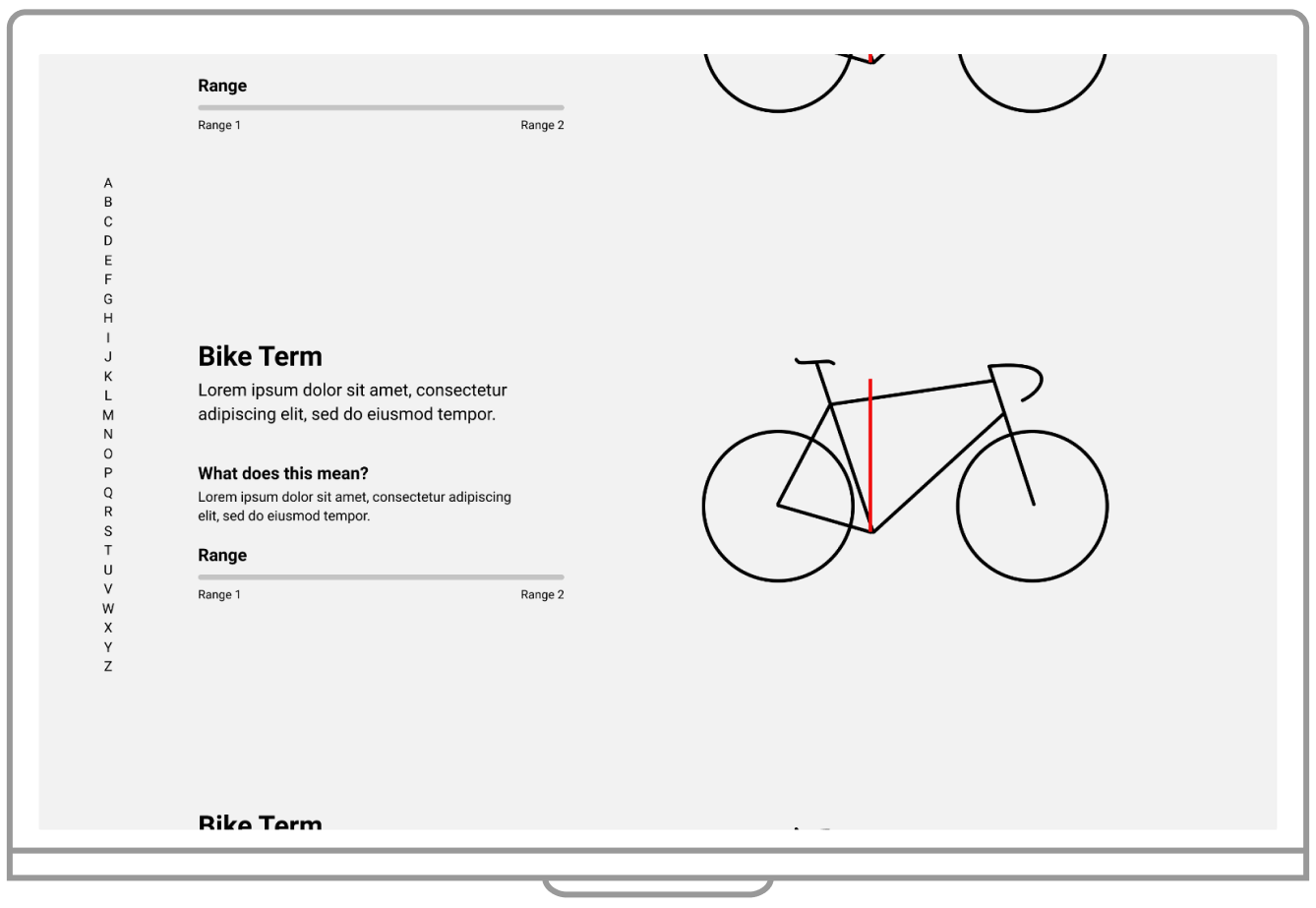
Bike terminology is confusing. We included a terminology page for reference, accessible on every page.
Usability testing identified major improvements to the user flow and an introduction to key features.
1
Improve Search Filters
Simplify the number of filters and improvements to geometry specific filters. 2
Select Size Comparison
Give users ability to select a size right from the table.3
Feedback
The bike selection flow needed more clarity and users needed feedback after an action. 4
Education
Add improvements that enhance user's knowledge.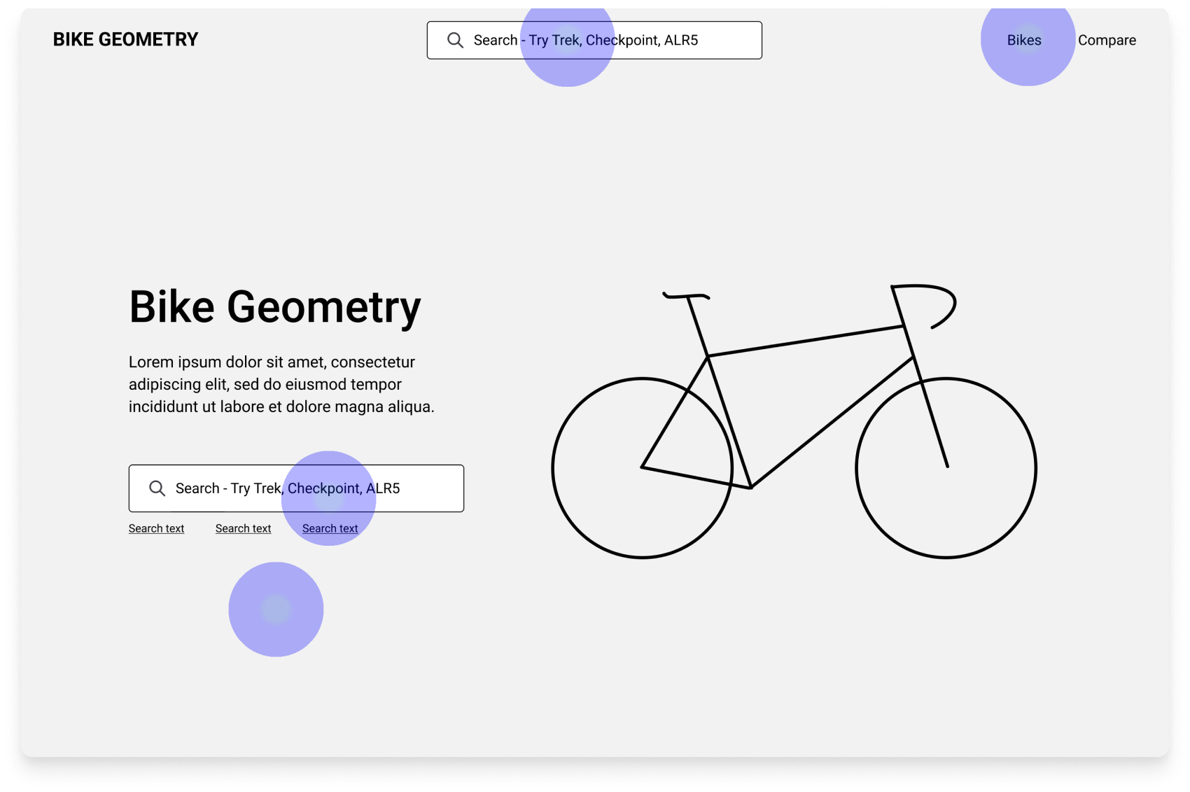
Users needed interaction cues
During testing, users mentioned not knowing if their action was being acknowledged. As a remedy, we added a bottom bar, a badge in the navigation and toasts.
Bicycle geometry made easy
Know how a bicycle will ride just based on the numbers of the bicycle frame! Select bikes you’re interested in and compare the numbers easily and quickly. With the new features and iterations we were able to create a product that catered to more of our users. We also paid attention to address accessibility and inclusivity considerations.
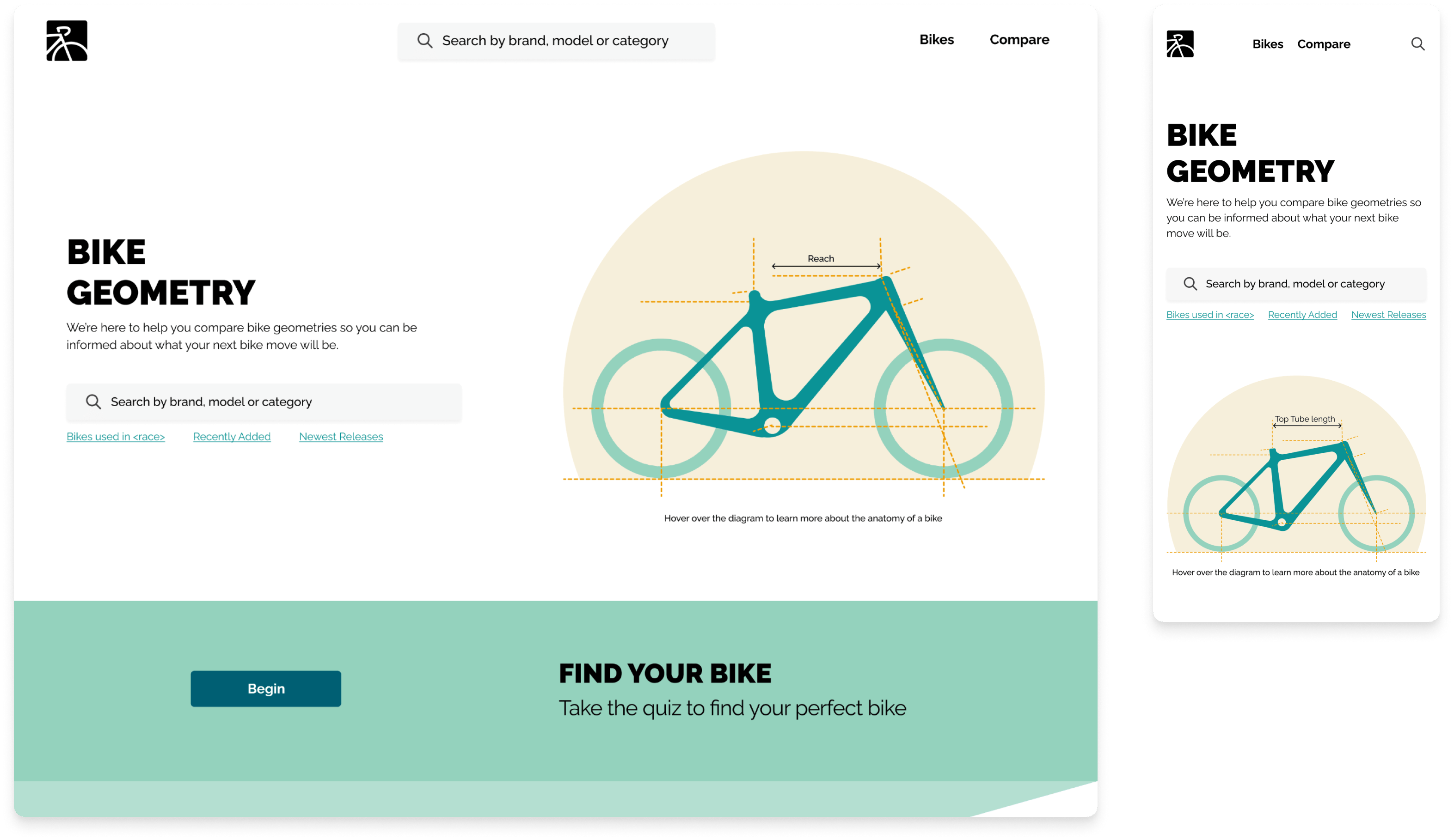
Home screen offers 4 entry points to search screen
Search screen with active filters for easy search access
Search screen with geometry filter active
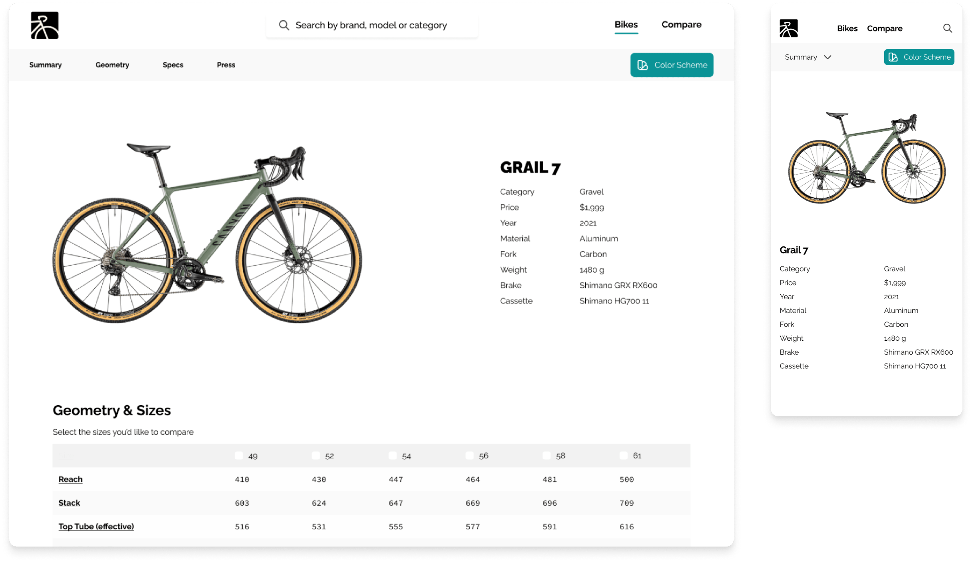
Bike Detail page
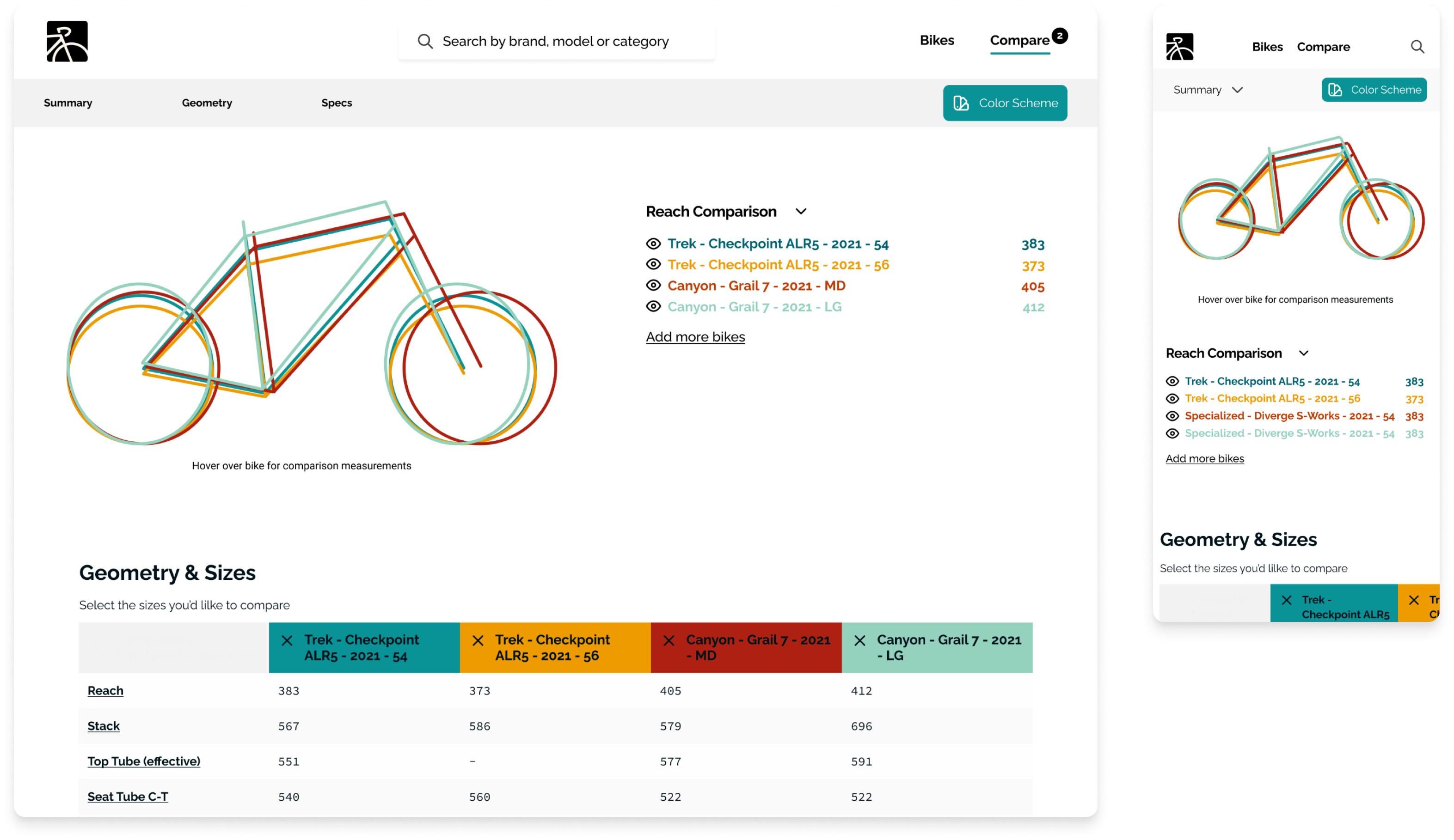
Comparison page has multiple methods to compare geometry
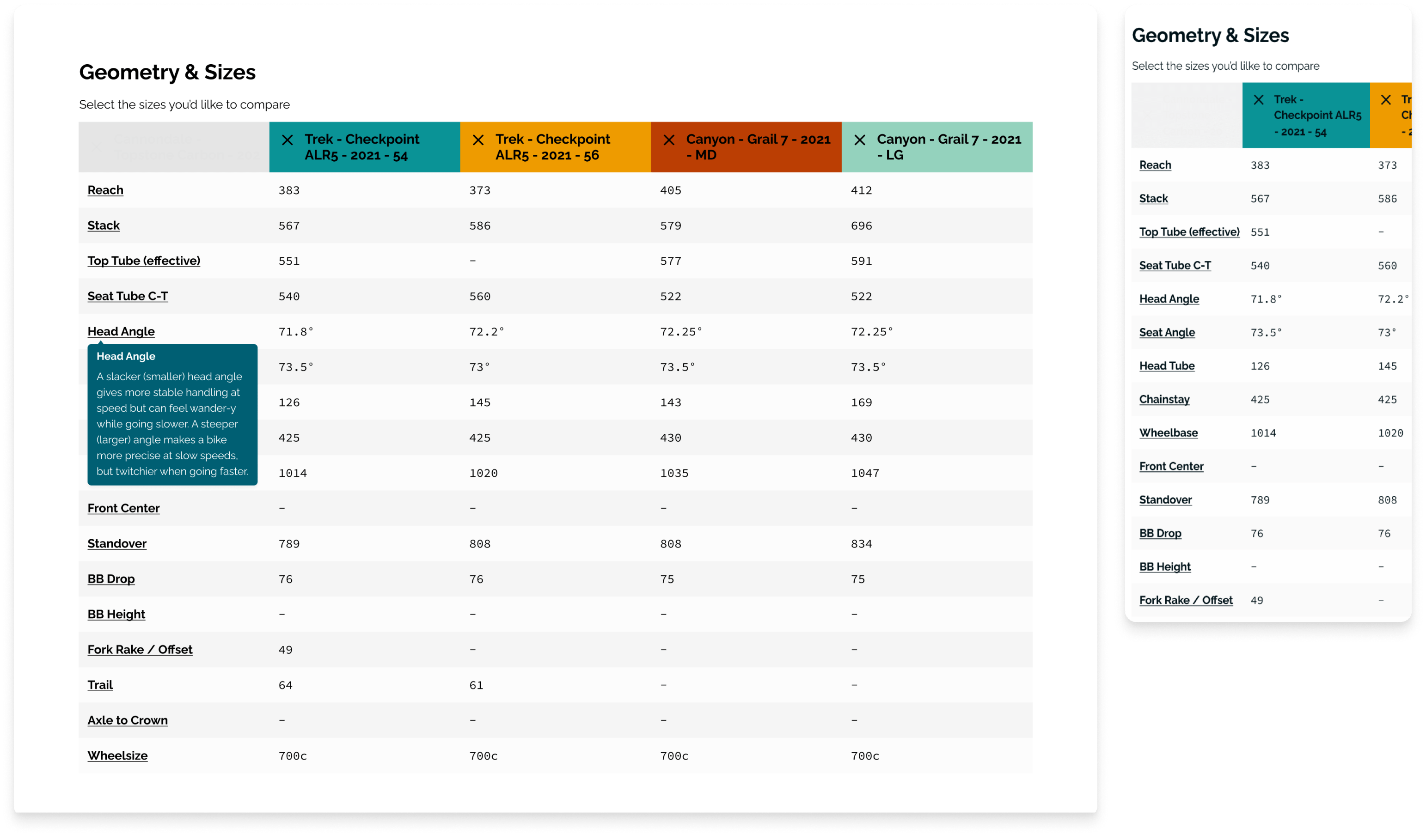
Closeup of comparison table
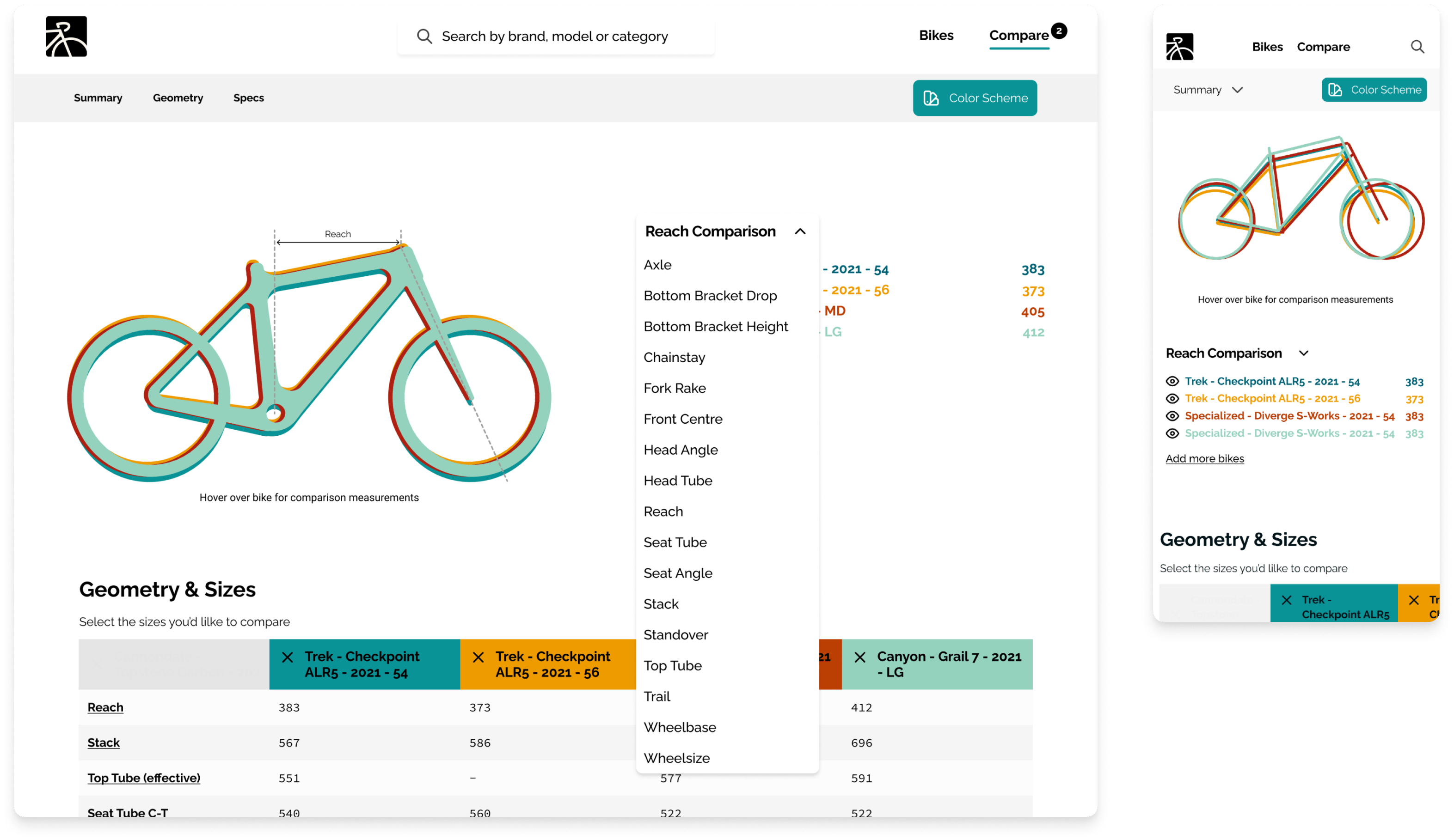
The header in the comparison page has drop down spec capabilities as well as the hover over image selection tool
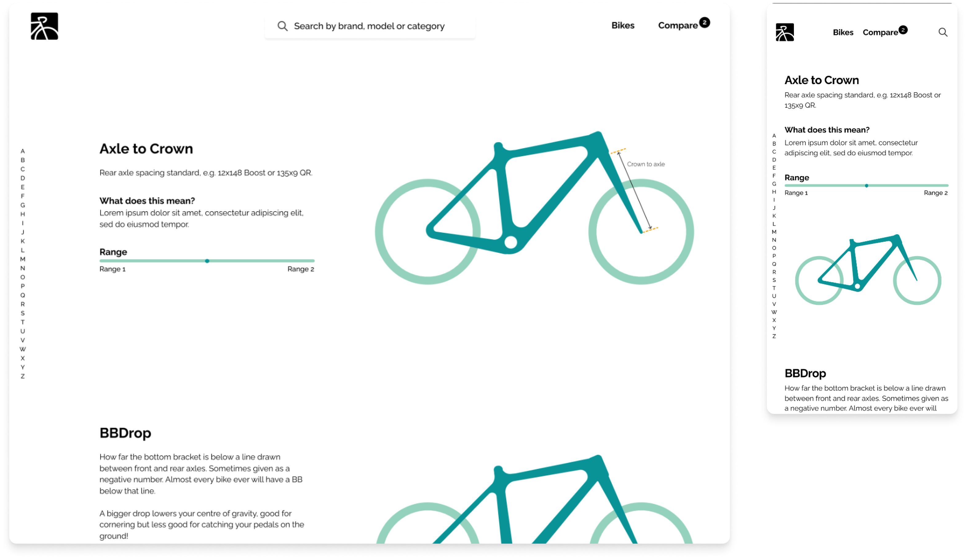
Terminology page
Assistance for new cyclists searching for a bike
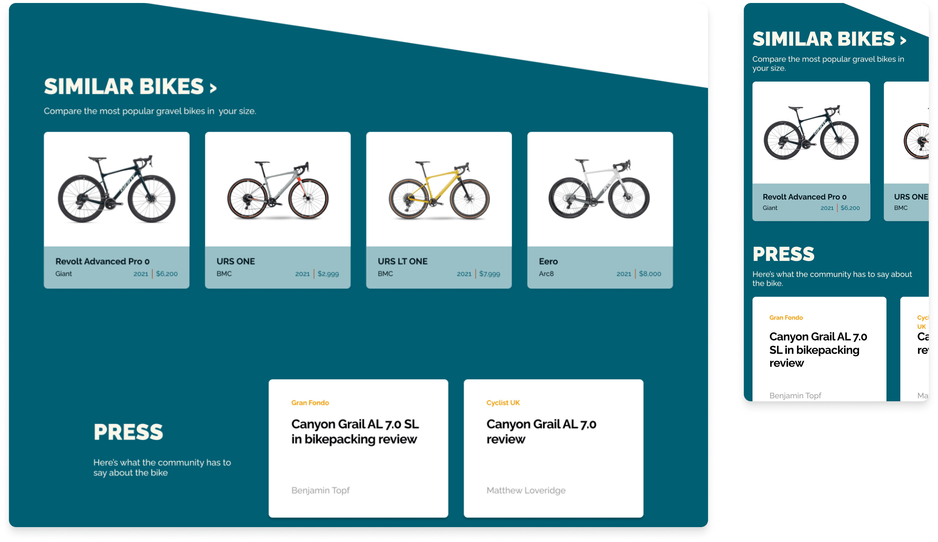
Sections on various pages to allow users the ability to find similar bikes or to read the press from different sources.
Color Palette
The compare page color codes the bike outlines and the table. Users are able to change the color palette or use bike outlines with patterns.
Visualizations
I used larger text and icons to help users navigation the site.
Annotations
Handoffs to the engineering team I have included annotations about component role, accessibility label, and how screen readers interact with the component.
Inclusivity
We wanted to be inclusive of newer riders as they enter the hobby. We included more features and a quiz!
Takeaways
Impact
Our users shared that the design was easy to understand and navigate through. They liked how easy it was to compare geometries and that there were several methods to do it. They mentioned they would use this to purchase their next bike and play around on it for fun.
What I learned
My biggest takeaway was that users value feedback after completing an action. Small design changes that allow the user to know where they are on the page and what has been selected is invaluable.
View the case study slide deckNext Steps:
1
Usability Testing
Conduct follow-up usability testing on the new website. 2
Collaborate
Collaborate with engineer on accessibility features. Reach out to bike fit and geometry experts.3
Iterate
Ideate any additional areas of need and ideate on new features. 4
Audit
Refinements on inconsistencies in existing prototypes.5
Features
Release of new features that will cater to newer users.
Previous Case StudyVote Oakland.Vote Oakland is a Bay Area based organization focused on local election ballot transparency.
Next Case StudyOakland Avenue.An Oakland restaurant guide to encourage citizens to connect and order from locally owned restaurants during the pandemic. Informed users of restaurant operating status and specials.
Designing out of
San Diego, California.
San Diego, California.
I'm always open to hearing about new project ideas and possibilities for collaboration. If you have an idea that you'd like to bring to life or if you're in need of a passionate product designer to be part of your team, I'd love to have a conversation.
hello@sydneytong.com
510.338.7860©2024 sydney tong. All rights reserved.