sydney tong.
An Oakland restaurant guide to encourage citizens to connect and order from locally owned restaurants during the pandemic. Informed users of restaurant operating status and specials.
My Role
Research, Design, Data InputTimeline
March `20 - August `20Platform
Responsive WebsiteTools
XD, Sketch, ProcreateOverview
We love living in Oakland and during lockdown my partner and I wanted to do something to help the local restaurants in our neighborhood. We worked with the different local neighborhood Chamber of Commerce, restaurants and other volunteers to get accurate information.
Restaurant owners and workers faced a lot of uncertainty and citizens wanted to help. We built a responsive website people could use to find restaurants in their neighborhood and their operating status.
Time was of the essence in this instance and we had to trust our gut, assumptions and experience. Due to the impact of restaurant shut-downs and how quickly situations changed it was important to move quickly.
*We took the site down after the second lock-down was lifted. Google and Yelp caught up and clients were able to manage their status more easily.
**I created the graphics for this project
The Problem
During the first COVID lockdown in March 2020, many Oakland residents expressed confusion regarding their favorite restaurants. On the restaurant side, owners were frantically trying to get information about their restaurant status out.
The Goal
Regulations were changing every day and restaurants needed to connect with customers. We needed to build a responsive website users could filter restaurants dining status and neighborhood.
Research
User interviews were simple. We listened to restaurant owners, workers and neighbors. Online threads on Reddit and Nextdoor gave a lot of insight on how to support neighborhood mom and pop restaurants. People were scared but still wanted to help their community. We trusted our gut on what we needed and skipped some research steps in favor of saving time.
User pain points
Dining Status
Are restaurants open, dine-in, take-out only, closed?Neighborhood
I want to support the restaurants directly in my neighborhood.New restaurants
Restaurants that opened in the beginning of the pandemic needed help with exposureNo online exposure
Old school restaurants that don’t have any online presence needed extra help.Research Kit
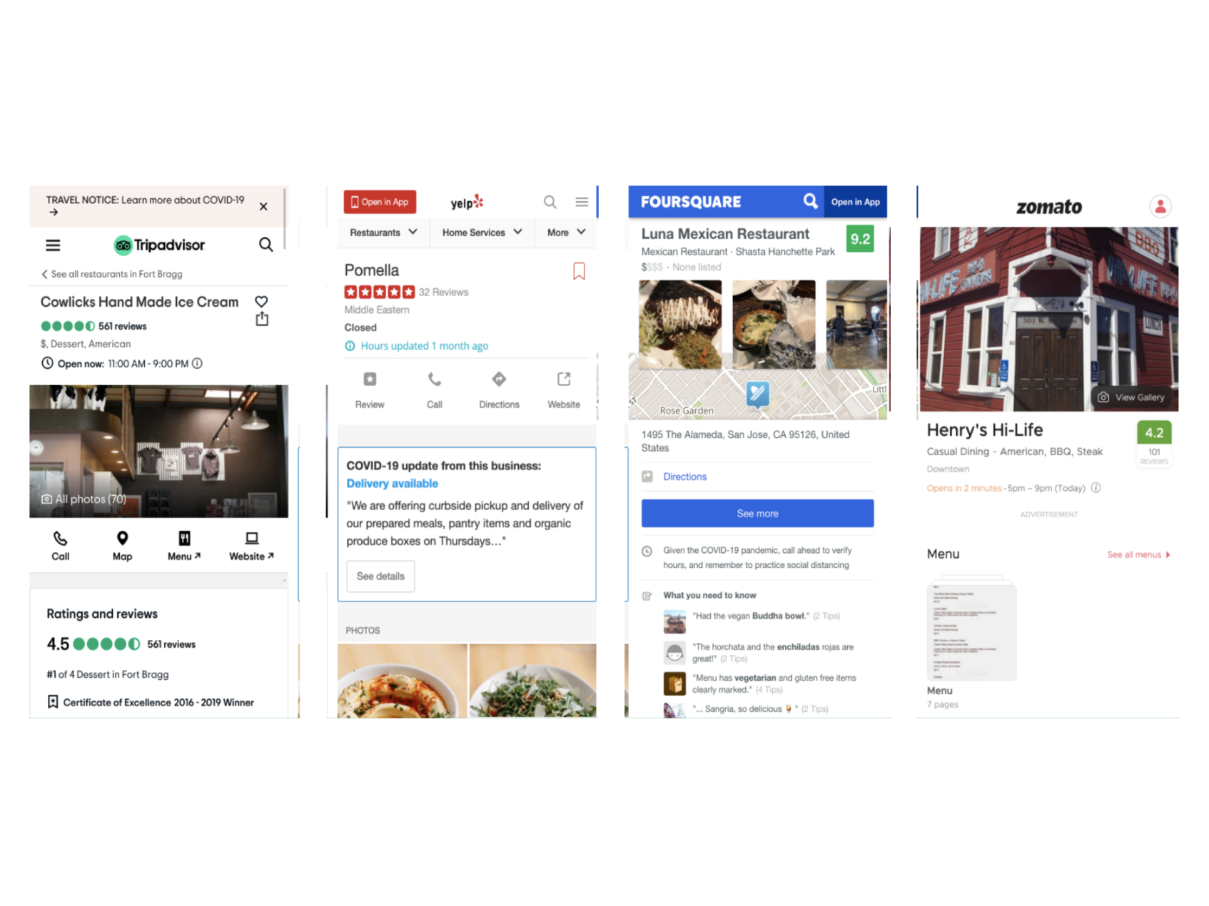
Our competitve audit was quick. We looked at several sites to see where we could improve our offerings and position ourselves in the market.
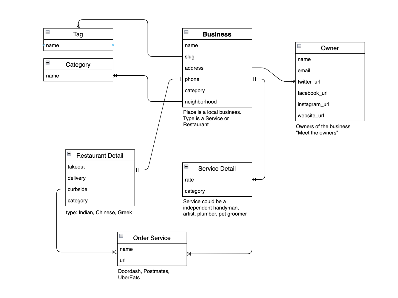
I collaborated with an enginner to understand how the database of the website will function.
Design
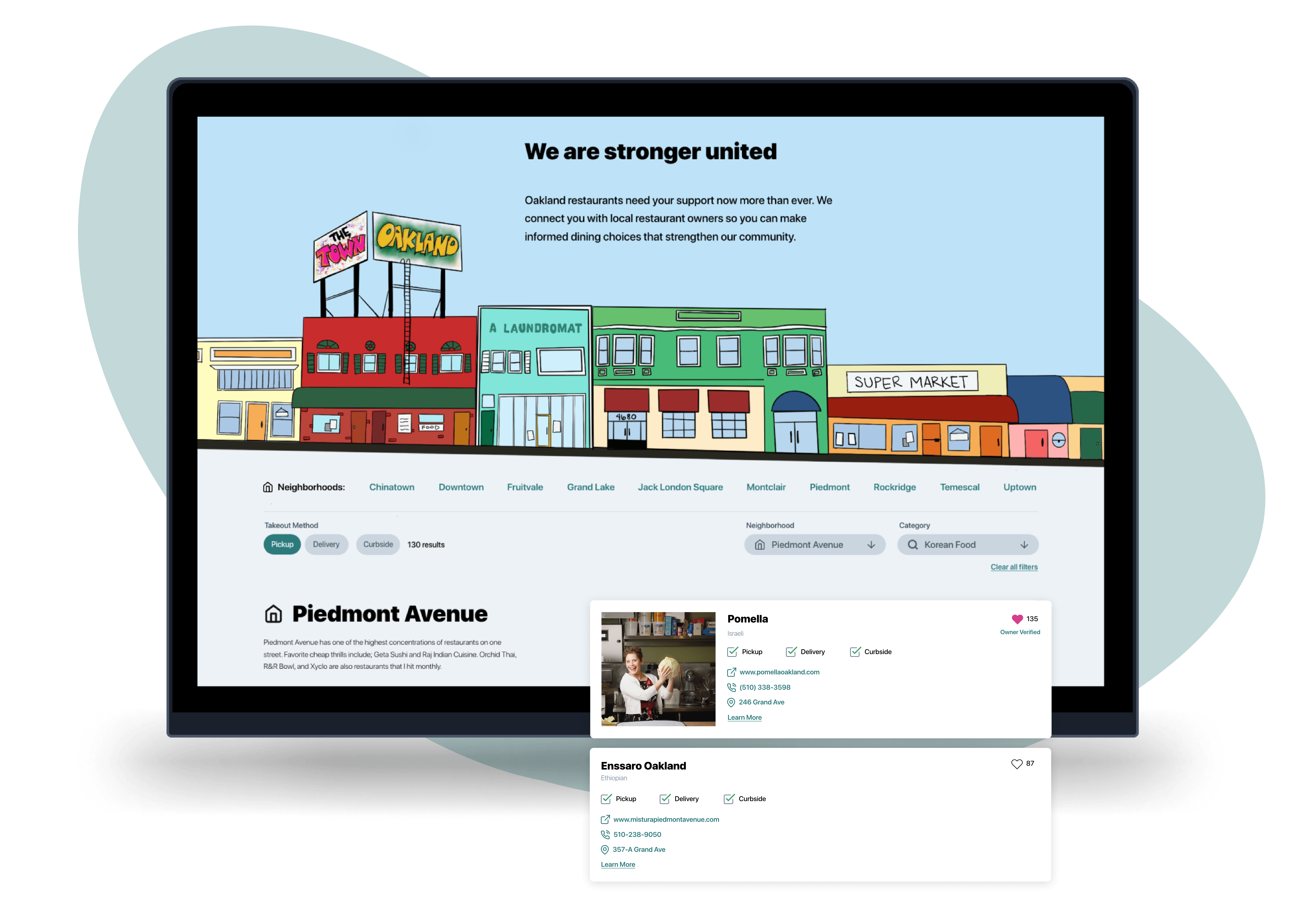
Our competitive audit was crucial in seeing what design patterns worked for restaurant listings on both desktop and mobile. Existing patterns worked and we were able to begin with digital wireframes to begin to work out the details in the design.
We wanted to focus only on displaying the information that users needed to find a restaurant and order food. This information helped to dictate our design decisions.
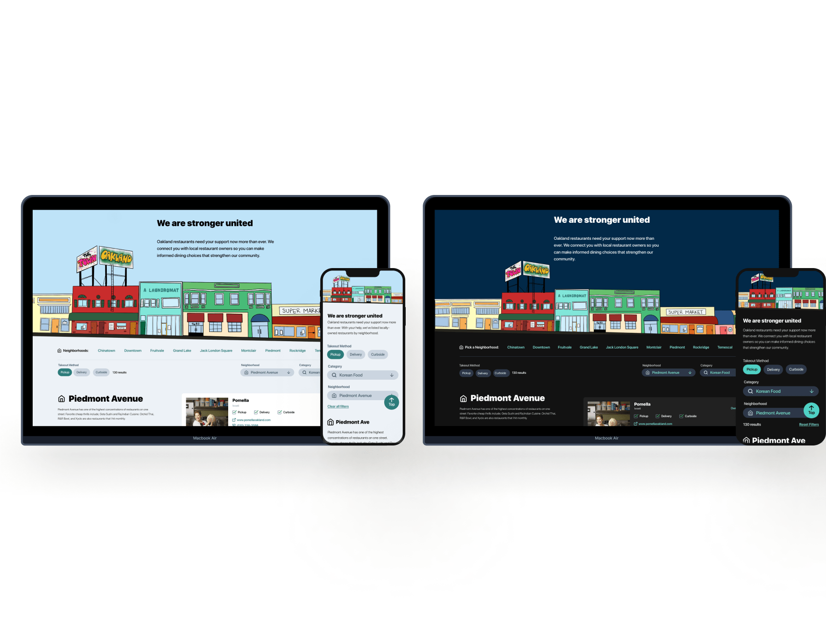
Users needed a way to search the site on a variety of devices. I started to work on designs for additional screen sizes to make sure the site would be fully responsive.
My goal was to make sure the search could switch effortlessly between desktop and mobile.
Digital Wireframes
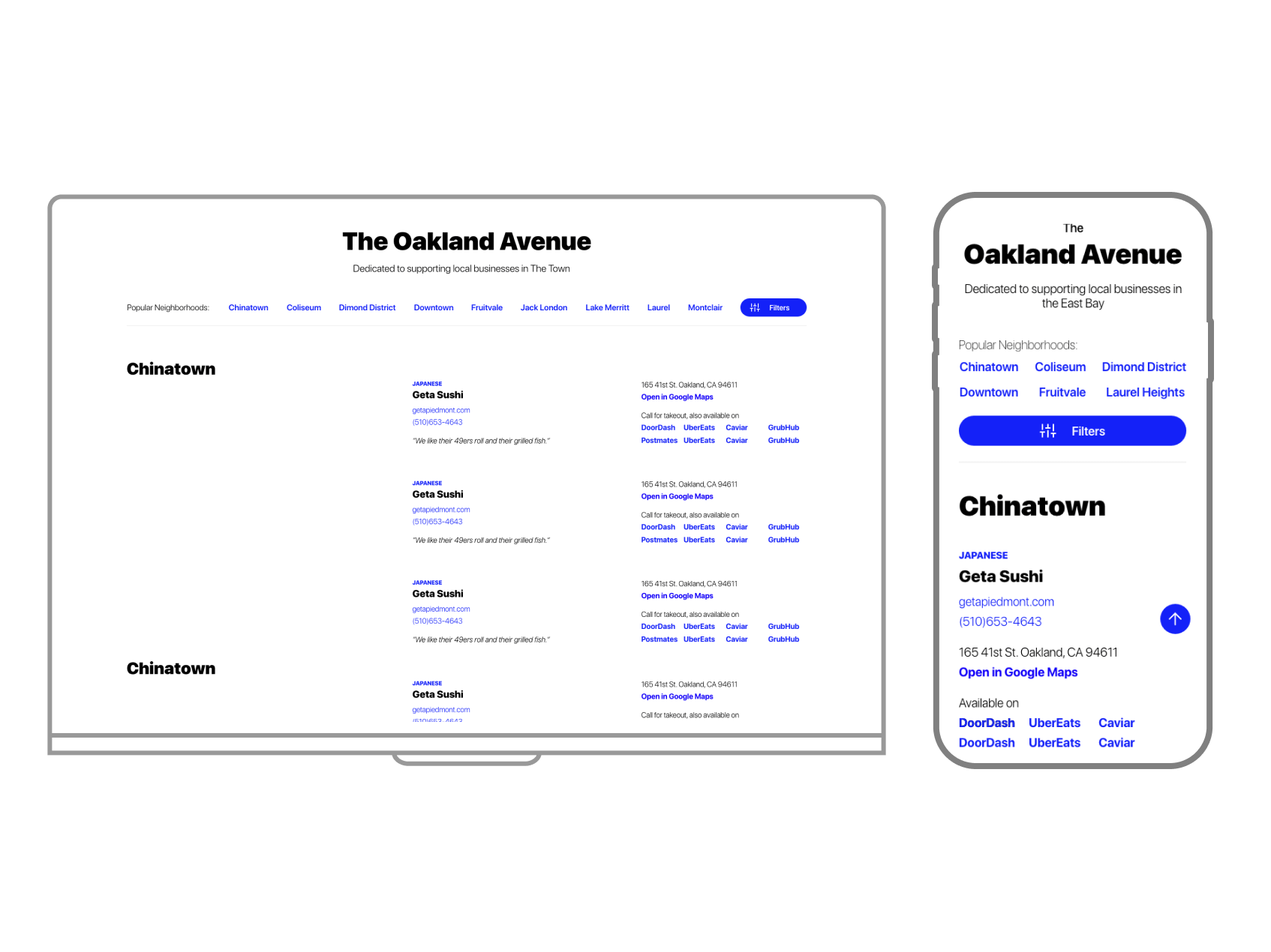
Each page went through several iterations of digital wireframes to work out how users would move through the site.
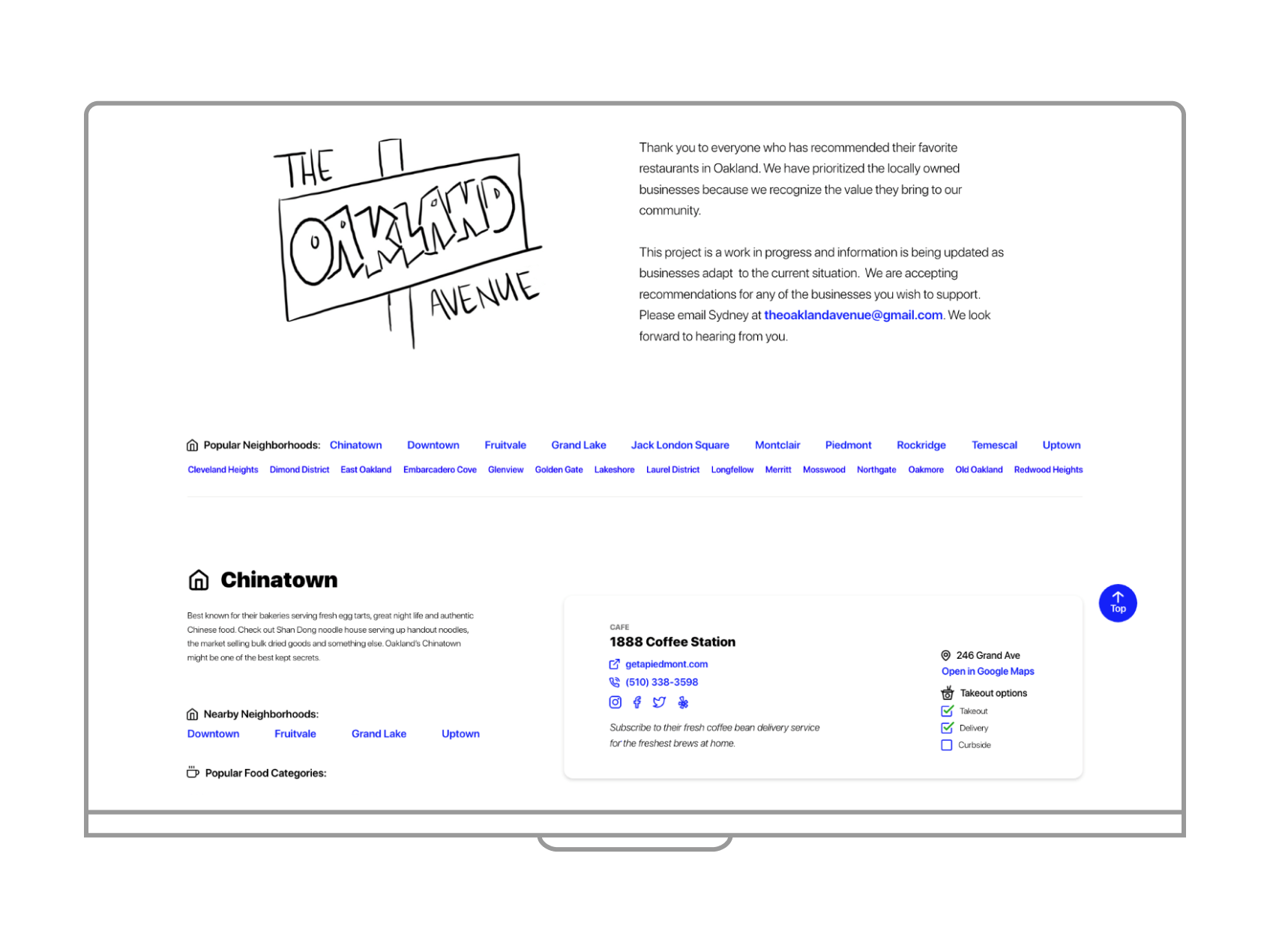
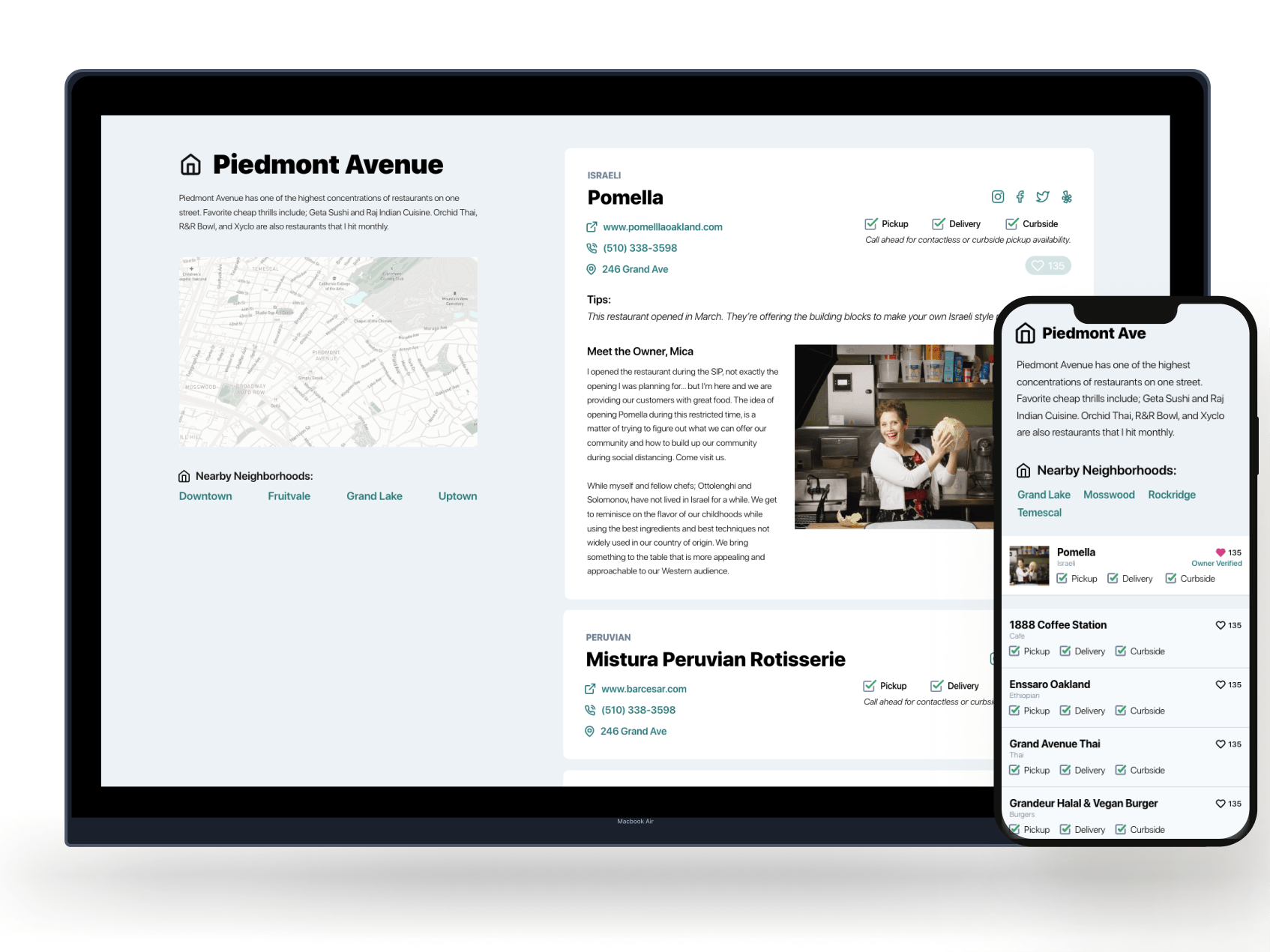
Second iteration changes: List all neighborhoods in Oakland, removed third party ordering services, a fun description of the neighborhood, nearby neighborhoods and popular cuisines in that particular neighborhood.
We added a “spark joy” moment for users to like their favorite places.
New restaurants asked if we could do a little about them to help promote their new business.
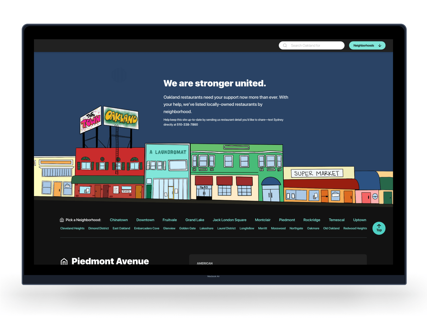
We designed for both light and dark mode
Usability study findings
Usability testing was conducted “hallway” style. I sent quick prototypes to family members and my partner for feedback. I also asked local restaurant owners and neighbors for feedback.
1
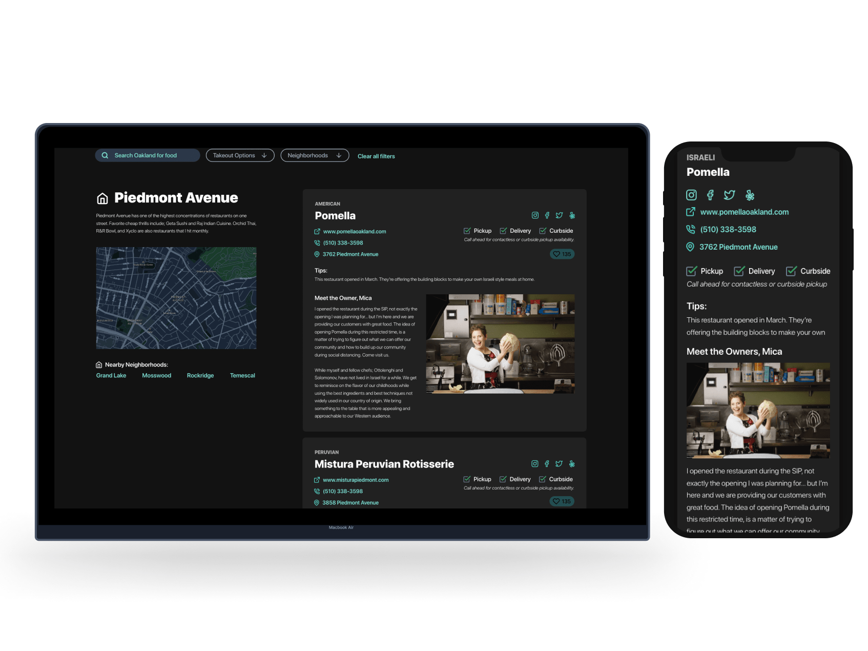
Map
Users wanted a map of the neighborhood for each section for exploration purposes. 2
Third party apps
Users did not want to use 3rd party apps because the restaurants don’t get much money from them. 3
Homemade graphics
Users liked the homemade drawn graphics. I asked my niece to draw out the words Oakland to use throughout the page. 4
Filters
Filters for neighborhood and style of cuisine needed more prominence on the page. Final designs
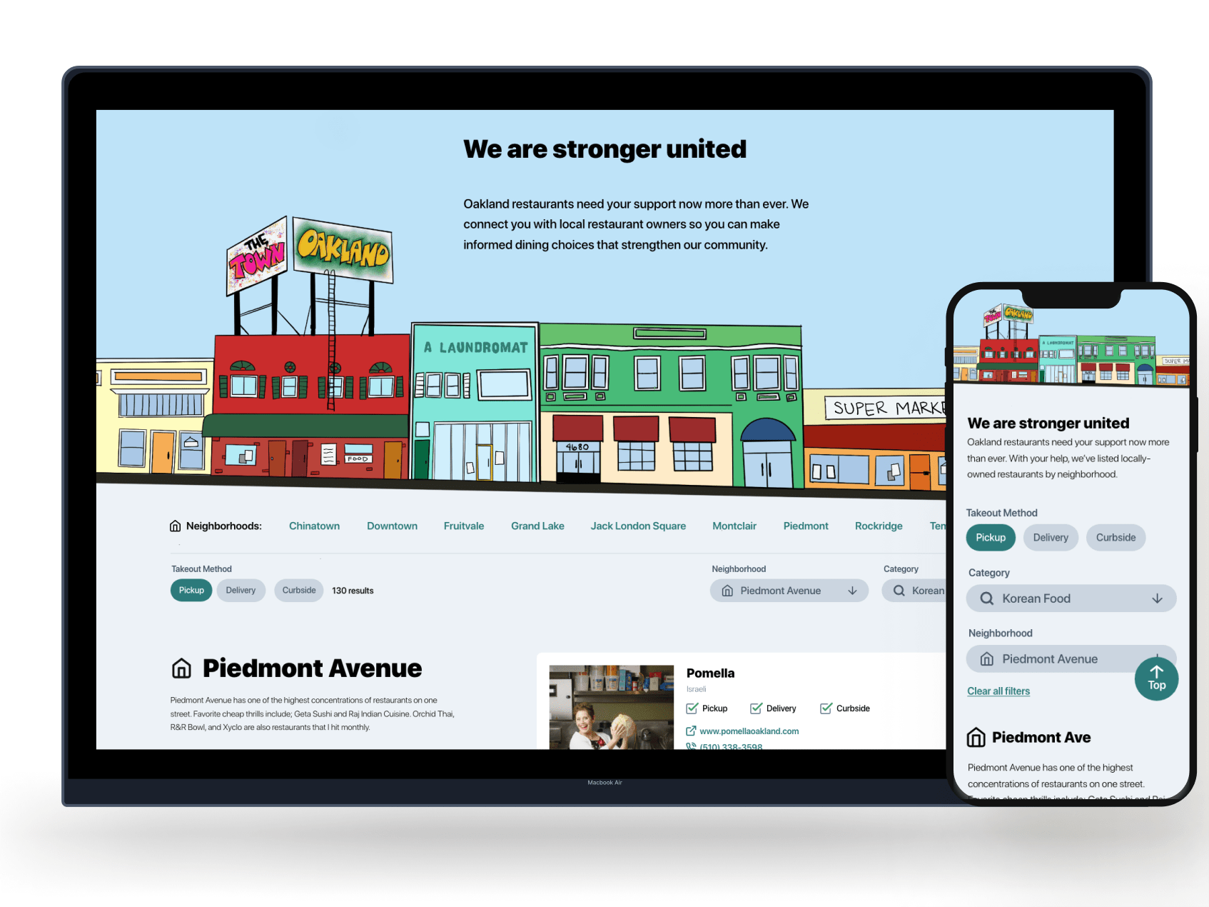
Light mode for desktop and mobile
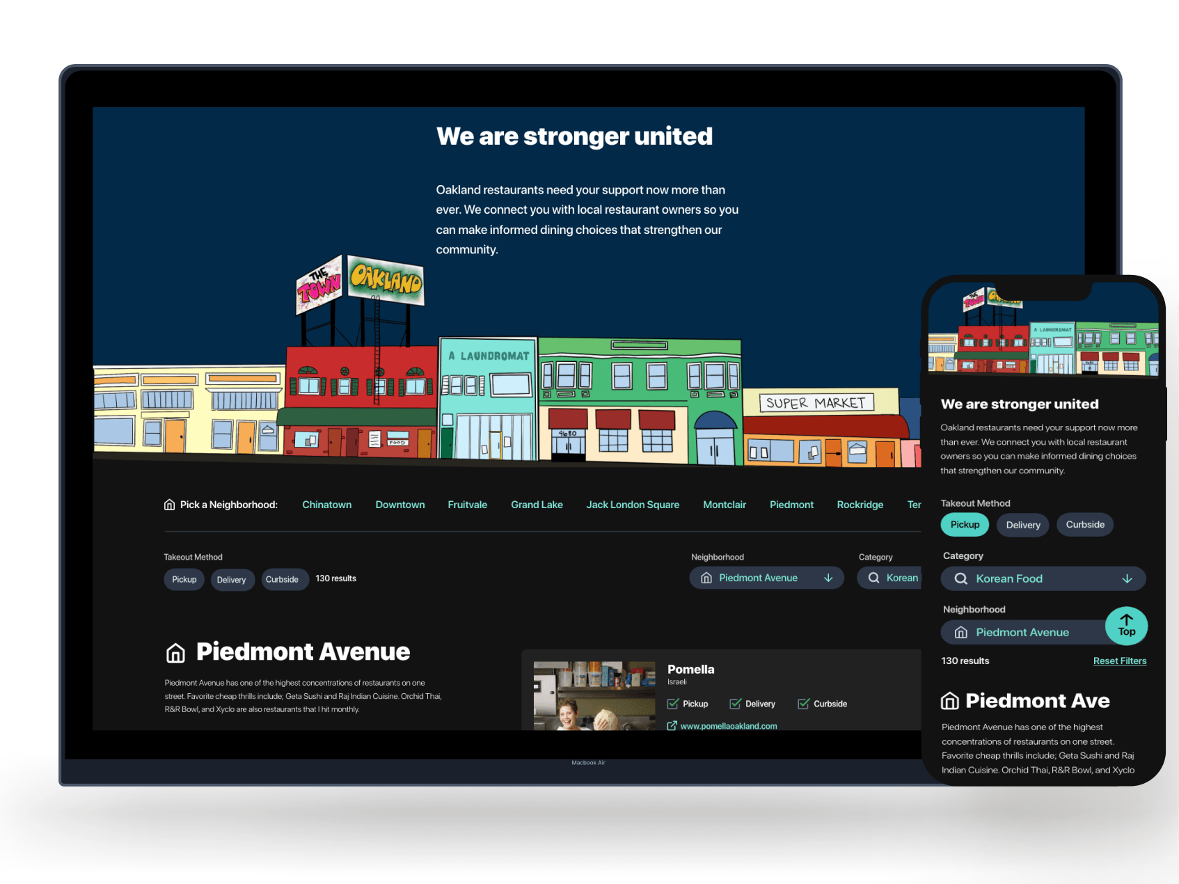
Dark mode for desktop and mobile
Single scrolling website made it quick for users to scroll and search.
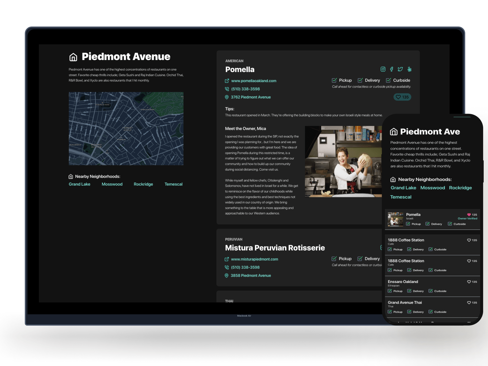
Dark mode high-fidelity mockup focused on a new restaurant that opened during Covid lockdown
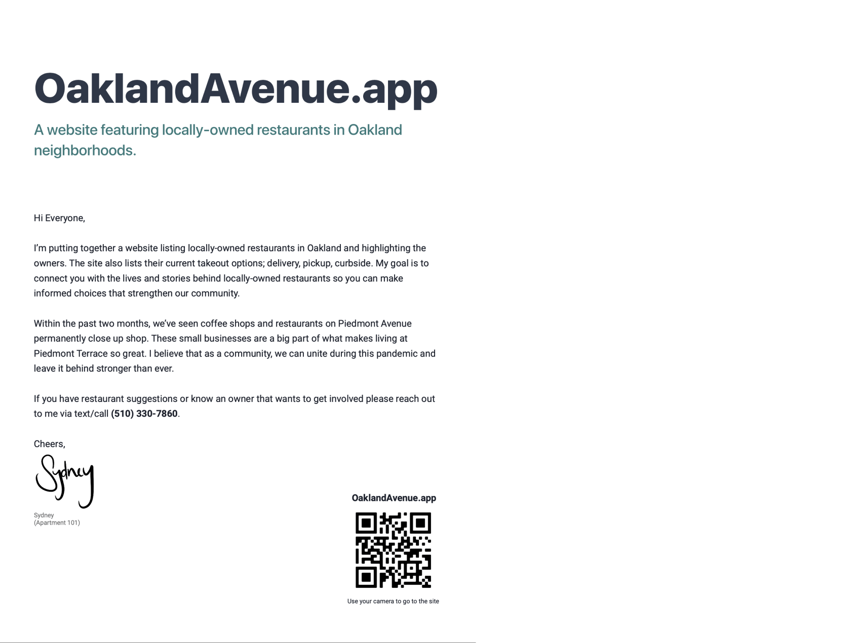
I printed out a flyer to post in my building to inform my neighbors of the site. I also put a post on Facebook and Nextdoor.
Inclusivity & accessibility concerns
1
Black-owned businesses
During the BLM protests we added a filter for users to choose Black and minority owned restaurants2
Colors
Followed accessibility guidelines for colors in both light and dark mode.3
Icons
Icons are helpful to aid users throughout the site. Allowing users to see restaurant operational status as well as other important indicating factors. Takeaways
Impact
We were able to get over 300 restaurants listed on our site! Restaurant owners expressed thanks for trying to help. Neighbors really appreciated the information and used it heavily to order food.
What I learned
It was a lot of work to keep all the restaurant data up-to-date on top of iterating and updating designs. The “hallway style” of user testing and rapid fire design and iteration was crucial in launching this product. I enjoyed being able to make something to help out my community.
Next Steps
Follow-up
I have an awesome design and a bunch of restaurant data I don’t know what to do with. Let me know if you have any ideas!!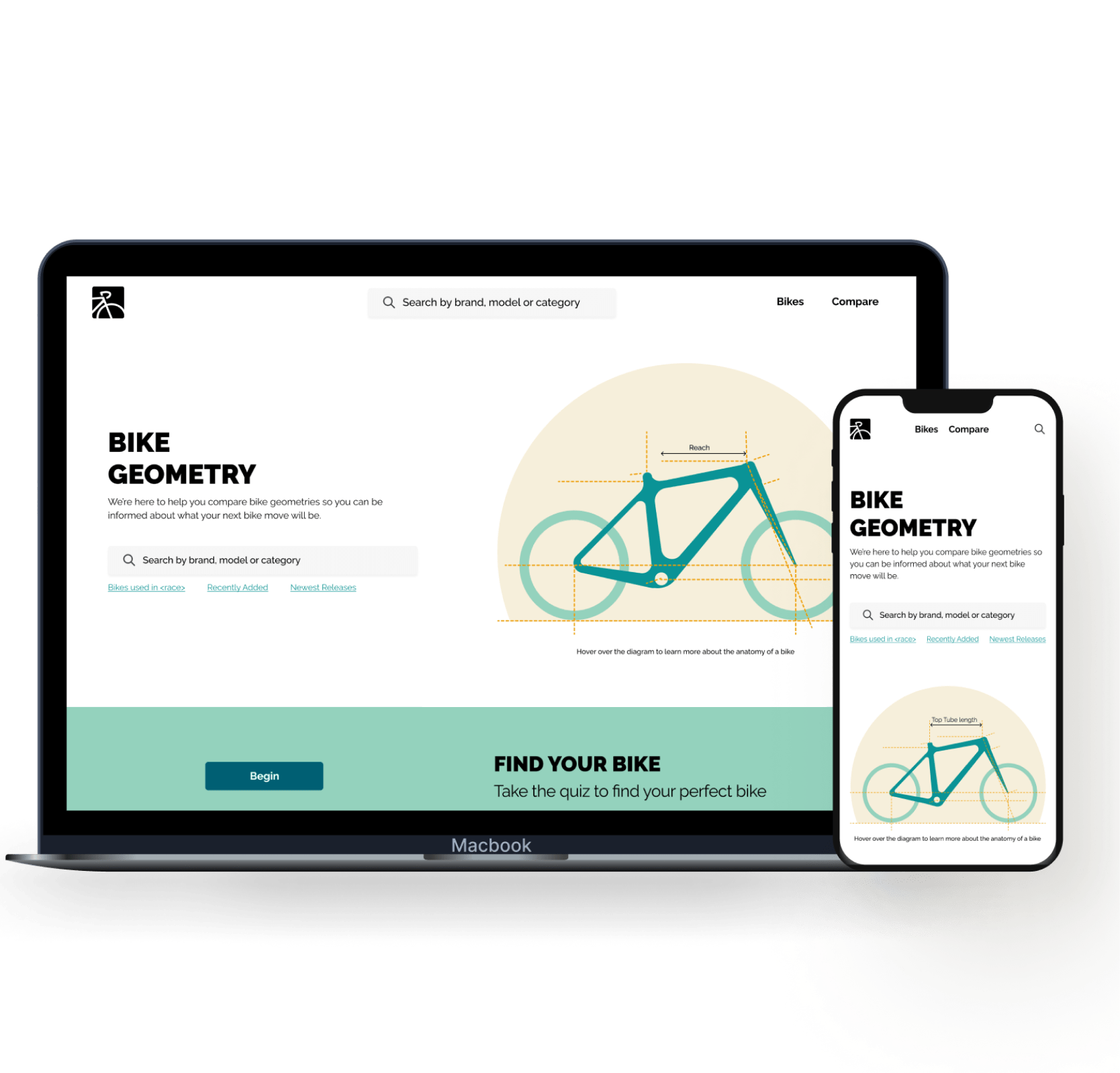
Previous Case StudyBYKE NERD.A comparison tool for bike enthusiasts who need help analyzing the details and intricacies of bike specs.
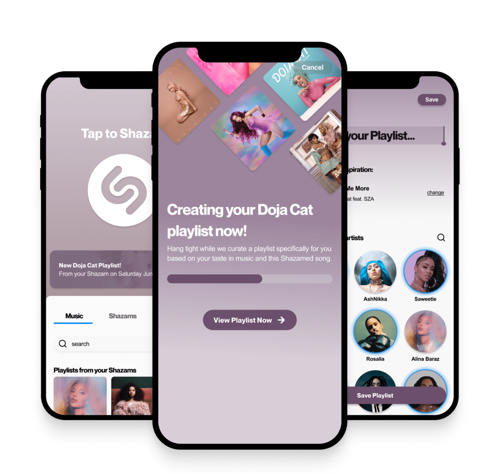
Next Case StudyShazam.A concept to generate a custom playlist based on users music taste and recently Shazammed songs in order to bring users back to the app after the initial use.
Designing out of
San Diego, California.
San Diego, California.
I'm always open to hearing about new project ideas and possibilities for collaboration. If you have an idea that you'd like to bring to life or if you're in need of a passionate product designer to be part of your team, I'd love to have a conversation.
hello@sydneytong.com
510.338.7860©2024 sydney tong. All rights reserved.