sydney tong.
A webapp that allows couples to harmoniously track expenses and create budgets together. It categorizes expenses and helps track where money goes every month.
My Role
Research, Design, PrototypeTimeline
Dec `18 - Jan `19Platform
WebappTools
Sketch, Anima, InvisionOverview
Creating a budget with a partner is not easy. With bills, groceries, brunches, gym memberships, and doggy daycare, life begins to add up. These expenses are all made on separate accounts and at the end of the month we are left wondering where all the money went? By collecting data from all accounts we are able to track expenses in one environment making it easier for couples to create a budget.
The Problem
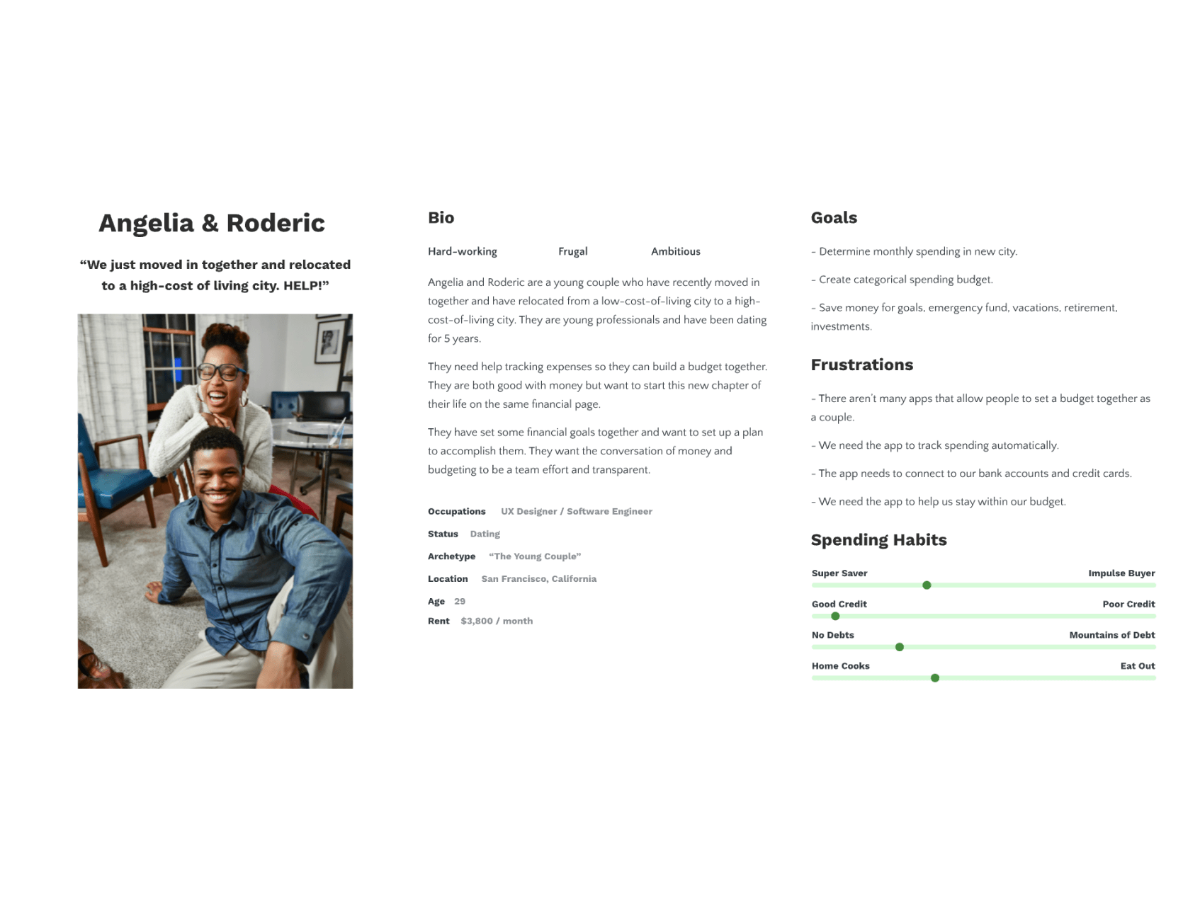
It is crucial that we are on the same page and we need the ability to track our finances, spending and saving habits together. As a couple, we need to understand how we are spending money so we can create a budget.
The Goal
A mobile app connecting a couple's bank accounts and credit cards allowing expenses to be viewed in one environment.
How might we allow users to categorically track their expenses with another person?
Research
A competitive analysis was conducted to see if there were options that would be able to work for our use case or what companies were already doing to help couples track spending, create budgets and plan for the future. Several options were available but none that had the features we were looking for.
It’s a priority that the transaction data is intuitively organized and easy to digest. General categories like Food are organized into smaller subcategories like; groceries, restaurants, fast-food and coffee shops. Specific transaction data from the different accounts need to appear within the app.
For the MVP we felt it was important to track spending and in the future we could add features like budget creation and future planning.
User Hesitations
Many accounts
There are many debit, credits accounts as well as cash spending. No one source of truthNo collaboration
Difficult to talk about because information is all over the placeBudget
Want to create a budget together based on collaborative and single spendingSpending
Want to be able to track spending openlyResearch Kit
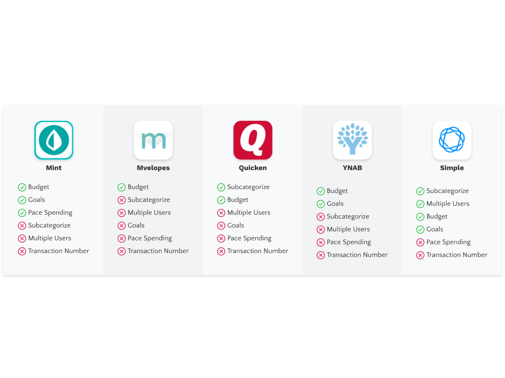
Competitive analysis - These apps have features that allow budgeting, categorical spending and connect to bank accounts. They fail to allow multiple users, subcategories, pace spending and specific transaction information.
Users are predominantly using this app prior to making a decision, like; making a big purchase, making plans, or paying bills.
Design
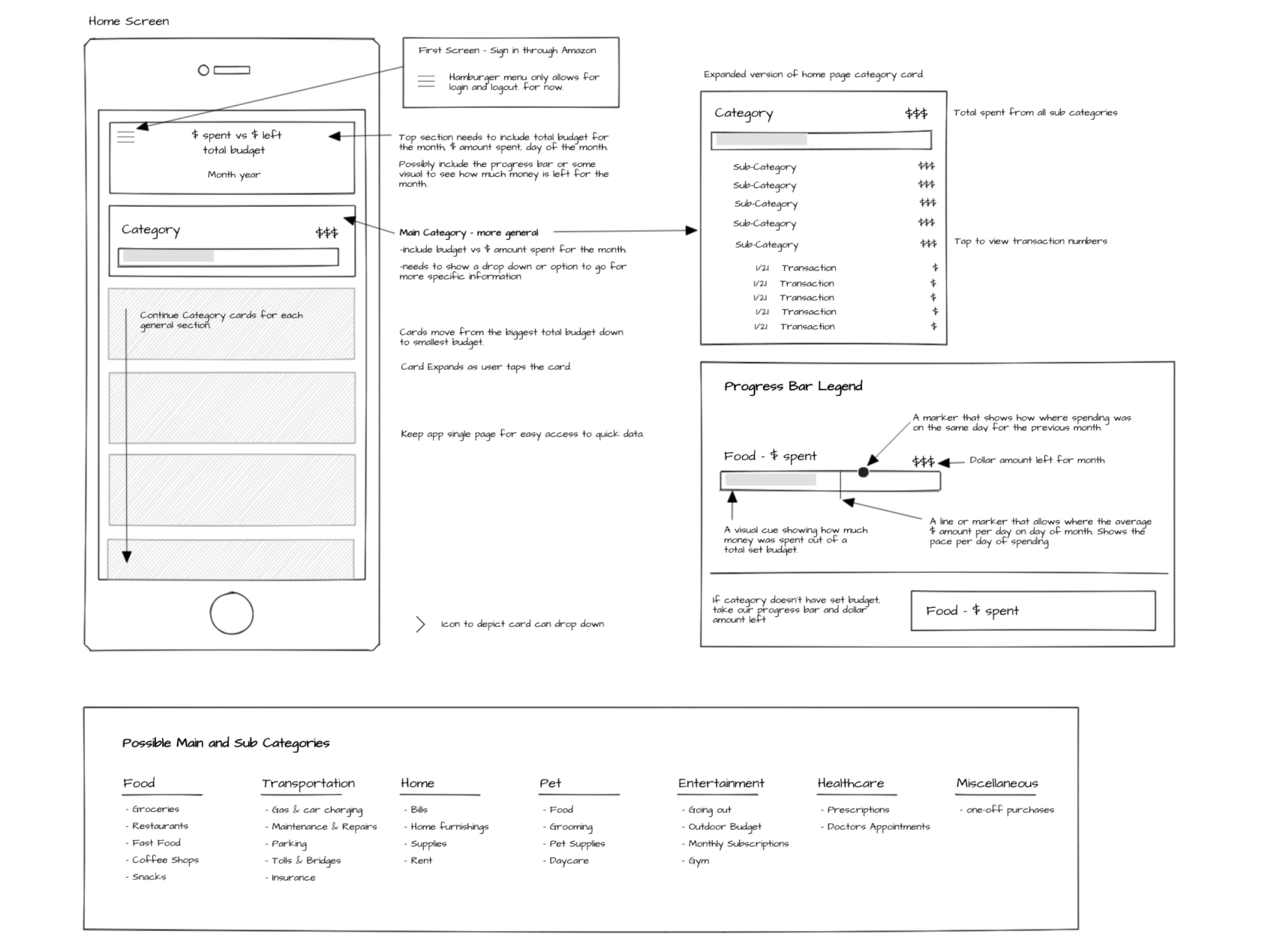
We wanted to keep the UI as simple as possible and wanted the front page to serve as a dashboard immediately upon opening.
Ideate, Design, Test, Iterate
Brainstorming necessary features & layouts for early design exploration.
Brainstorming to quickly determine the flow and layout for the spending tracking app.
We went with a simple design and focused on the user flow and layout.
Usability study findings
We did a combination of user testing of prototypes, A/B testing and best practices to back these design decisions.
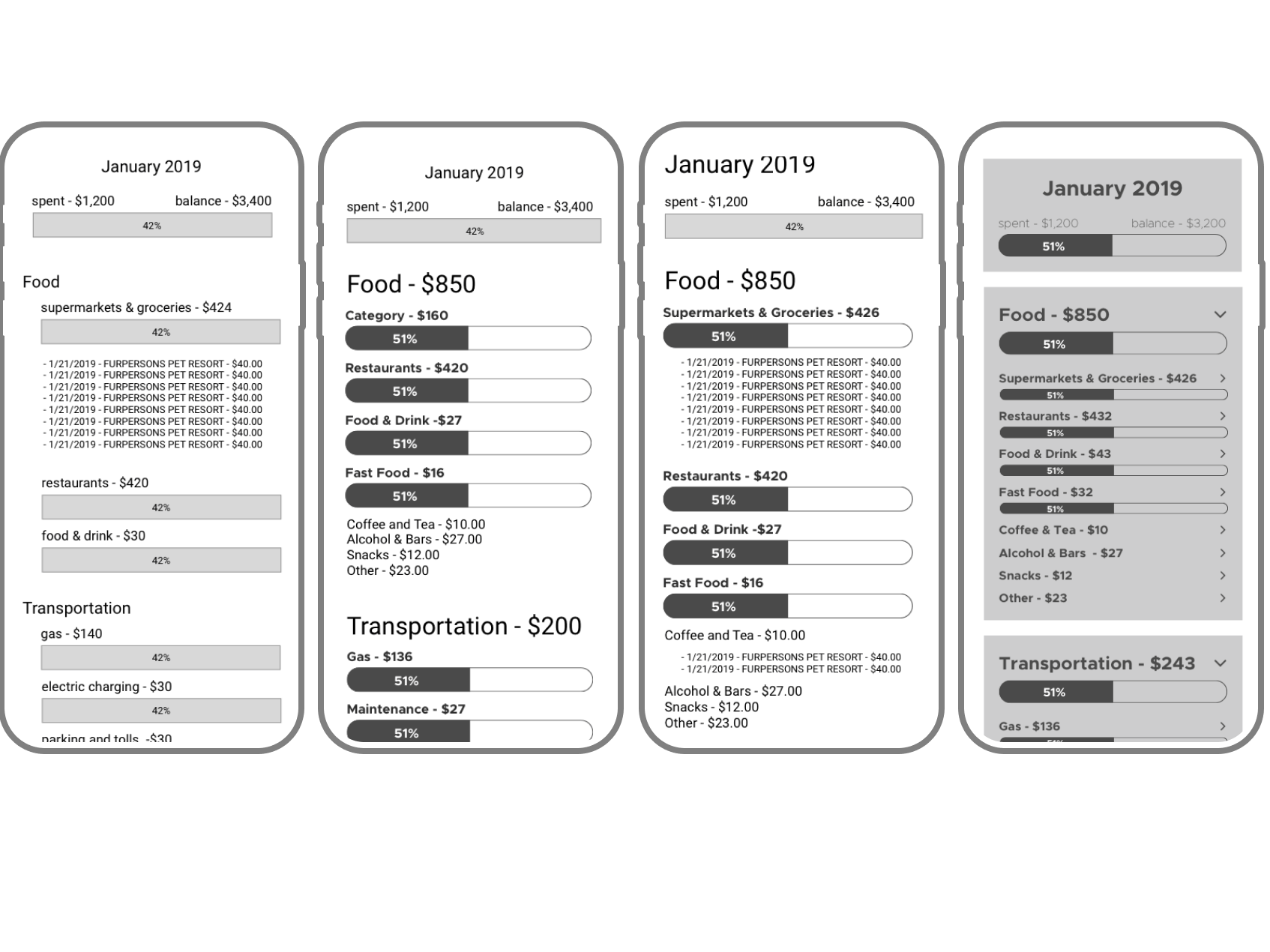
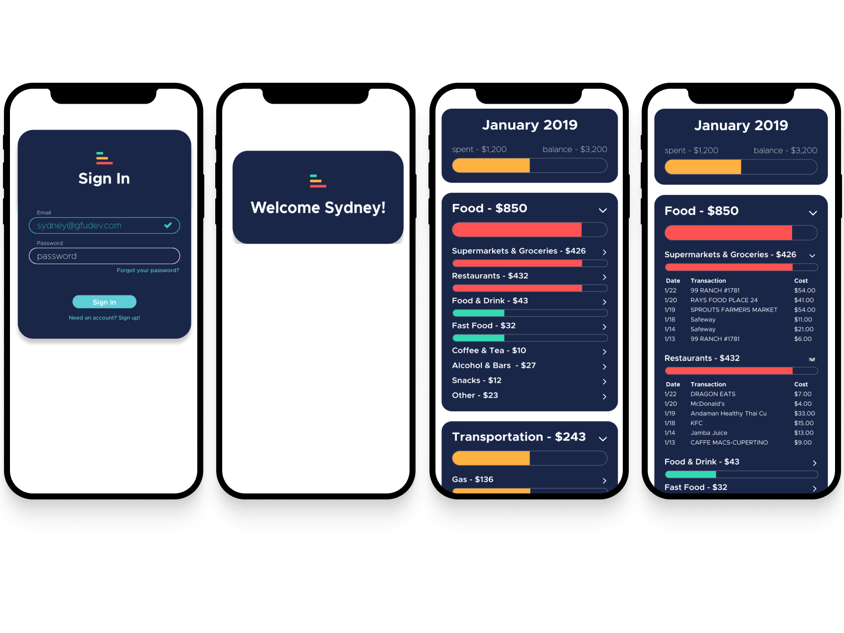
1
Single page
We decided to keep the app on a single page with drop down categories because we wanted all the information to be ready and on one screen. 2
Progress bars
Color-coded progress bars visualized how much of the month’s budget has been spent. Green indicates 0%-33% spent, Yellow indicates 34%-67% of the budget has been spent and red indicates 68%-100+% spent. 3
Categorization
We used Plaid to connect bank accounts to the app. Plaid consolidates data from multiple sources and categorizes it which makes it easy to use and analyze. Plaid was a huge help in categorizing the data for the app. </br> We created categories and subcategories based on our own personal spending and preferences. For this version this is all done in code but we will like to add features that can allow this to be done in-app. Takeaways
Impact
After using the app for 1.5 months, we felt like we were making more informed purchases and that we were more aware of our own and each other's spending. It was jarring to see how much we spent on food in one month, especially in the restaurants category. By choosing to eat out less often we have reduced our total Food category expenses by 38%.
What I learned
We made notes explaining what wasn’t working and what we are doing to fix the issues for the next version. We also need to do a better job of setting quantifiable goals.
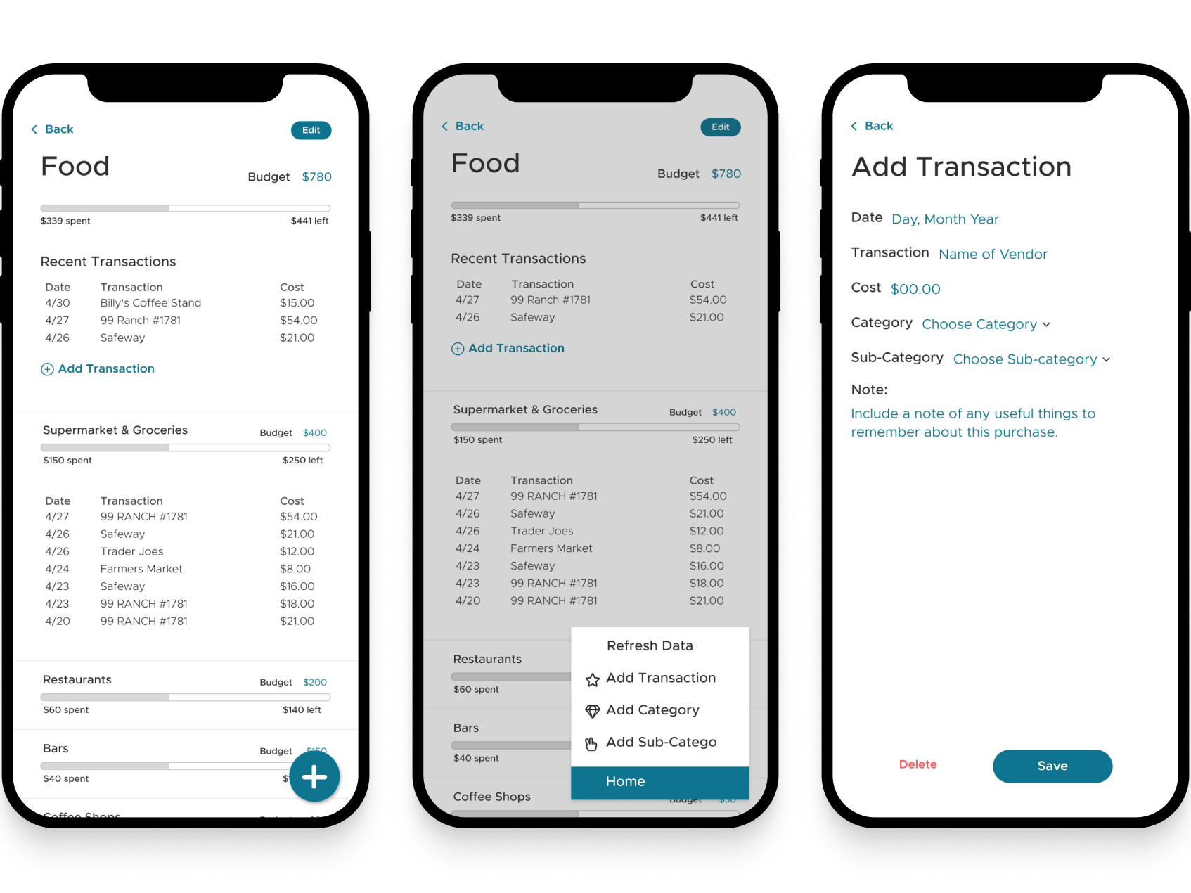
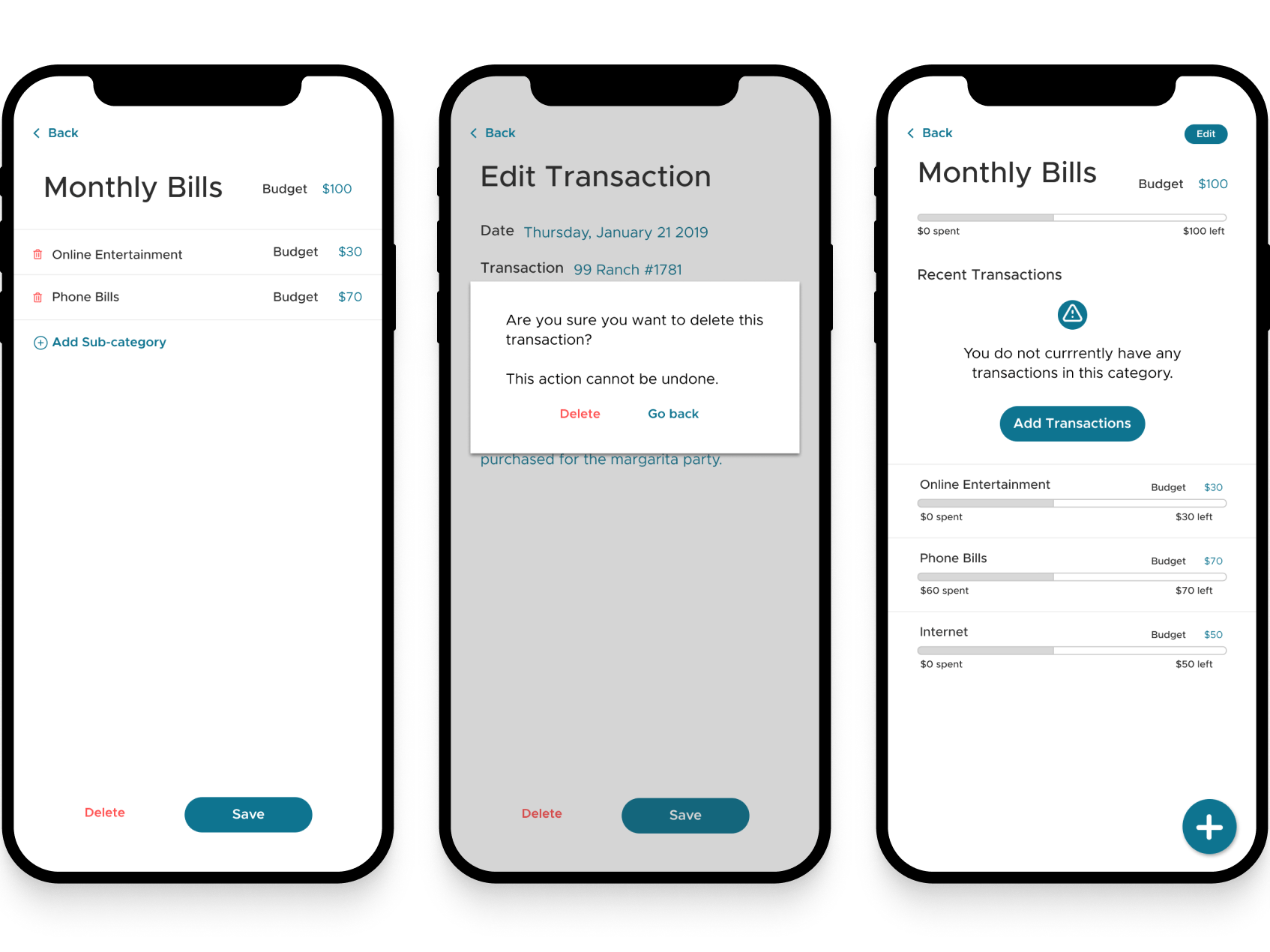
- Single page - This ended up not being the best long-term solution. We want to add more features which makes the page feel cramped.
- Labeling data - We need to do a better job of labeling data. Designs of the second version include clearly labeled data.
- Editing Data - While we have the capabilities to edit data and budgets through code it is a pain. We ended up not using the app as much because we couldn’t edit data on the go.
- UI - The UI felt too big so we shrunk down text and progress bars to make it look more professional.
Next Steps
1
Testing & inventory
Take inventory of user pain points in the latest mvp. Make list and prioritize features and problems. 2
Designs
Design features to alleviate issues. Version 2
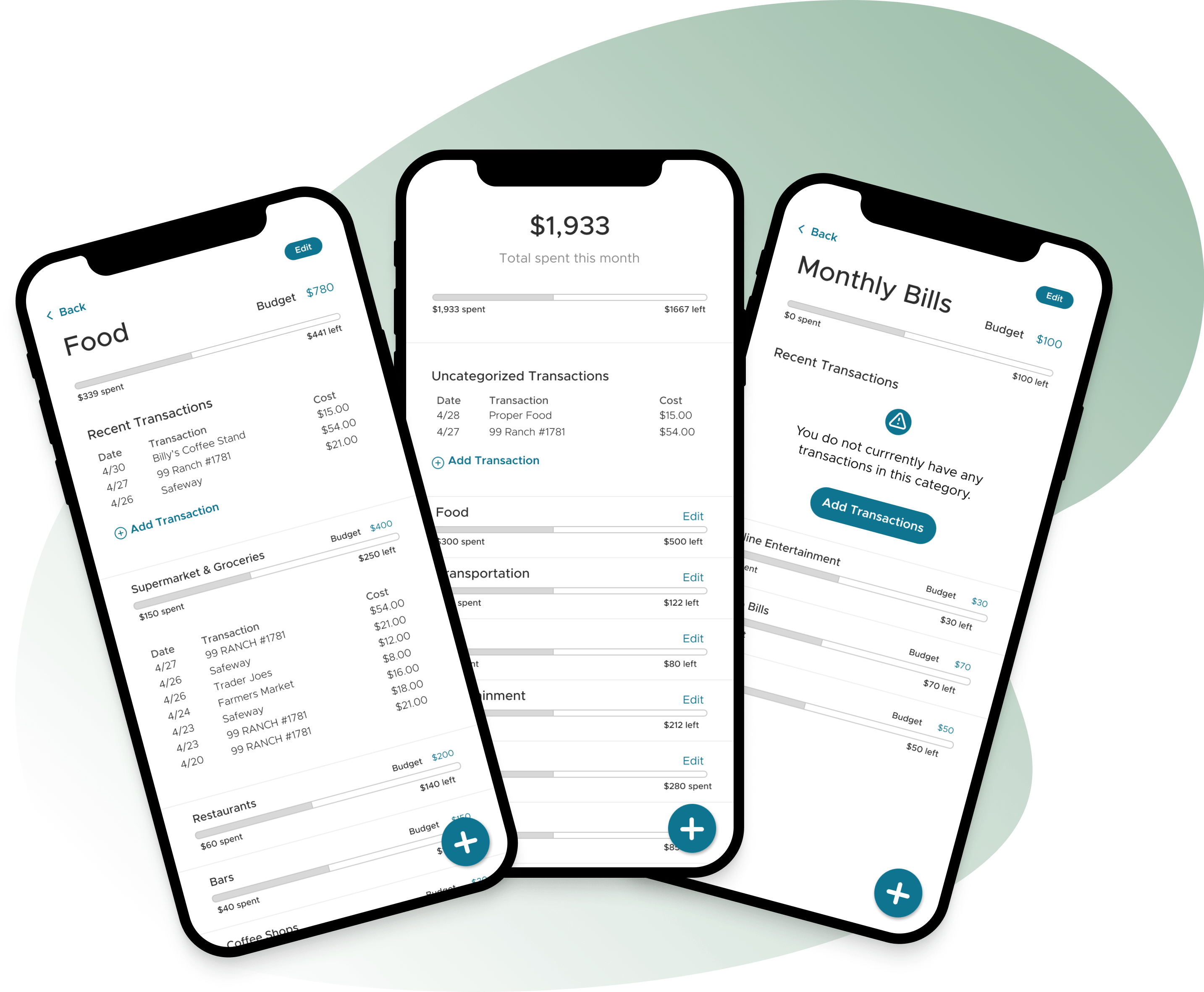
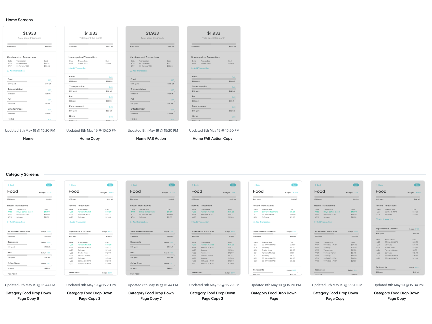
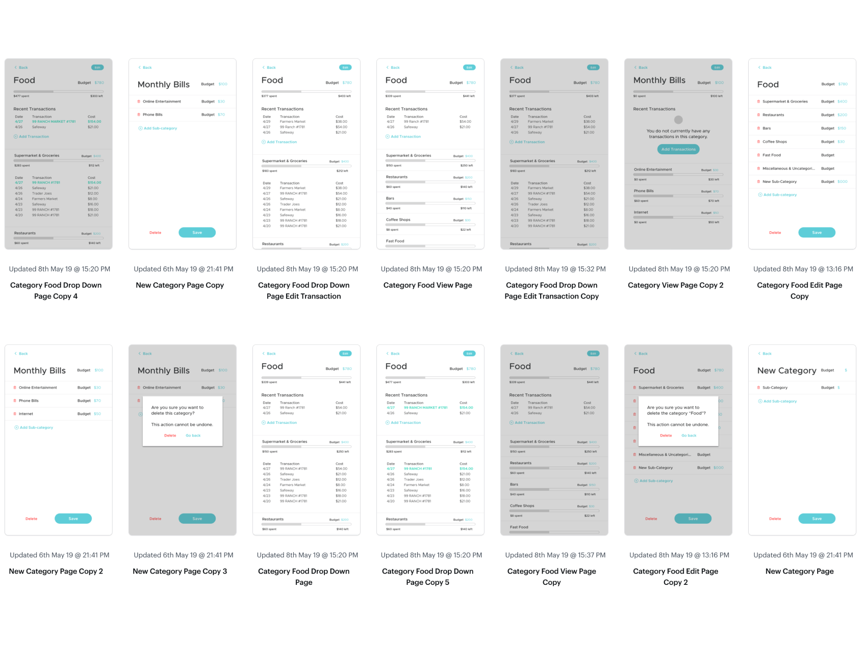
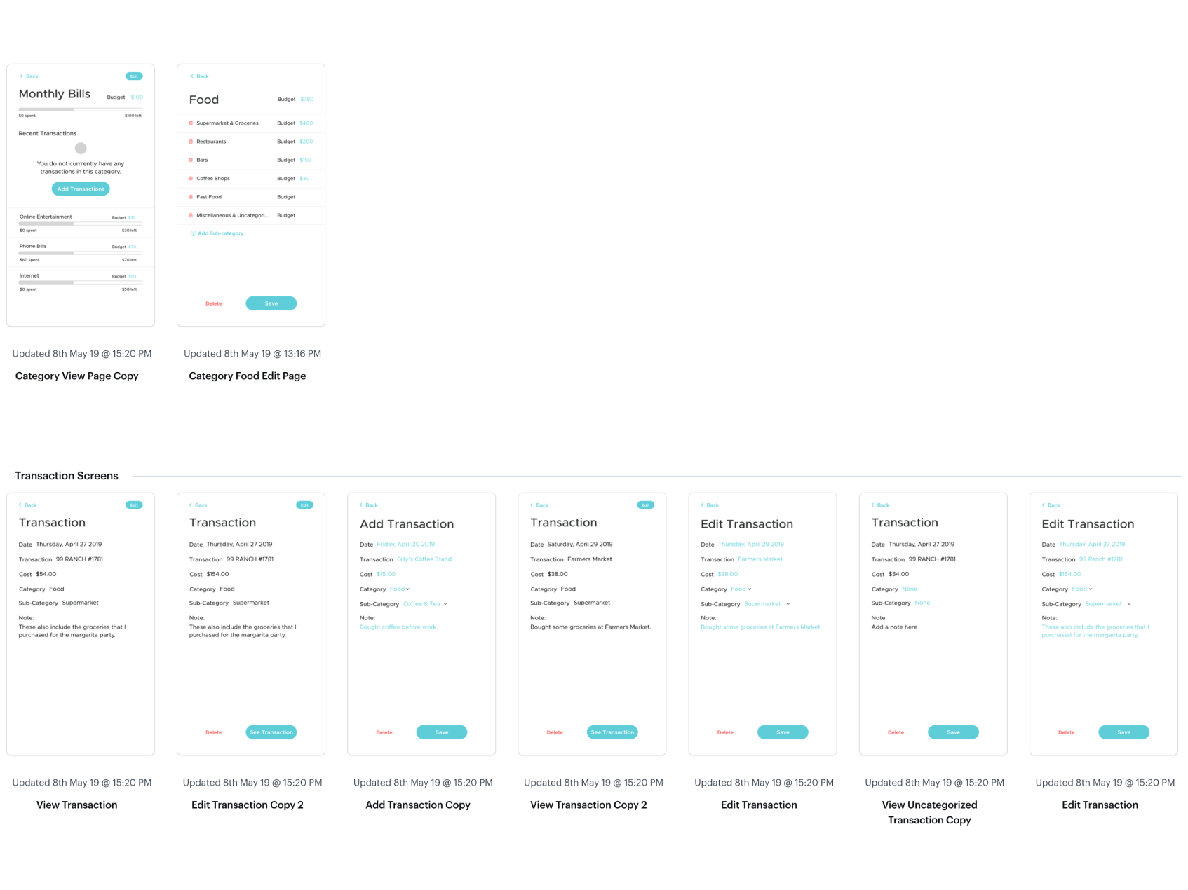
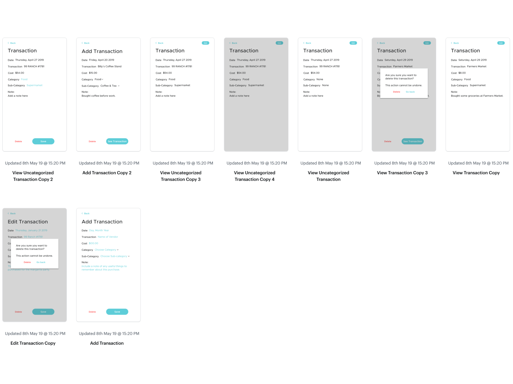
We refined what we liked in the first version of the app and reevaluated what we disliked. We designed this low-fidelity prototype which illustrates the design decisions we've decided to alleviate friction points. Here are some things you can try to do with the prototype:
- Check your Food budget. See how much you've spent in each of the sub-categories and check where the purchases were made.
- Add a transaction to the "Food" budget for purchases that use cash.
- The home screen lists uncategorized transactions which can be placed into a category.
- Using the floating action button you can add a category, subcategory, and a transaction.
- This prototype also allows the option to view, edit or add a transaction.
view prototype here
High-fidelity mockups
High fidelity mockups for the budget app 2.0
More mockups for budget app 2.0
More mockup screens 1
More mockup screens 2
More mockup screens 3
More mockup screens 4
Designing out of
San Diego, California.
San Diego, California.
I'm always open to hearing about new project ideas and possibilities for collaboration. If you have an idea that you'd like to bring to life or if you're in need of a passionate product designer to be part of your team, I'd love to have a conversation.
hello@sydneytong.com
510.338.7860©2024 sydney tong. All rights reserved.