sydney tong.
Analysis of analytics gave insight to how we might improve the above-the-fold design for a travel blog website. Scope Travel is an adventure travel blog hosting articles and content for like-minded travelers.
My Role
Research, Design, CodeTimeline
Jan `19 - Mar `19Platform
Responsive websiteTools
Sketch, XD, LightroomOverview
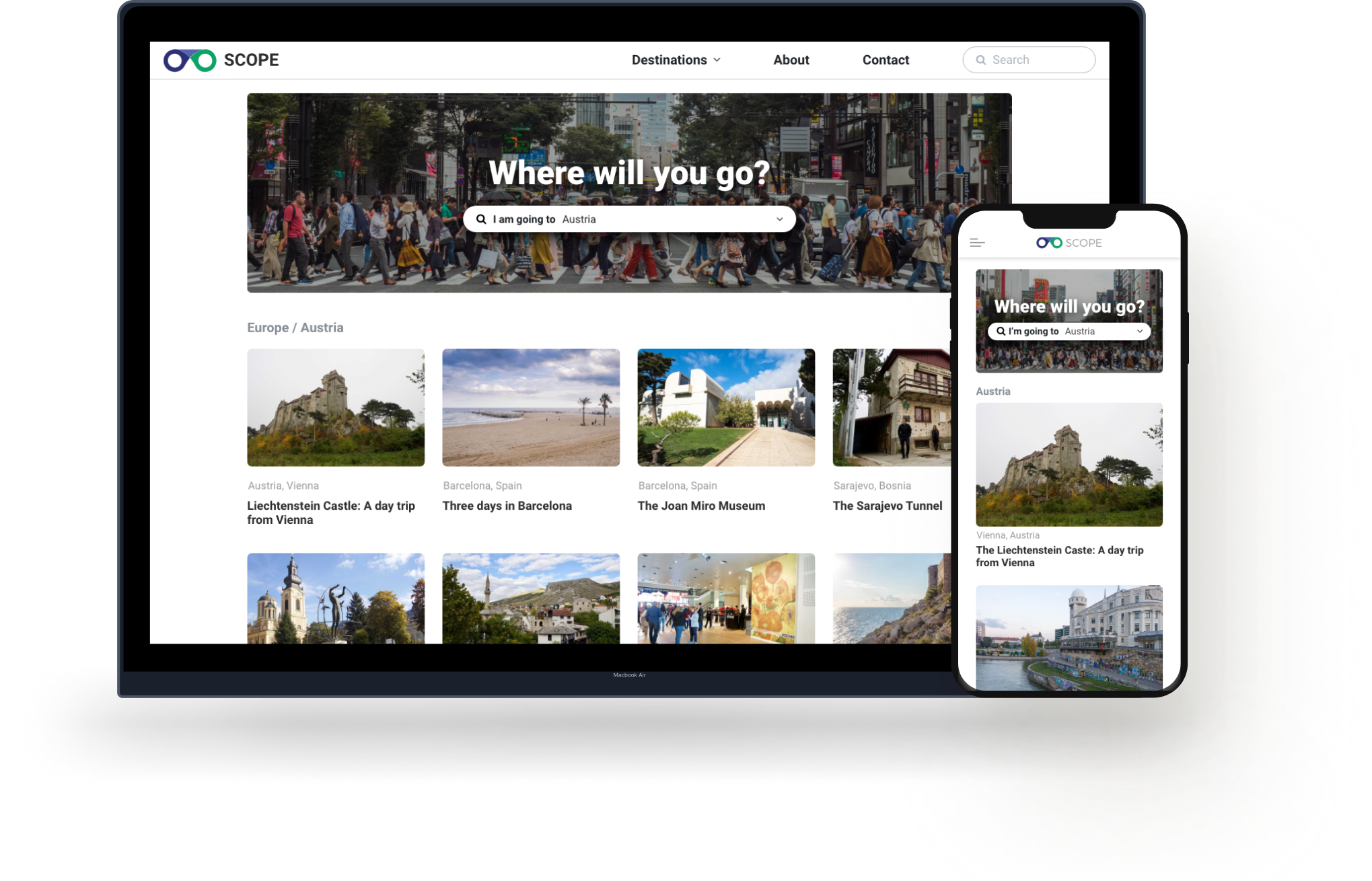
Scope Travel is a blog that caters to travelers looking for adventure in not-so-touristy destinations around the world. Articles include itineraries, things-to-do, culture awareness, and budget trips.
The Problem
The majority of users (over 90%) visiting the website come directly to an article page via a Google search. The site had a high bounce rate and a low number of pages per session.
How might we make content and resources more accessible and engaging to our users?
The navigation and article layout did not give users enough options for related content for an extended site session. The layout did not address our users biggest need, which is to gain access to material that would aid in trip planning.
The Goal
The whole site will receive a redesign with a particular focus on the article page layout and search components on the destination home page. We will create a design system which will be implemented over time.
Research
The previous site implemented effective SEO which allowed the majority of our users to find an article organically through search engines. However, users were leaving after reading the article and not continuing to read another article. The article layout did not inform users on what to expect or get an idea of what kind of site they were on or give any opportunity to engage further with the website.
We analyzed 100 randomly chosen users reading various articles. We found that 73% of users were reading/skimming the entire article. Users typically spent more time on articles that showed images of the writers, which we could assume they were more likely to read if they felt a connection to the writer. Users found value in clear headers and blockquotes and were more likely to read the content when it was broken up.
Based on the user's geographic location we can infer that a majority of users were searching for travel content in preparation for their trip and not during, which is valuable when constructing a content publishing strategy.
We followed the user’s journey to see where there were opportunities for improvements.
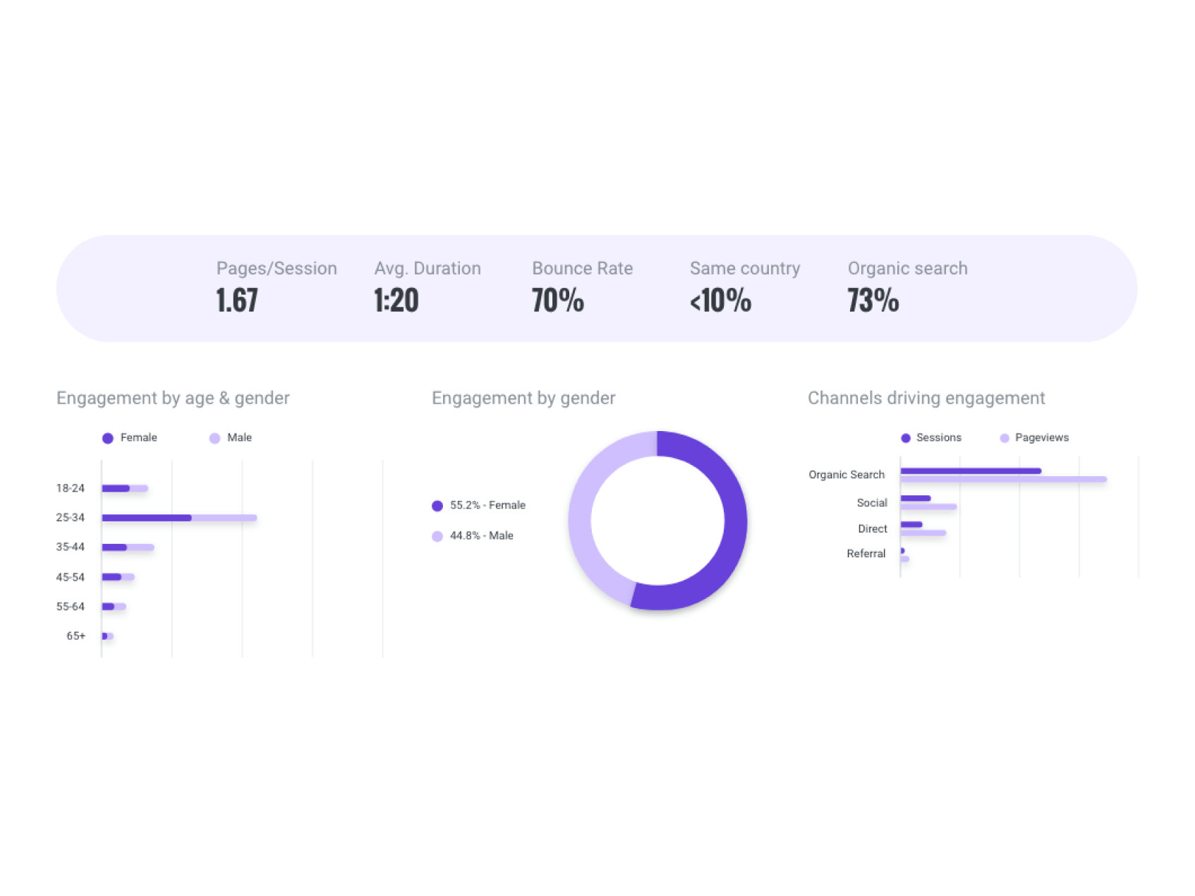
Analytics
High-bounce rate
Google Analytics showed that we had a higher than average bounce rate 70% Low pages per session
On average users visited 1.67 pages per session High organic search
A large number of visitors found our site organically High scroll rate
A high percentage of users staying on the site were finishing the entire article Research Kit
Users were finding the site organically but didn't click through to other pages.
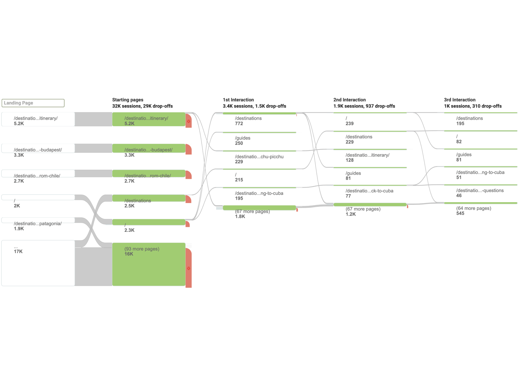
Majority of users were finding articles on search engines but did not click through to other pages.
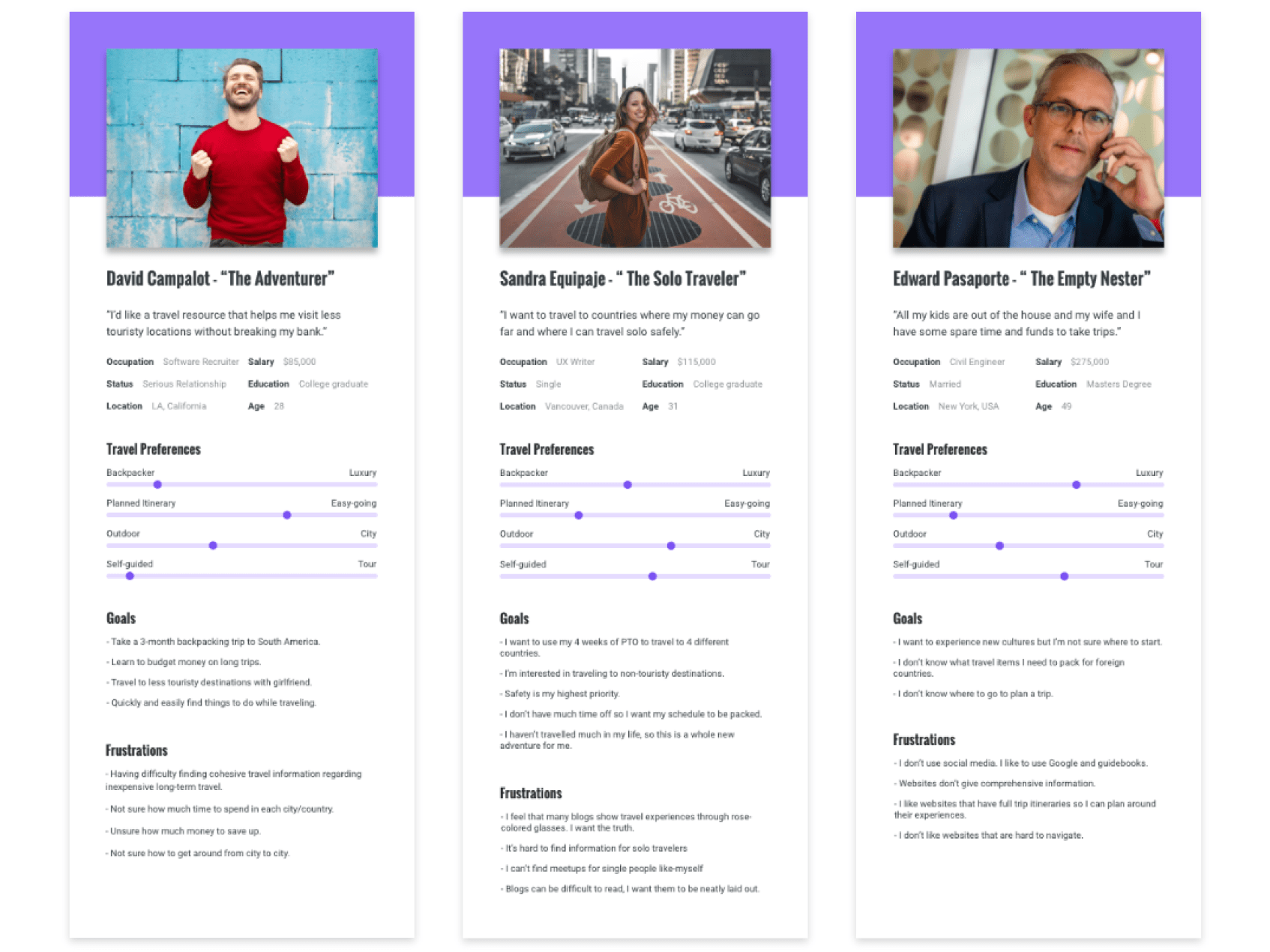
Personas
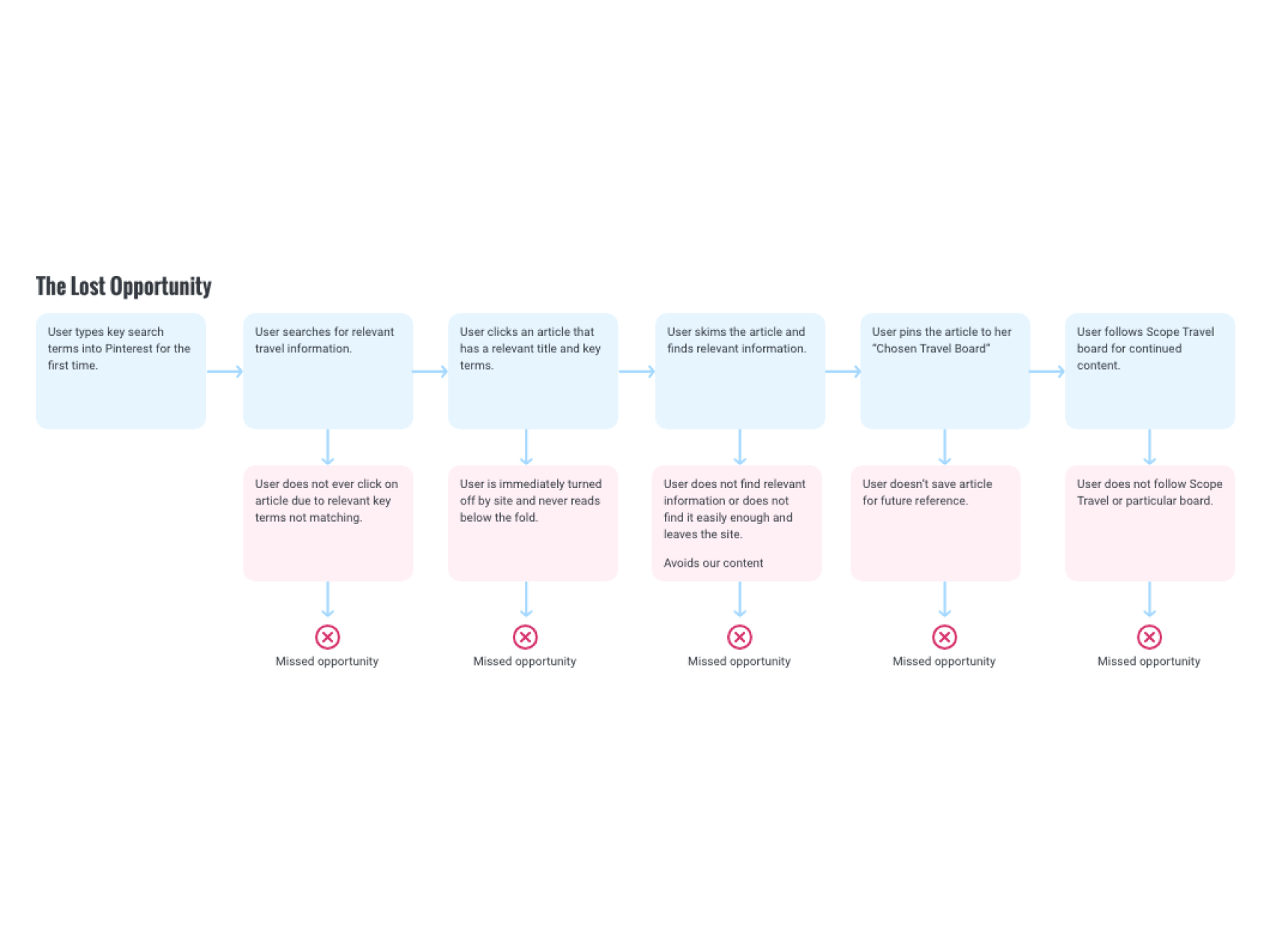
Journey Map - We needed to visualize the importance of this design and the number of missed opportunities we had in Sandra's journey via Pinterest.
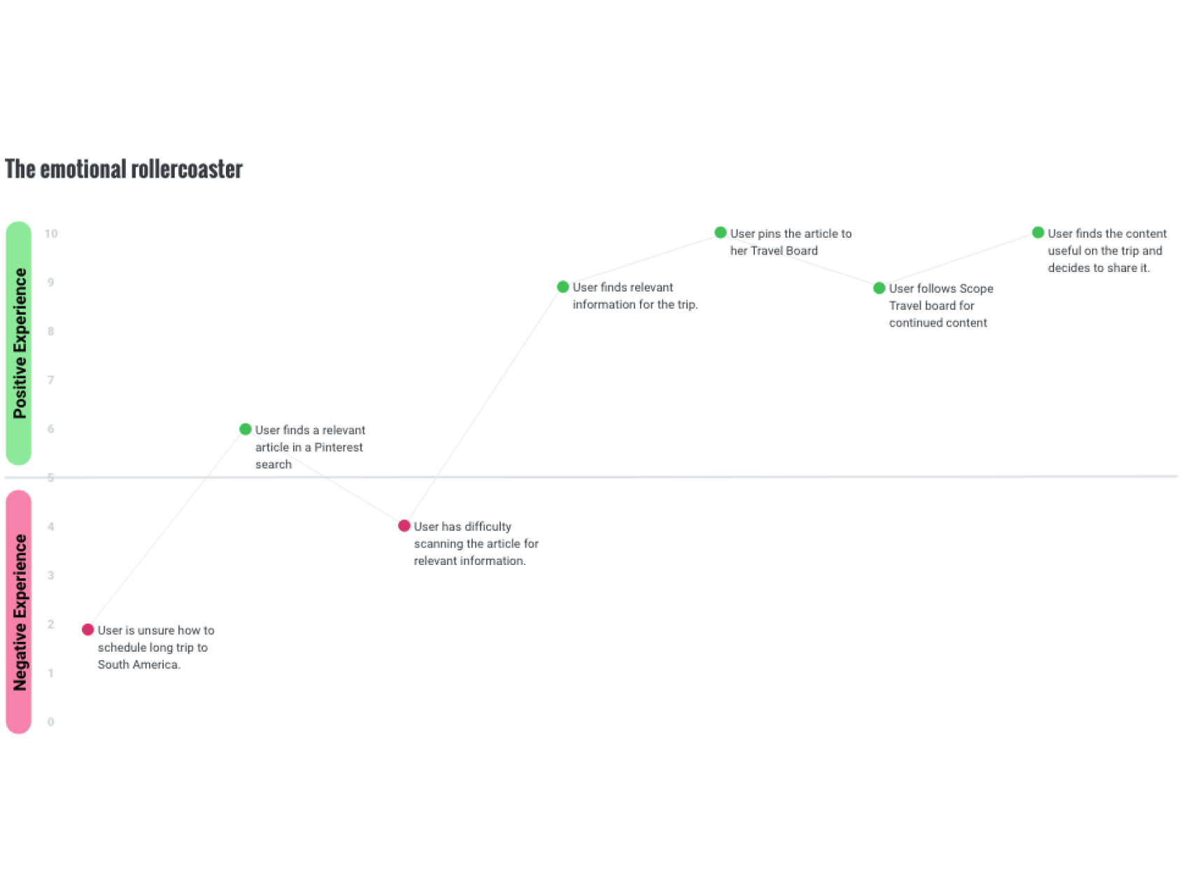
With the old design we were losing most of our Pinterest users on the third step. With the redesign we noticed that we were gaining more followers and returning visitors on Pinterest.
Design
Three design principles guided our design decisions throughout the duration of this project. We submitted different iterations of the article layout for A/B testing for feedback.
We tested different components designs and layouts during this process. We wanted the users to have a pleasant experience regardless of the device they were using. We wanted to avoid the mobile version being a shrunken down desktop site, which resulted in different component designs for both mobile and desktop.
Ideate, Design, Test, Iterate
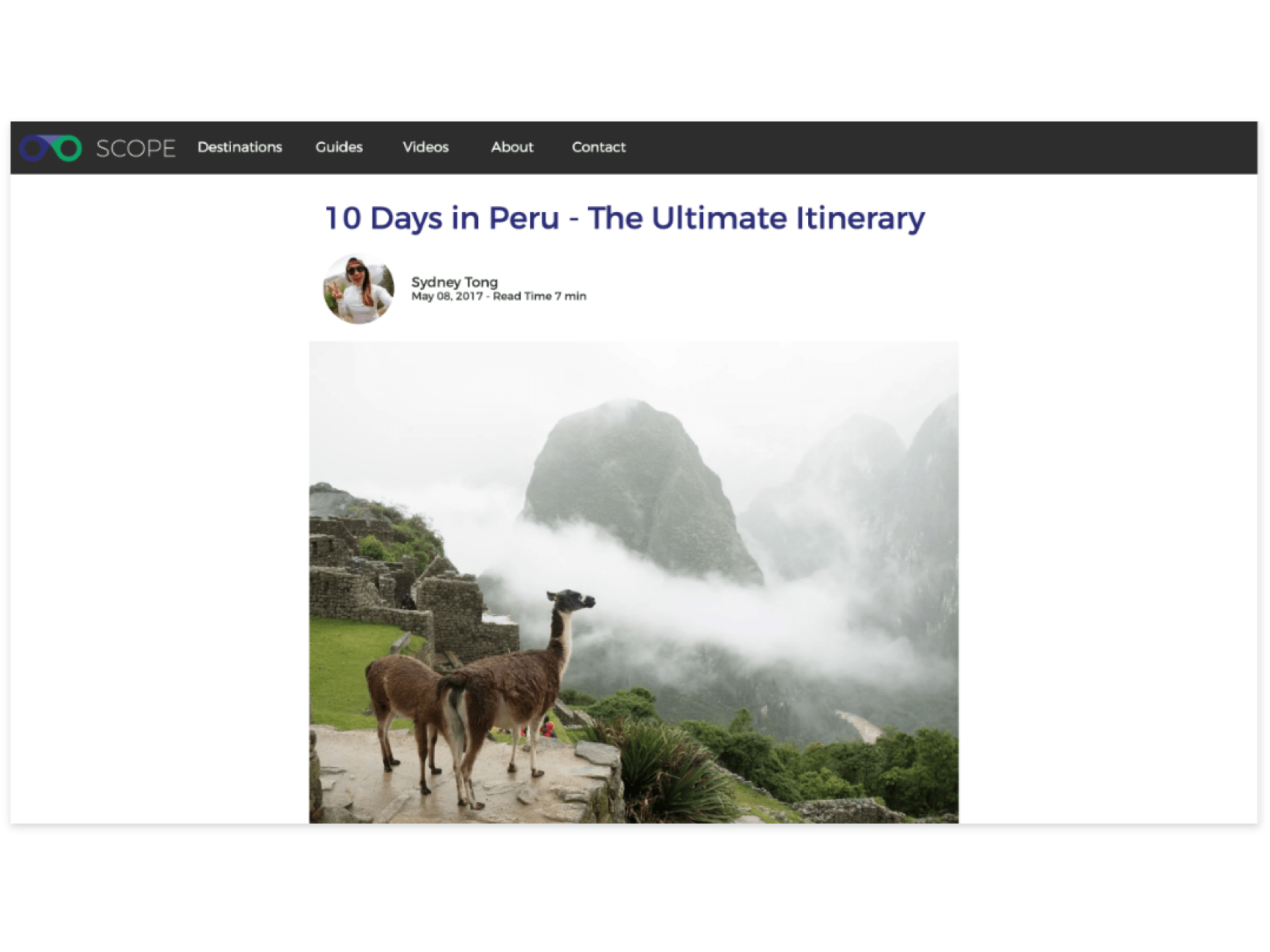
The article page prior to the redesign did not allow any oppourtunities to engage further with the website.
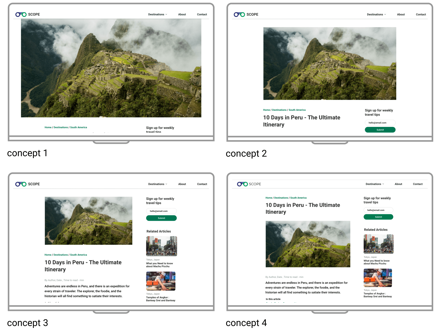
Different above the fold designs were tested for the best user retention and bounce rates. Concept 4 performed the best of the group.
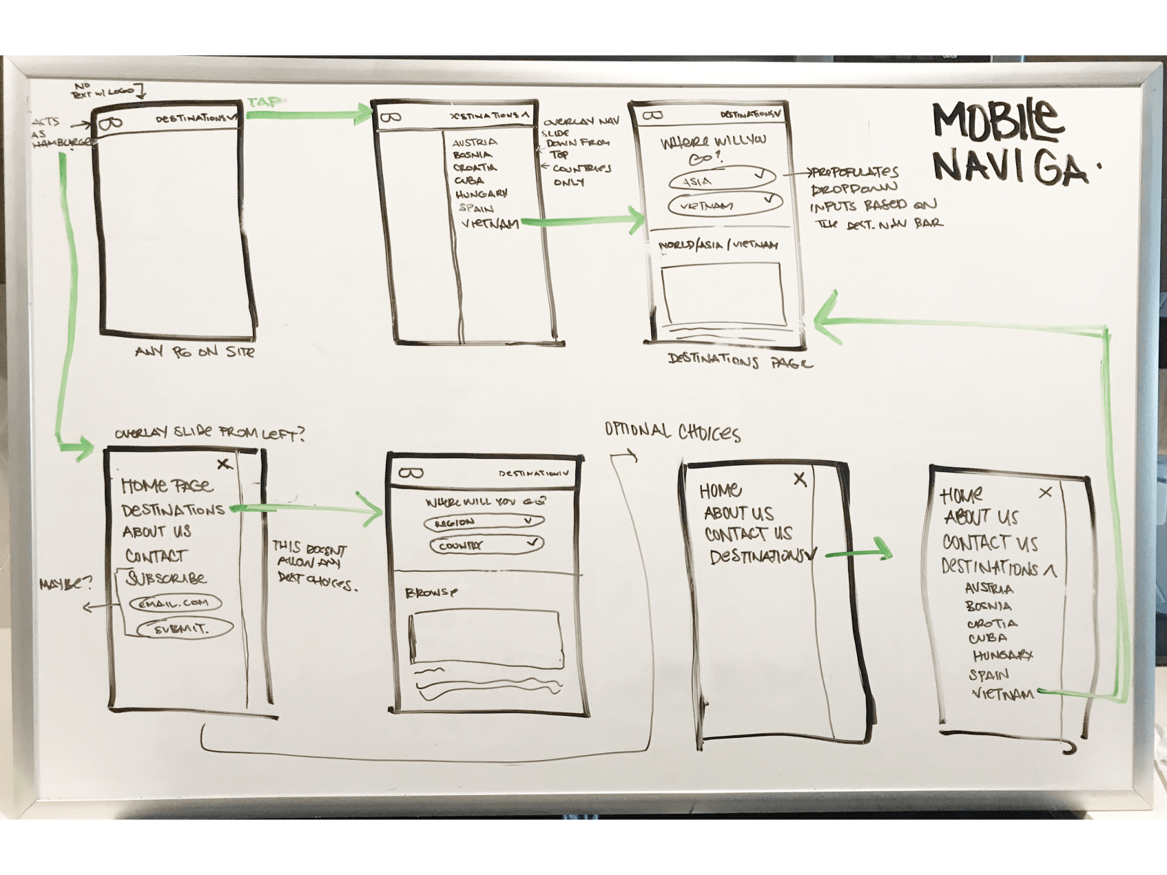
Rethinking country search options in mobile on the whiteboard prior to putting anything into “pixels” was a great way to brainstorm and rethink options.
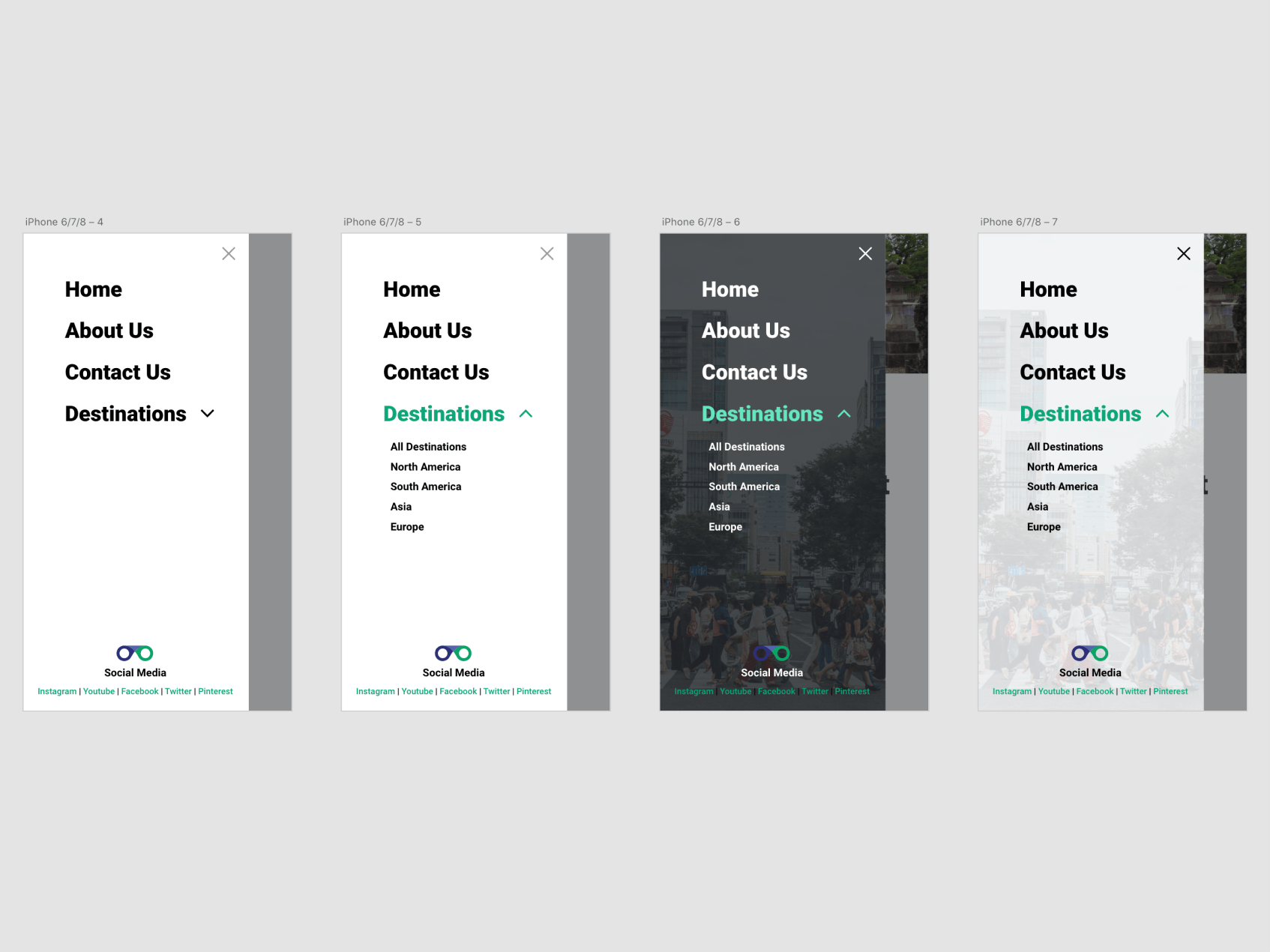
We went with a simple pull out menu drawer for mobile navigation. We jazzed it up with some overlays and images.
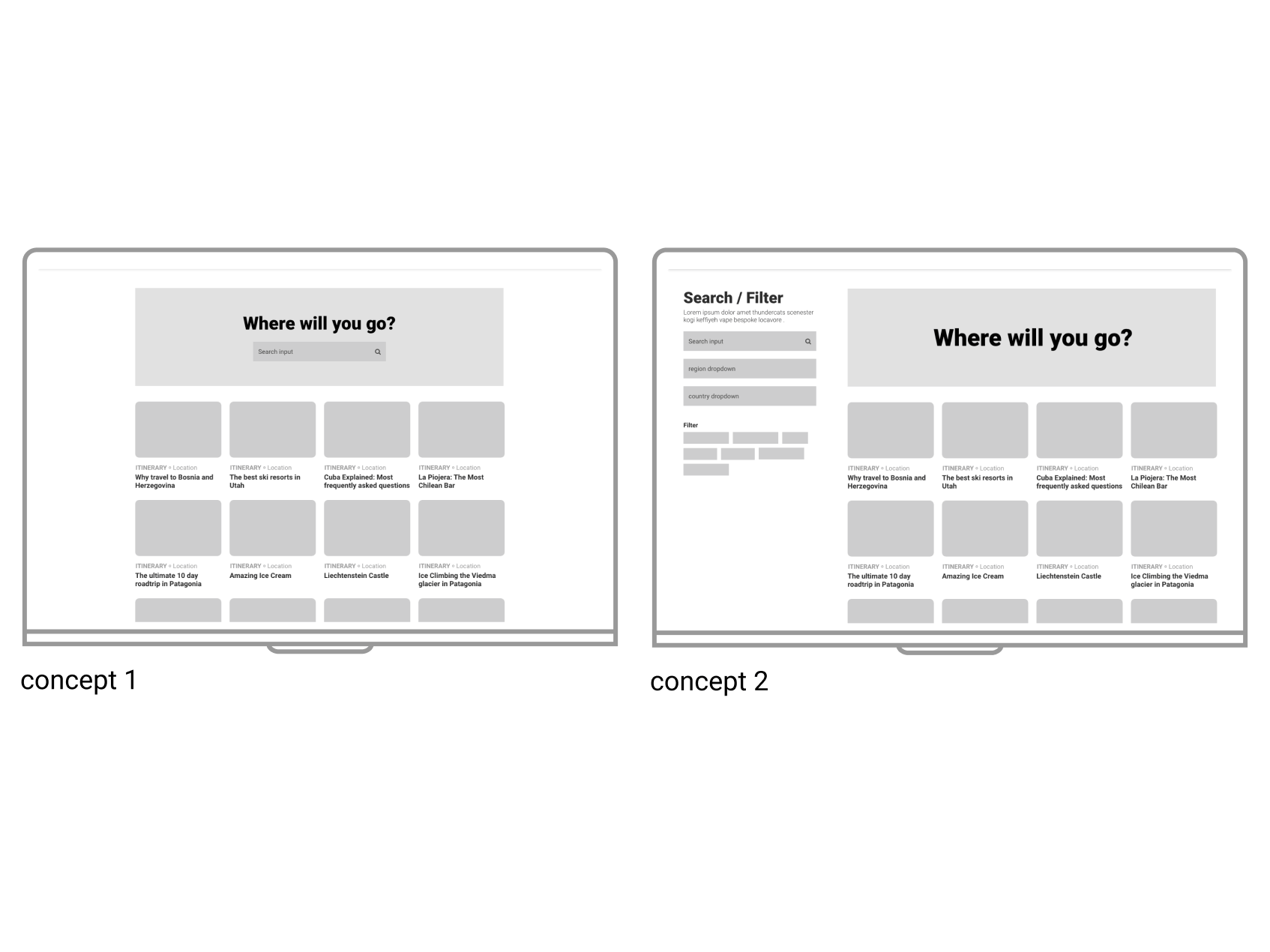
Digital wireframe concepts for the Destinations page. We went with concept 1 because it was a more direct approach.
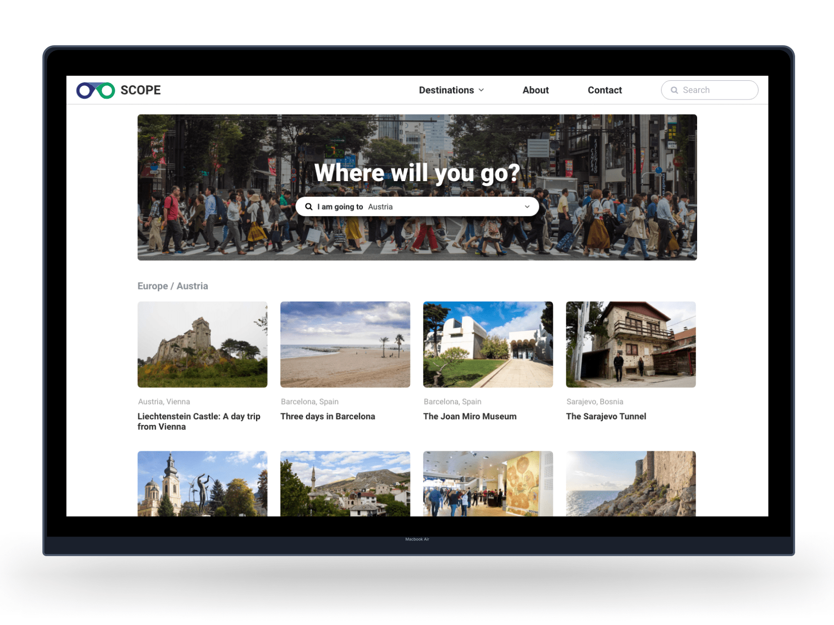
Final mockups for the desination page.
Usability study findings
1
Desktop - Two-column layout
More than half of our users read our articles using a desktop so we added a sidebar packed with content about us and an email subscription form. 2
Readability
We A/B tested different line-heights, text box widths, and image widths. Results led us to the final product of more narrow widths and a sans-serif font. 3
Article table of contents
The articles are lengthy and we addressed this pain point by adding a table of content. The table of contents also improved SEO. 4
Navigational Links
Majority of users introduced to Scope Travel were through an article. To aid in user navigation we added breadcrumbs and improved navigation. High-fidelity mockups
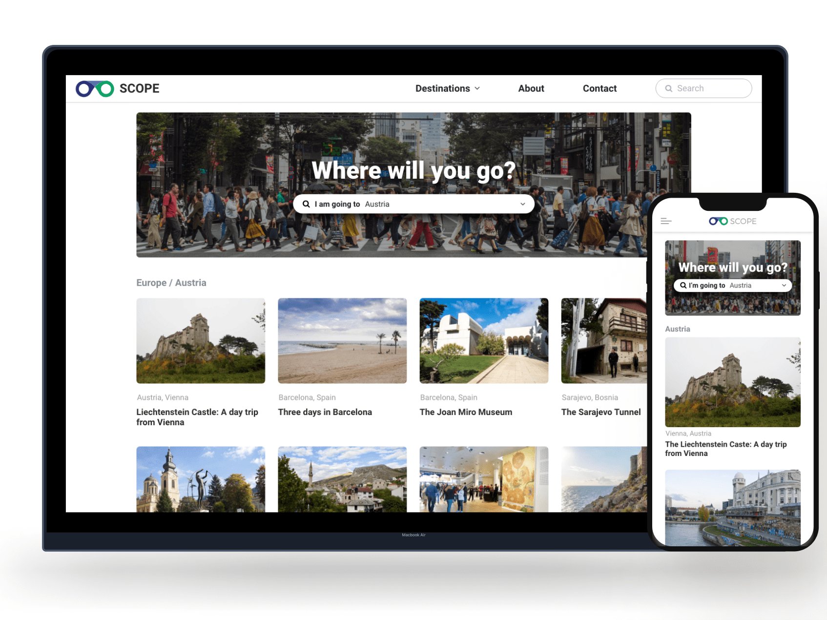
Final mockups for the destination home search page.
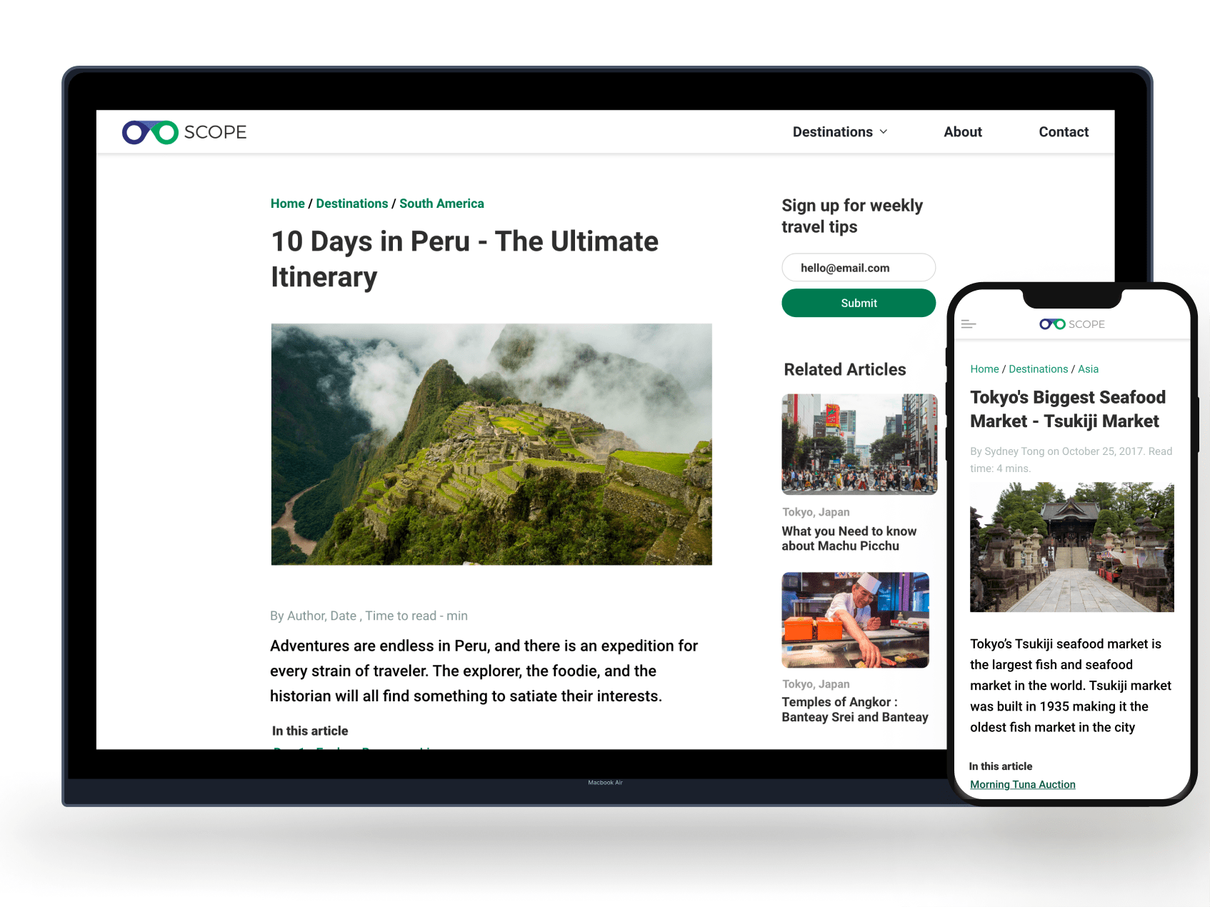
The two column article page was the most successful in user testing. On mobile devices the second column stacked below the article content.
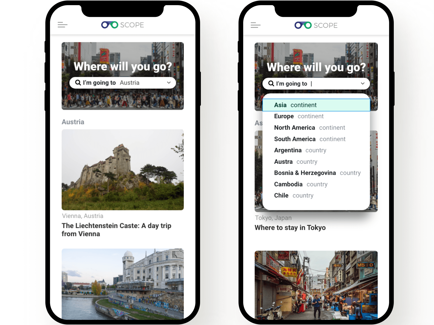
Drop down mockups for inactive and active states. The dropdown concept was selected out of our wireframes because it was the most clear option for users in tests (compared to concept 1 and 3).
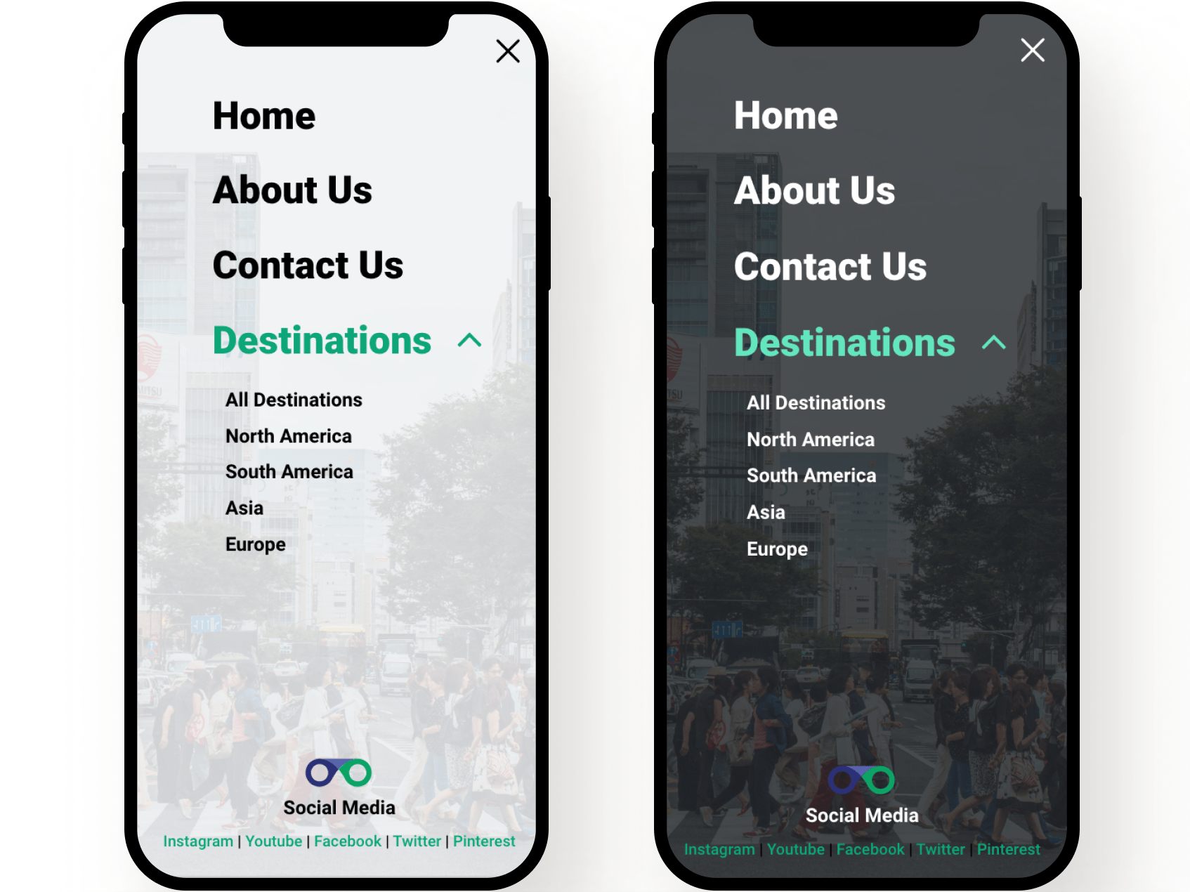
Light and dark modes both available for mobile devices.
Accessibility & inclusivity considerations
1
Color palette
Updated colors to pass WCAG accessibility guidelines2
Offline content
Our articles are now available to read offline IF users have already loaded the website for users with slow internet connection. 3
Screen readers
Collaborated with the engineering team to create a layout that is easy to navigate with screen readers.Takeaways
Impact
After the release of the new design, we saw a reduction in our bounce rate and increase in the number of pages per session. Analyzing the latest data we can see that users are using the table of contents and more actively sharing the article URL.
The changes in the site have made it easier for us to see what content our users find valuable and we have been able to make decisions in the type of content we want to publish in the future.
The results have not been as immediate and as drastic as we would have liked, but it is still early in the process. The research and data that we gathered during this project have proved to be the most valuable in terms of making future marketing decisions.
What I learned
My biggest takeaway was the importance of analytics when making design decisions. It helped to improve the site’s overall SEO in addition to the user’s experience.
Next Steps
1
Next Stage
The research and preparation for the design stage was the most valuable part of the redesign. We gathered so much data that has allowed us to create a roadmap for relevant content creation and better marketing material.2
Analysis of Analytics
We have on-going plans to improve the redesign based on the analytics and are restructuring content to appeal to new and returning users. The research phase also gave us insight on how to restructure our email campaigns to be more productive.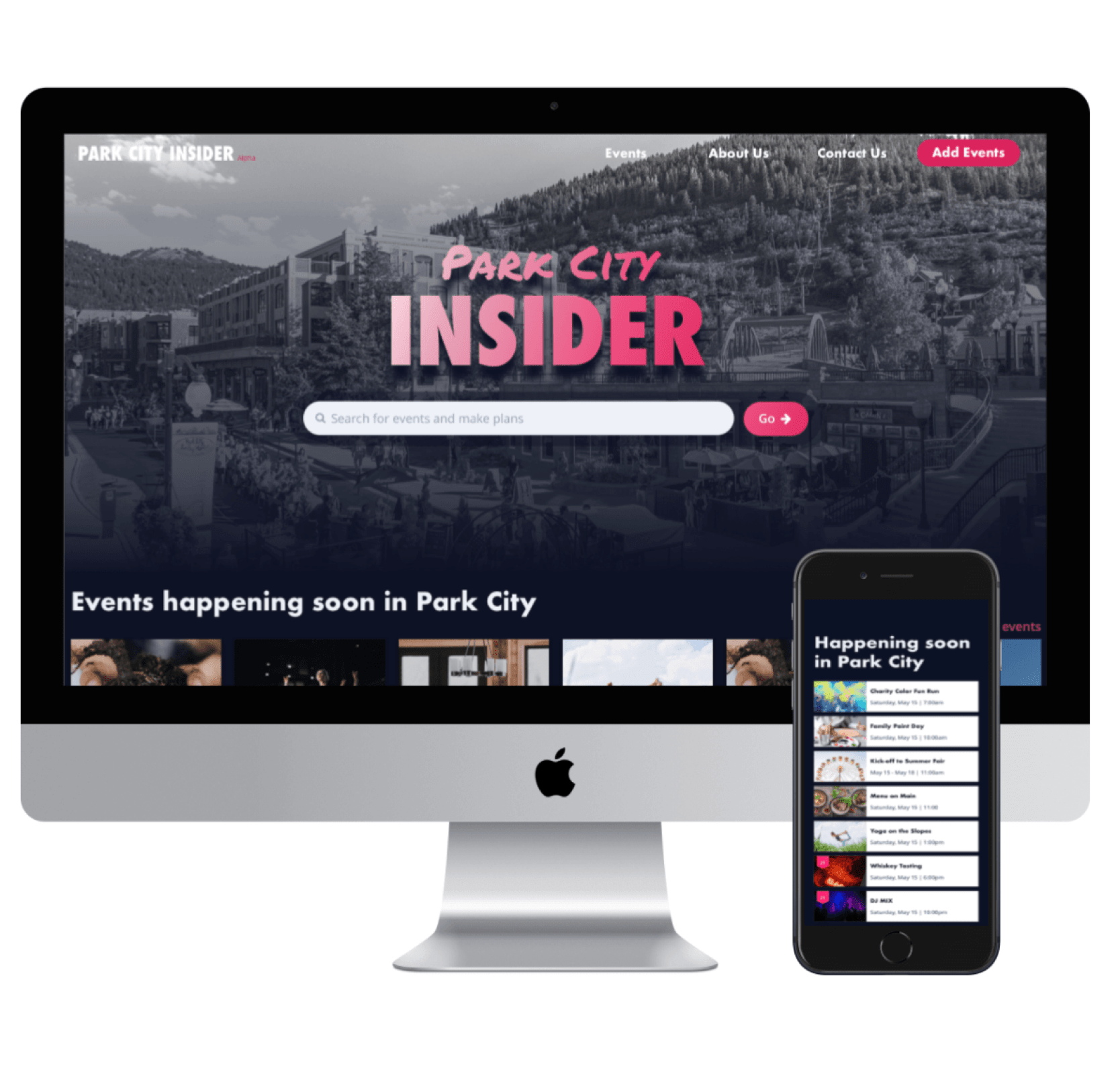
Previous Case StudyPark City Insider.Park City Insider is an event website that caters to visitors and locals searching for events in Park City Utah.
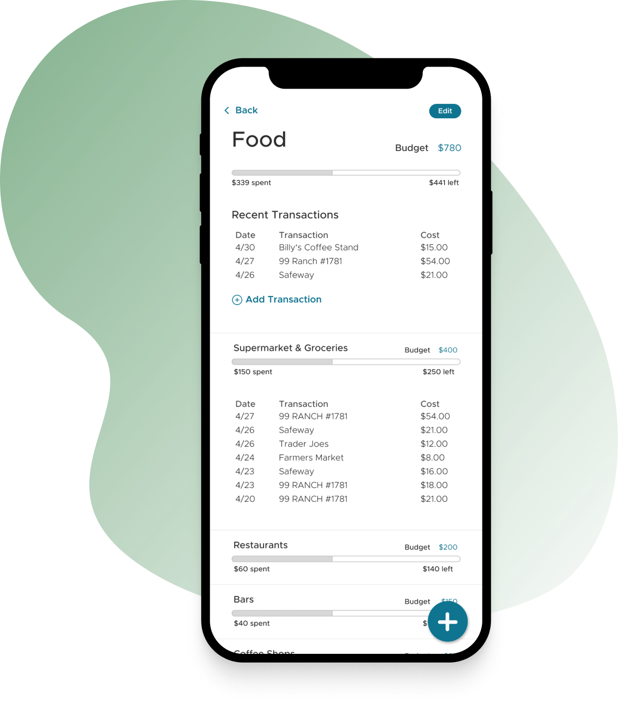
Next Case StudyThe budget app.A webapp that allows couples to harmoniously track expenses and create budgets together. It categorizes expenses and helps track where money goes every month.
Designing out of
San Diego, California.
San Diego, California.
I'm always open to hearing about new project ideas and possibilities for collaboration. If you have an idea that you'd like to bring to life or if you're in need of a passionate product designer to be part of your team, I'd love to have a conversation.
hello@sydneytong.com
510.338.7860©2024 sydney tong. All rights reserved.